

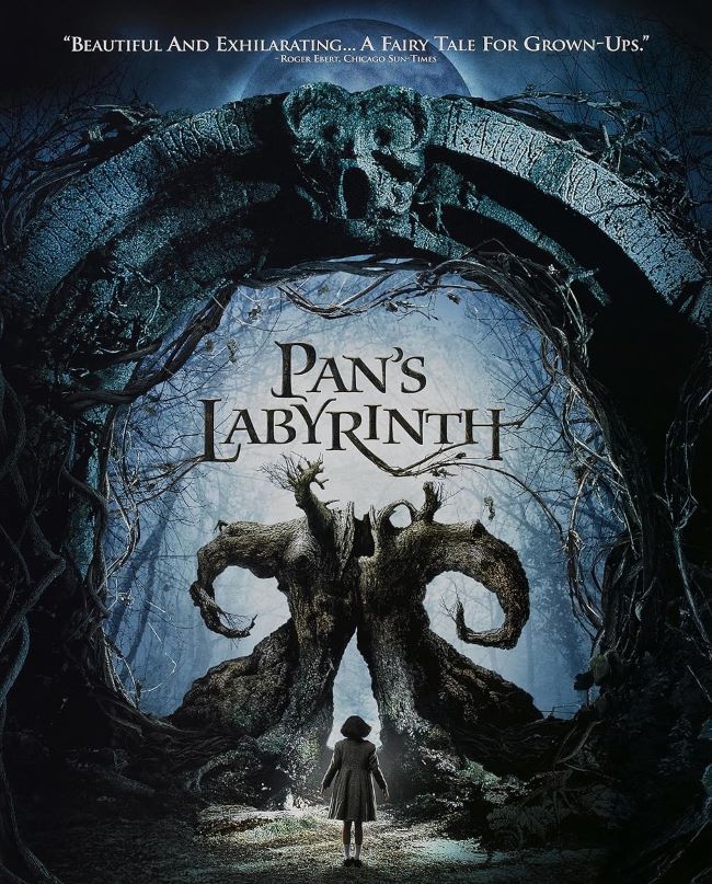
The Pan’s Labyrinth font feels like it was born in the shadows of an old storybook—mystical, fragile, and yet unsettling. It carries the texture of myths, etched in ink that seems half-faded, half-alive. When you see it, you don’t just think of typography—you think of fairy tales that aren’t meant for children, of doors that open to other worlds, of secrets whispered in the dark.
Pan’s Labyrinth Font
Download Pan’s Labyrinth Font (Alternative 1 – Alternative 2)
Unlike polished, modern fonts, the Pan’s Labyrinth font leans toward the ornate and the gothic. It combines elegance with a sense of unease, almost as if the letters themselves are enchanted and cursed at the same time. Fonts like Carolingia, Black Chancery, or Unzialish echo this balance—delicate curves intertwined with something ancient and otherworldly.
What I love about the Pan’s Labyrinth font is how it embodies contradiction. It’s beautiful but eerie, gentle but ominous. Just like Guillermo del Toro’s masterpiece, it doesn’t let you stay comfortable. Instead, it pulls you deeper, letter by letter, into a labyrinth where reality and fantasy blur.
The Pan’s Labyrinth font isn’t just about letters—it’s a doorway. A threshold between the real and the imagined, between innocence and horror. And once you step through, there’s no going back. You can also check our free fonts collection.


