

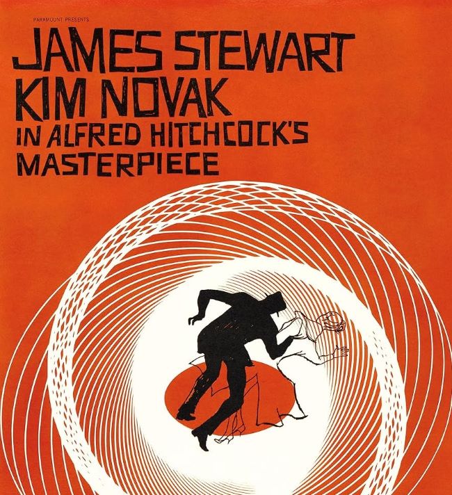
The Vertigo font is instantly tied to Alfred Hitchcock’s legendary 1958 thriller, a film that redefined suspense and visual storytelling. The movie’s title sequence, designed by Saul Bass, is one of the most iconic in cinema history, and the typography plays a major role in that hypnotic effect. Bold, geometric lettering combined with swirling optical illusions creates a sense of unease and fascination—perfectly reflecting the themes of obsession and psychological tension in the film.
Vertigo Font
When looking for fonts that echo the style of the Vertigo font, designers often turn to bold sans-serif typefaces with a modernist edge. Fonts such as Trade Gothic Bold, Helvetica Bold, or custom geometric styles can capture a similar intensity. Their clean yet striking forms deliver the same commanding presence that made Hitchcock’s opening credits unforgettable.
The power of the Vertigo font lies not only in its visual strength but also in how it becomes part of the storytelling. Just like the spirals that pull the viewer into the mystery, the lettering feels dynamic, alive, and unsettling. It’s a perfect choice for projects that need a sense of suspense, drama, or psychological depth.
The Vertigo font proves that typography can do more than just label a film—it can pull you directly into its world. You can also check our free fonts collection.


