

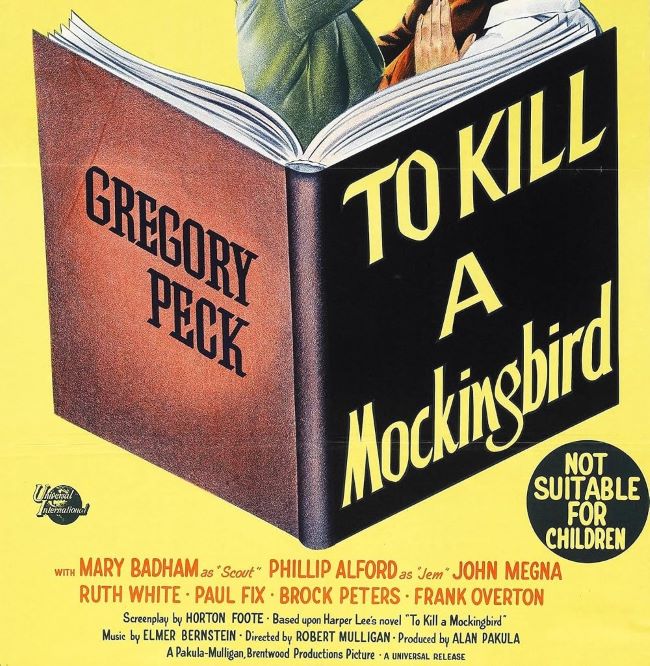
The To Kill a Mockingbird font is closely tied to the timeless 1962 film adaptation of Harper Lee’s classic novel. Much like the story itself, the typography reflects a blend of tradition, seriousness, and a sense of Southern atmosphere. The lettering used in the film’s title sequence has a hand-crafted, serif style that feels both literary and cinematic, embodying the gravity of the themes explored in the story.
To Kill a Mockingbird Font
Download Font (Alternative 1 – Alternative 2)
Designers often associate the To Kill a Mockingbird font with elegant book typography and classic film titles of the mid-20th century. While the exact custom lettering from the film isn’t available as a commercial typeface, fonts with similar qualities—such as Garamond, Baskerville, or Georgia—capture its scholarly and refined look. These fonts carry the same timeless charm, making them excellent substitutes when aiming for a design that echoes the film’s iconic presence.
What makes the To Kill a Mockingbird font especially memorable is the way it supports the film’s themes of morality, justice, and human dignity. Its dignified serif style adds to the sense of history and storytelling, grounding the viewer in a world shaped by literature and cultural heritage.
The To Kill a Mockingbird font continues to inspire designers, educators, and film enthusiasts who want to capture that blend of literary sophistication and cinematic nostalgia. Just as the story endures, the typography remains a symbol of classic American storytelling. You can also check our free fonts collection.


