

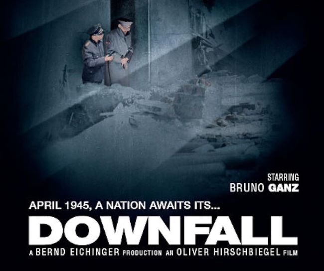
The Downfall font carries the same weight and intensity as the film it represents. Known for its stark portrayal of Hitler’s final days in the bunker, the typography mirrors that atmosphere—serious, cold, and unflinching. The Downfall font feels authoritative, with a rigid structure that reflects the military precision and grim mood of the story.
Downfall Font
Download Downfall Font (Alternative 1 – Alternative 2)
It often resembles fonts like Helvetica Bold, Arial Black, or DIN, which have a clean but commanding presence. These typefaces lack ornament, instead emphasizing clarity and strength—perfect for war dramas and historical narratives.
What I find powerful about the Downfall font is how it avoids unnecessary flair. Just like the film itself, it doesn’t soften the subject matter. Instead, it communicates weight, history, and finality. It’s a reminder that typography, even when simple, can convey emotion and tone just as strongly as dialogue or cinematography.
The Downfall font is more than just letters—it’s a design choice that sets the tone for one of cinema’s most haunting historical depictions. You can also check our free fonts collection.


