

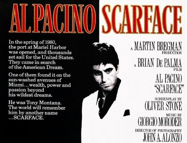
The Scarface font is as bold and unforgettable as Tony Montana himself. When Brian De Palma’s 1983 crime epic opens, the typography immediately sets the stage: tall, sharp serif letters that carry the weight of power, danger, and ambition. It’s not just a title — it’s a warning, a declaration, and a promise of excess.
Scarface Font
Download Scarface Font (Alternative 1 – Alternative 2 – Alternative 3)
The style resembles fonts like Engravers Old English and Optima Bold, both of which bring that combination of elegance and authority. The letters stand tall and commanding, much like Montana rising from nothing to build his empire. Every curve and stroke feels like it belongs on a movie poster drenched in neon, cocaine dust, and Miami heat.
What makes the Scarface font so striking is how it straddles two worlds: the sophistication of high society and the brutality of the streets. Just like Tony, it has one foot in glamour and the other in violence. Designers who tap into this font style aren’t just borrowing from cinema — they’re channeling an aesthetic of danger, ambition, and ultimate downfall.
Using the Scarface font in your projects means more than adding dramatic flair. It’s about embracing a design language that screams ambition, excess, and style — much like the man who once said, “The world is yours.” You can also check our free fonts collection.


