

The Reservoir Dogs font is as sharp and gritty as Quentin Tarantino’s legendary debut film. Bold, unapologetic, and confrontational, the typography used in the title card reflects the movie’s raw energy and criminal underworld aesthetic. It’s not polished Hollywood glam—it’s rough around the edges, much like the characters themselves.
Reservoir Dogs Font
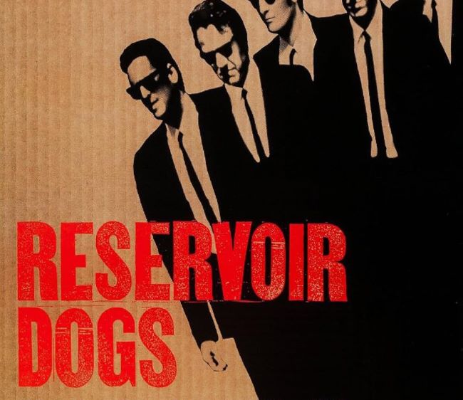
The lettering resembles fonts such as ITC Machine Bold which carry heavy, block-like structures. These typefaces give off an intense, no-nonsense vibe, echoing the tension and violence at the heart of the story. The Reservoir Dogs font doesn’t whisper—it shouts.
What makes this design effective is how it matches Tarantino’s storytelling: stylish yet brutal, chaotic but meticulously crafted. The strong sans-serif lines reflect a world built on crime, betrayal, and razor-sharp dialogue. It’s the kind of typography that instantly communicates danger and intensity, much like Mr. Blonde’s infamous dance scene or the bloody warehouse setting.
In the end, the Reservoir Dogs font is more than just a typeface—it’s an extension of the movie’s identity. Bold, fearless, and unforgettable, it captures the essence of Tarantino’s breakout film and continues to inspire gritty, urban-inspired design projects today. You can also check our free fonts collection.


