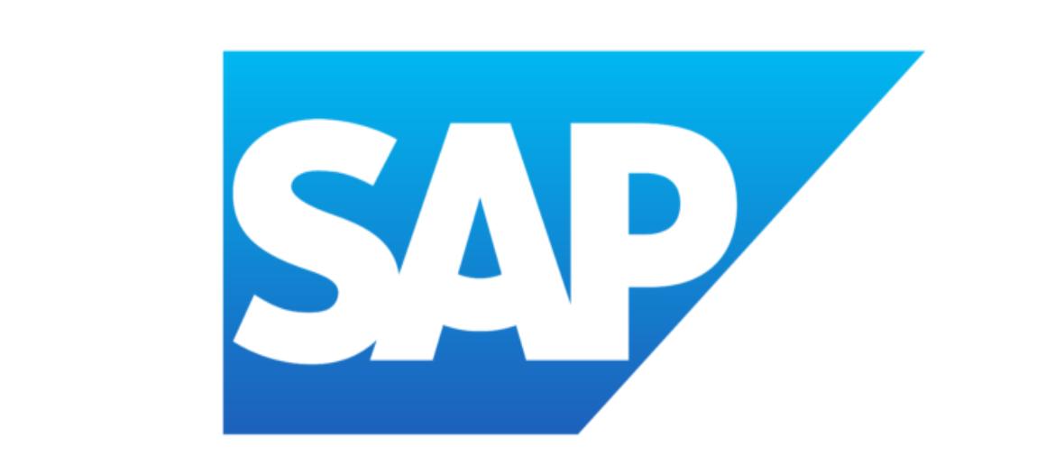
SAP Font has always stood out to me because of how professional and straightforward it looks. Every time I see the company’s branding, I realize how much the SAP logo font contributes to its reputation as a trusted leader in enterprise software. In my opinion, the typeface reflects clarity, stability, and innovation—all qualities that SAP is known for.
SAP Font
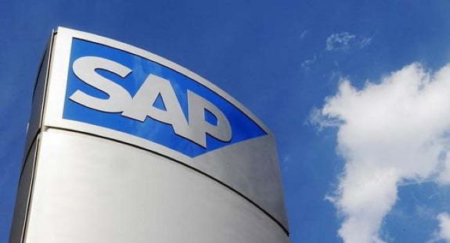
The SAP logo font is based on Frutiger, a clean and modern sans-serif typeface. I think this was the perfect choice because it emphasizes readability and precision, which mirrors the brand’s focus on simplifying complex business processes. From my analysis, the SAP logo font works consistently across digital platforms, corporate materials, and product interfaces, reinforcing the brand’s professional identity.
Compared to other tech companies, SAP Font feels more structured and business-focused. I believe that’s why it connects so strongly with corporate audiences. To me, SAP Font proves that typography can communicate reliability and expertise, making the SAP logo font an integral part of the brand’s global presence.
SAP itself is one of the world’s largest software companies, best known for its enterprise resource planning (ERP) solutions that help businesses manage operations, data, and customer relationships more efficiently. You can also check our free fonts collection.

