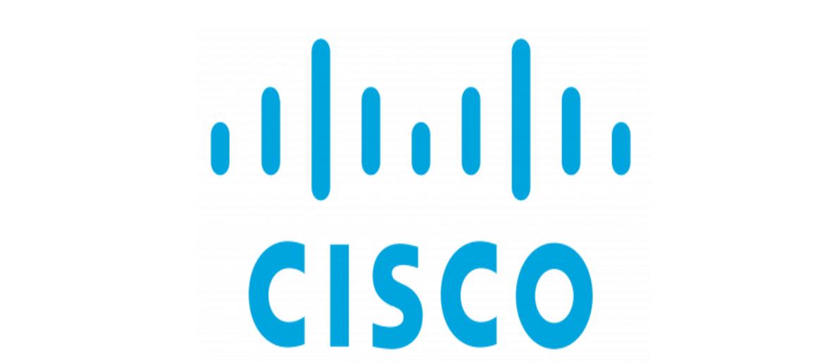
Cisco Font has always stood out to me because of how professional and trustworthy it feels. Whenever I see their branding or technology products, I notice how much the Cisco logo font contributes to the company’s image of stability and innovation. In my opinion, the typeface perfectly matches a brand that connects the world through technology.
Cisco Font

The Cisco logo font is based on a customized version of DIN, a clean and modern sans-serif typeface. I think this choice makes sense because it communicates clarity, precision, and reliability—qualities that reflect Cisco’s role in networking and communication. From my analysis, the Cisco logo font looks strong across digital platforms, presentations, and product branding, reinforcing consistency everywhere.
Compared to other tech companies, Cisco Font feels more structured and corporate, which I believe helps build trust. To me, the Cisco Font proves that a well-designed logo font doesn’t just represent a company visually—it also conveys the values and stability that customers expect. You can also check our free fonts collection.

