

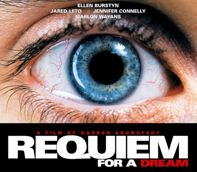
The Requiem for a Dream font is tied to Darren Aronofsky’s haunting 2000 masterpiece, a film that explores obsession, addiction, and the fragility of dreams. The typography used in the title design is clean, modern, and unsettling in its simplicity. It’s a stark sans-serif style, reflecting the cold and clinical tone of the film’s narrative. The stripped-down design lets the story’s intensity speak for itself, creating a chilling visual identity.
Requiem for a Dream Font
Download Requiem for a Dream Font (Alternative 1 – Alternative 2)
While there isn’t an official Requiem for a Dream font available to download, many fans and designers look for typefaces that capture its same aesthetic—sharp, minimal, and unforgiving. Fonts like Helvetica Neue Bold, Futura Bold, or Arial Black are often used as close alternatives. These fonts embody the same sense of modernism and precision while maintaining that heavy, uncompromising presence that mirrors the film’s atmosphere.
For creatives, fonts inspired by the Requiem for a Dream font are ideal for projects that need a dramatic, impactful, and serious mood. They work well in film posters, editorial layouts, psychological thriller projects, or any design where stark contrast and emotional weight are key.
Using a Requiem for a Dream font style in your design is more than just a typographic choice—it’s about channeling the film’s raw emotional power and its unforgettable visual tone. You can also check our free fonts collection.


