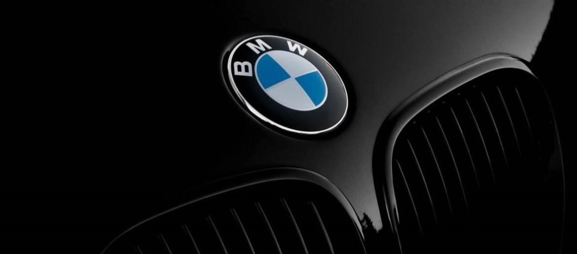
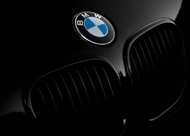
BMW Font has always stood out to me because of its sharp and clean appearance. Whenever I see the BMW badge or their advertisements, I notice how the typography adds to the brand’s image of precision and innovation. In my opinion, BMW Font feels like the perfect blend of performance and sophistication.
BMW Font
Download BMW Font (Alternative 1 – Alternative 2)
The typeface associated with the brand is BMW Type, a custom corporate font inspired by Helvetica. I think this was a smart choice because it conveys clarity, strength, and timeless design—all qualities that match BMW’s reputation. From my analysis, BMW Font works seamlessly across car interiors, digital screens, and marketing materials, keeping the brand identity consistent everywhere.
When I compare it to other automotive brands, BMW Font stands out for its modern and no-nonsense feel. I believe that’s what makes it so effective—it communicates luxury and reliability without being overly decorative. To me, BMW Font proves that great typography, just like great engineering, is all about precision. You can also check our free fonts collection.

