

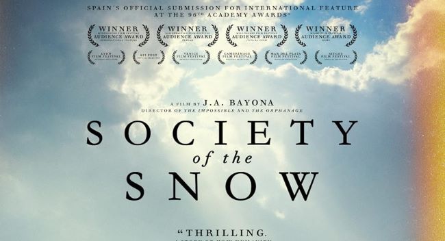
The Society of the Snow font is tied to the Netflix survival drama inspired by the true story of the 1972 Andes plane crash. The film tells a powerful tale of endurance, resilience, and humanity in the face of tragedy, and the typography in the title reflects that tone. It has a raw, straightforward, and bold appearance, perfectly aligning with the serious and emotional atmosphere of the story.While there isn’t an official release of the Society of the Snow font, designers often look to clean sans-serif styles that communicate strength and clarity. The font design avoids ornamentation, emphasizing a modern and stark look that resonates with the film’s dramatic narrative.
Society of the Snow Font
Download Society of the Snow Font (Alternative 1 – Alternative 2)
If you want to capture the same tone as the Society of the Snow font for your own projects, these alternatives provide the same mix of simplicity and emotional weight, making them ideal for impactful designs. You can also check our free fonts collection.


