Mercedes Font has always impressed me with how sophisticated and timeless it feels. Whenever I see the brand’s logo or advertisements, I notice how the typeface adds to its luxury image. In my opinion, Mercedes Font is not just lettering—it’s a reflection of the brand’s heritage and prestige.The typeface commonly associated with the brand is Corporate A and Corporate S, and I think they capture the essence of Mercedes perfectly. Clean, modern, and elegant, these fonts align with the brand’s identity of precision engineering and luxury design. From my analysis, Mercedes Font works seamlessly across digital, print, and automotive branding, reinforcing consistency everywhere.
Mercedes Font

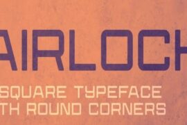
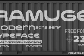
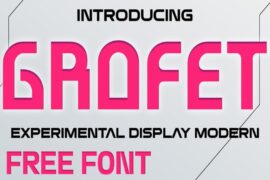
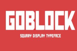
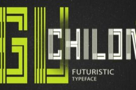
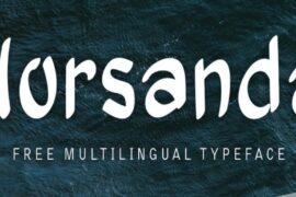
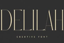
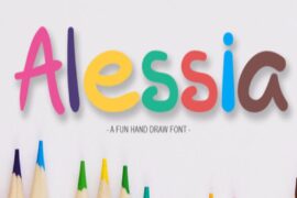
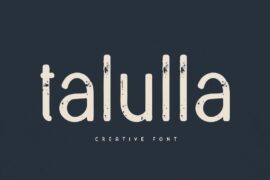
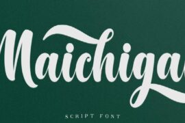
Free Download Mercedes Font (Alternative 1 – personal use – Alternative 2 -personal use)
Compared to other car brands, Mercedes Font stands out because of its understated elegance. I believe that’s why it resonates so strongly—it doesn’t need to be loud to convey authority. To me, the Mercedes Font proves that true luxury in design comes from simplicity paired with refinement.
You can also check our free fonts collection.

