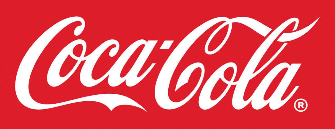
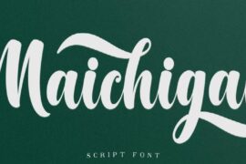
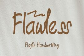
Coca Cola Font has always fascinated me because it’s one of the most recognizable typefaces in the world. Every time I see it, I realize how much the flowing script has become part of global culture. In my opinion, Coca Cola Font isn’t just a design choice—it’s a symbol of tradition and joy.The famous typeface used in the logo is based on Spencerian Script, a handwriting style that was popular in the 19th century. I think this was a brilliant choice because it gives the brand a handcrafted, personal feel. From my analysis, Coca Cola Font captures warmth and nostalgia, which perfectly matches the brand’s message of happiness and togetherness.
Coca Cola Font
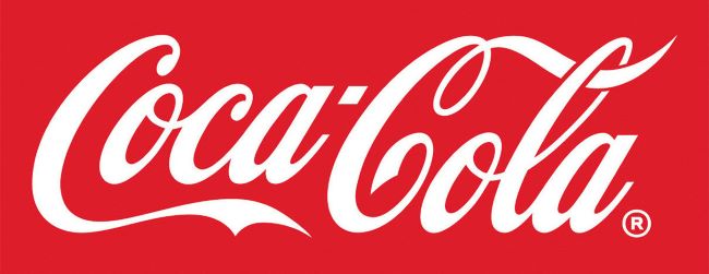
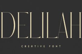
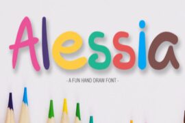
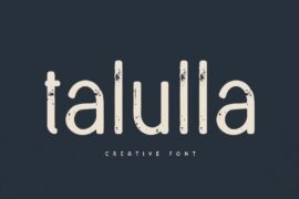
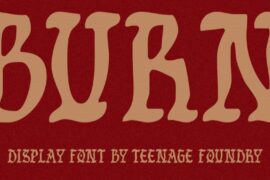
Download Alternative Coca Cola Font
When I compare it to other brand fonts, Coca Cola Font stands out because it has remained almost unchanged for over a century. I believe that consistency is what makes it so powerful. To me, the Coca Cola Font proves that sometimes the best design decision is to stay true to your roots. You can also check our free fonts collection.

