

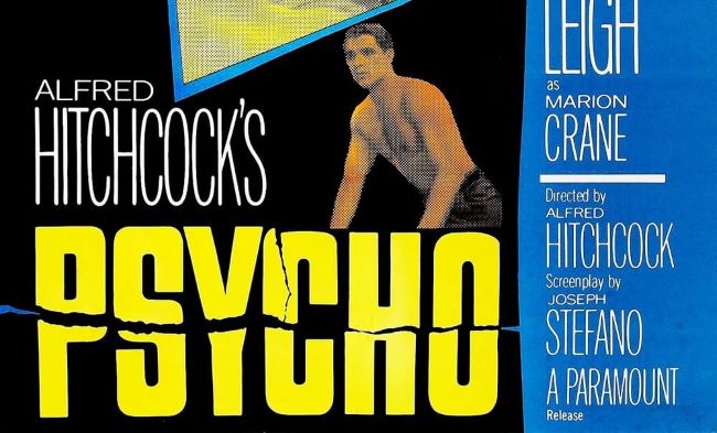
The Psycho font is as unforgettable as Alfred Hitchcock’s legendary 1960 thriller. Just like the movie itself, the typography captures a sense of unease, fragmentation, and psychological tension. The jagged, split design of the Psycho font feels like a visual scream, echoing the famous shower scene that changed cinema forever.
In the original posters, the lettering looks fractured, as if it has been violently torn apart. This broken style mirrors the instability of Norman Bates and the shocking twists that define the film. Designers today use the Psycho font when they want to create titles, posters, or artwork that demand attention and deliver a chilling, suspenseful mood.
Psycho Font
Free Download Psycho Font (Alternative)
The exact typeface was custom-designed for the movie, but there are some strong replicas and alternatives available. The most popular fan-made option is Compacta BT, which recreates the fragmented look perfectly. If you’re after a free alternative, fonts like You Murderer BB also provide that sharp, horror-inspired vibe.
The Psycho font continues to terrify and inspire, proving that even typography can make audiences feel uneasy. Its jagged letters and fractured design aren’t just type—they’re visual storytelling, capturing the raw fear and suspense that Hitchcock delivered on screen. You can also check our free fonts collection.


