

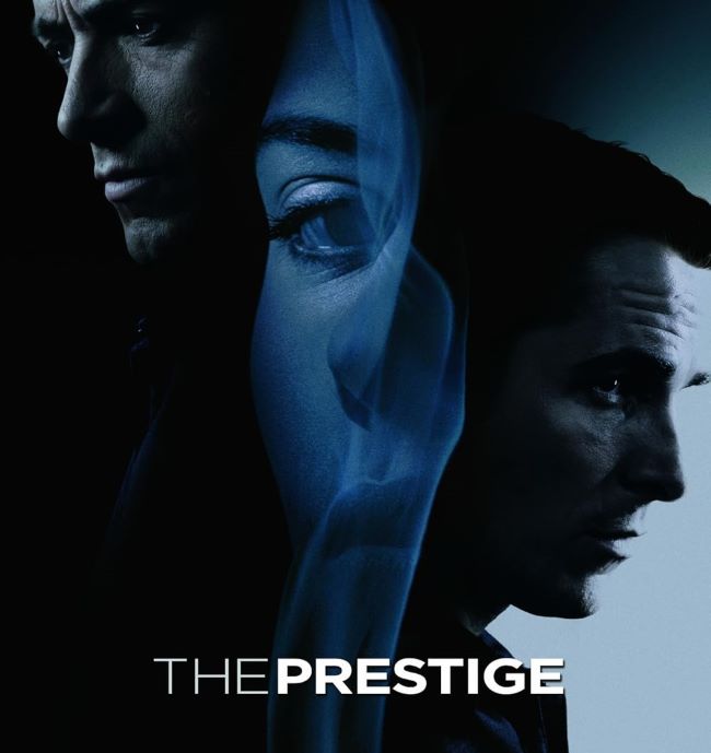
The Prestige font carries the same air of mystery and sophistication as Christopher Nolan’s unforgettable film. Just as The Prestige explores the art of illusion, misdirection, and obsession, the typography in its title design sets a mood of intrigue right from the start.
Designers often use the Prestige font (or its alternatives) when they want to convey sophistication, mystery, or a classic movie poster vibe. It works beautifully in book covers, event posters, and branding projects where a touch of drama is needed. Much like the movie’s twists and turns, the typography holds attention without revealing too much at once.
The Prestige Font
Download Free Alternative The Prestige Font
The Prestige font proves that typography can work like magic—subtle, powerful, and unforgettable, leaving the audience with an impression that lingers long after the final act. You can also check our free fonts.


