

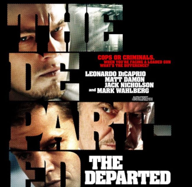
The Departed font instantly sets the gritty, no-nonsense tone of Martin Scorsese’s award-winning crime thriller. Bold, blocky, and unapologetically direct, the typography mirrors the film’s themes of loyalty, betrayal, and survival in the harsh streets of Boston.Unlike many Hollywood dramas that lean on elegant serif fonts, the Departed font takes inspiration from strong sans-serifs. The style is very close to Aachen Bold and Compacta Bold, a condensed and heavy typeface that became a favorite in movie posters for its ability to grab attention with minimal space. Its tall, narrow structure makes it powerful and efficient—just like the brutal pacing of the story.
The Departed Font
Free Download Alternative 1 ( Barlow Condensed Extra Bold )
Free Download Alternative 2 ( Headlines Bold )
Designers turn to fonts like the Departed font when they want maximum impact with minimal embellishment. It’s perfect for urban posters, magazine covers, and graphic design projects that demand toughness and edge. Alternatives like Impact, Bebas Neue, or Anton can provide a similar sharp and commanding presence for free.The Departed font shows how typography can reflect the very soul of a film—tough, unflinching, and unforgettable. Just like Scorsese’s storytelling, the letters themselves pull no punches. You can also check our free fonts collection.


