

Nordic Fonts for Norse and Medieval Designs
The rich cultural heritage of Scandinavia has inspired countless design elements throughout history, and typography is no exception. Nordic fonts draw from the ancient traditions of Norse runes, medieval manuscripts, and the raw, elemental beauty of the Northern European landscape. These typefaces embody the strength, mysticism, and craftsmanship that defined Nordic civilizations for centuries.
Whether you’re crafting a brand identity that needs to convey power and authenticity, developing a fantasy game set in mythological realms, or designing book covers that transport readers to ancient fjords and snow-covered mountains, nordic fonts provide the perfect foundation. They seamlessly blend historical accuracy with modern design sensibilities, offering designers the tools to create work that feels both timeless and contemporary.
The appeal of nordic fonts extends far beyond their aesthetic value. Each letterform tells a story of harsh winters, epic sagas, and the indomitable spirit of the North. From the angular precision of runic inscriptions to the flowing curves inspired by Viking ship carvings, these fonts capture the essence of a culture that valued both artistic beauty and functional strength.
Browse ice cream and blockbuster typography with Ben and Jerrys Font, Inception Font, Capn Crunch Font, 12 Angry Men Font, and Bertolli Font — and more.
Below we’ve curated 30 of the best nordic fonts that capture the spirit of ancient Scandinavia.
Nordic Fonts
Old North – Nordic Font
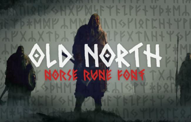
Old North is a rugged nordic font that perfectly captures the essence of Norse runes with its angular strokes and weathered appearance. The typeface features carefully crafted letterforms that appear as if they were carved into stone by ancient craftsmen, with each character showing subtle signs of age and weathering. The angular geometry reflects the practical nature of runic writing systems, where efficiency and clarity were paramount. This makes Old North ideal for historical projects, archaeological presentations, or fantasy designs that require an authentic connection to Nordic heritage. The font’s versatility allows it to work equally well in both display and text applications, though it truly shines when used for headlines and titles that demand attention and respect.
Garked – Nordic Font
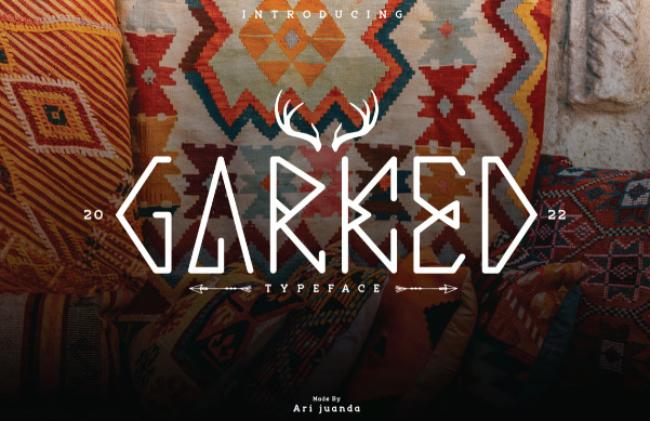
With its sharp edges and bold presence, Garked is a nordic font that demands attention through its commanding visual weight and intricate detailing. The typeface draws inspiration from the metalworking traditions of Nordic craftsmen, with each letter appearing forged from iron and tempered by fire. The sharp, angular cuts suggest the precision of a master blacksmith’s tools, while the bold strokes convey the strength and durability that were essential qualities in Nordic design. The intricate details woven throughout each character make Garked perfect for tattoo designs, where the complexity can be appreciated up close, or medieval branding projects that need to convey authenticity and craftsmanship. The font’s aggressive personality makes it particularly effective for projects related to gaming, sports teams, or any brand that wants to project power and determination.
Mjölnir – Nordic Font
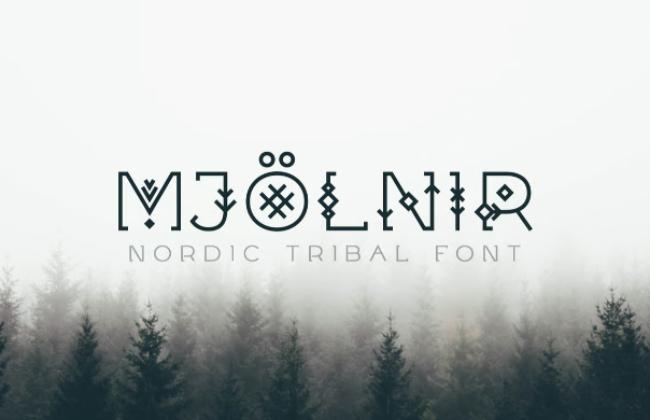
Named after Thor’s legendary hammer, this nordic font features thunderous strokes and Norse knotwork details that bring mythological power to any design project. Mjölnir captures the divine energy of Nordic mythology through its dynamic letterforms, which seem to crackle with the same supernatural force that made Thor’s weapon feared across the nine realms. The intricate knotwork patterns integrated into the character design reflect the complex interwoven cosmology of Norse beliefs, where every element was connected to every other element in an endless cycle of creation and destruction. The thunderous strokes vary in weight and intensity, creating a sense of movement and power that makes text appear to leap off the page. This font is particularly effective for projects related to mythology, fantasy gaming, or any brand that wants to tap into the primal power associated with Norse gods and legends.
Sleipnir – Nordic Font
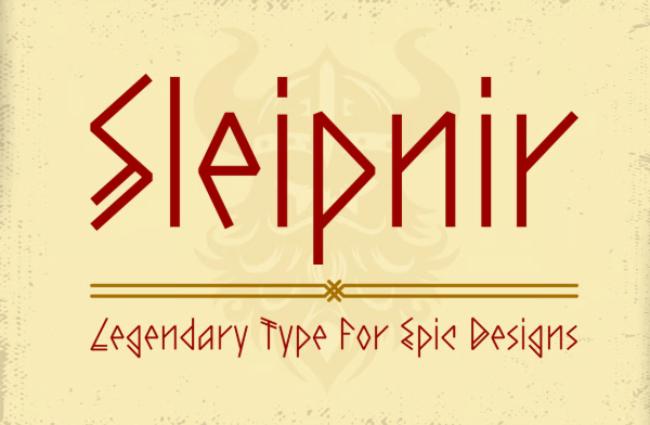
Inspired by Odin’s eight-legged steed, Sleipnir is a nordic font with dynamic movement and ancient character that seems to gallop across the page with supernatural speed. The flowing strokes suggest the fluid motion of the legendary horse as it carried the All-Father between the worlds, while the ancient character details root the design firmly in Nordic tradition. Each letterform has been carefully crafted to suggest speed and mythical power, with extending flourishes that mirror the flowing mane and tail of the divine horse. The dynamic movement inherent in the design makes it perfect for projects that need to convey motion, progress, or journey themes. Whether used for travel companies wanting to evoke epic adventures, sports brands needing to suggest speed and agility, or entertainment properties based on Nordic mythology, Sleipnir brings a sense of otherworldly energy that transforms ordinary text into something magical and compelling.
Nordica – Nordic Font
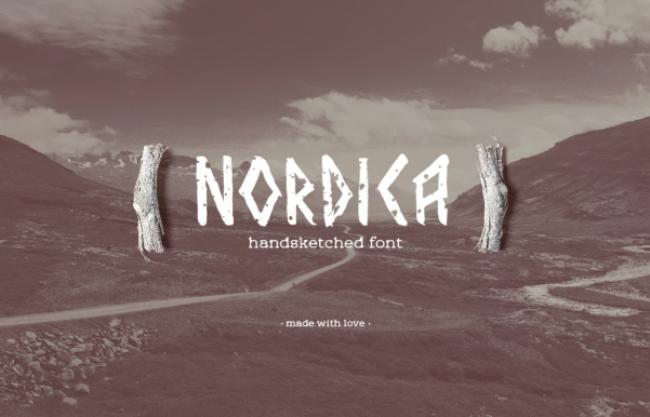
Nordica offers a clean yet powerful interpretation of nordic font aesthetics, making it versatile for both historical projects and modern Nordic-inspired branding that requires sophistication without sacrificing character. This typeface represents the evolution of nordic design principles into contemporary applications, maintaining the essential strength and cultural authenticity while embracing cleaner lines and more refined details. The clean approach doesn’t diminish the font’s power; instead, it concentrates that power into precise, purposeful strokes that speak of Nordic efficiency and functionality. The powerful interpretation ensures that even in its most restrained moments, Nordica maintains the gravitas and presence that defines the best nordic fonts. This versatility makes it an excellent choice for corporate branding that wants to suggest Nordic values like reliability, craftsmanship, and environmental consciousness, while also working beautifully for historical documentaries or educational materials about Scandinavian culture.
Paraoh – Nordic Font
This nordic font combines Norse rune influences with Egyptian hieroglyphic weight, creating a unique hybrid perfect for fantasy or adventure themes that span multiple ancient civilizations. Paraoh represents an intriguing cross-cultural fusion that speaks to the far-reaching influence of Nordic traders and explorers, who were known to travel vast distances and encounter diverse cultures throughout their journeys. The Norse rune influences provide the angular, practical foundation that characterizes authentic nordic typography, while the Egyptian hieroglyphic weight adds a sense of monumental permanence and mystical significance. This unique combination creates letterforms that feel both familiar and exotic, making them perfect for fantasy projects that draw inspiration from multiple ancient sources. The hybrid nature of the design makes it particularly effective for adventure themes, where the suggestion of cross-cultural contact and exploration adds depth to the visual narrative. Game designers, book publishers, and film studios working on projects that blend historical elements will find Paraoh offers a distinctive voice that sets their work apart.
Vaska – Nordic Font
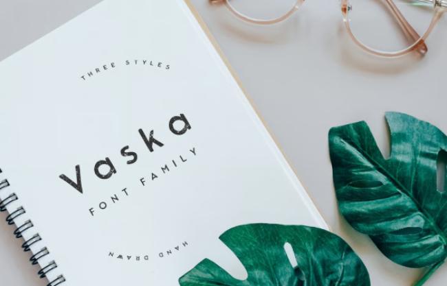
Vaska’s chiseled stone appearance makes this nordic font ideal for creating authentic-looking runestones or historical reenactment materials that demand absolute historical accuracy. The typeface has been meticulously crafted to replicate the exact techniques and aesthetic qualities of actual stone carving, with each character showing the subtle variations and imperfections that occur when skilled craftsmen work with natural materials. The chiseled stone appearance isn’t merely decorative; it reflects the practical constraints and artistic possibilities that shaped authentic runic inscriptions throughout Nordic history. Each letterform bears the marks of the carving process, from the slight variations in depth to the way light and shadow play across the carved surfaces. This attention to detail makes Vaska particularly valuable for museums, historical societies, and educational institutions that need typography capable of supporting serious historical content without breaking the illusion of authenticity. The font also works exceptionally well for memorial projects, architectural signage, and any application where the gravitas of stone-carved text is desired.
Fr Warrior – Nordic Font
With its battle-worn texture and aggressive angles, Fr Warrior is a nordic font that looks like it was carved by a Norse warrior’s axe during the heat of battle. The typeface embodies the raw, uncompromising spirit of Nordic warfare, where survival depended on strength, skill, and the quality of one’s weapons. The battle-worn texture tells a story of conflict and endurance, with each character bearing scars and marks that speak to hard-won victories and narrow escapes. The aggressive angles reflect the practical geometry of weapons and armor, where every line served a purpose and decoration was secondary to function. This combination creates letterforms that pulse with energy and danger, making them perfect for projects that need to convey intensity, competition, or struggle. Gaming companies developing combat-focused titles, sports teams wanting to project intimidation, and action movie studios will find Fr Warrior provides the visual aggression their projects demand while maintaining the cultural authenticity that gives it depth and meaning.
Ragnarok – Nordic Font
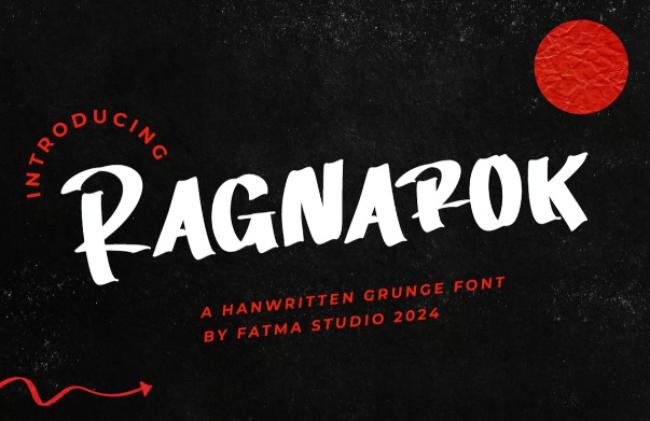
Inspired by the Norse apocalypse, this dramatic nordic font features flaming details and broken edges that suggest the chaos and renewal of the final battle between gods and giants. Ragnarok captures the epic scope and emotional intensity of Nordic eschatology, where the end of one world becomes the beginning of another through fire, flood, and conflict. The flaming details aren’t merely decorative elements; they represent the consuming fire that will cleanse the world and make renewal possible. The broken edges reflect the violence and destruction that precede rebirth, while also suggesting the fragmentation of old certainties that opens space for new possibilities. This dramatic approach makes the font particularly effective for projects dealing with themes of transformation, revolution, or dramatic change. Publishers working on apocalyptic fiction, game developers creating end-times scenarios, or brands that want to suggest radical innovation will find Ragnarok provides the visual drama their projects require while grounding that drama in authentic Nordic mythology.
Old Norse – Nordic Font
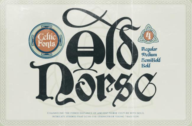
One of the most authentic nordic fonts available, Old Norse is based on historical runestones and manuscripts for genuine Nordic appeal that satisfies the most demanding scholarly and artistic requirements. This typeface represents years of research into actual Nordic inscriptions, with each character carefully studied and recreated to ensure historical accuracy while maintaining modern usability. The historical runestones that inspired Old Norse were created over centuries by different craftsmen using various techniques, and this font captures that rich diversity while maintaining visual consistency. The manuscripts that informed the design process represent the evolution of Nordic writing from purely functional runic systems to more ornate medieval letterforms influenced by Christian manuscripts. This genuine Nordic appeal makes Old Norse invaluable for academic publications, museum exhibitions, and any project where historical authenticity is paramount. The font works equally well for modern applications that want to suggest timeless Nordic values like craftsmanship, reliability, and connection to the natural world.
Black North – Nordic Font
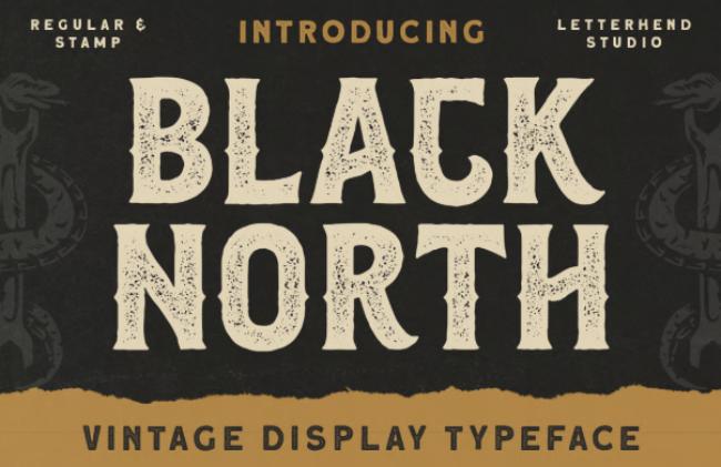
This heavy, imposing nordic font captures the darkness of Nordic winters with its thick strokes and frostbitten texture that evokes the harsh beauty of the far north. Black North embodies the dramatic seasonal contrasts that shaped Nordic culture, where long, dark winters tested human endurance and created deep appreciation for light, warmth, and community. The thick strokes suggest the substantial construction needed to survive in harsh climates, while the frostbitten texture captures the way ice and snow transform familiar objects into something otherworldly and beautiful. The imposing presence of the font reflects the psychological impact of the Nordic landscape, where vast scales and extreme conditions create a sense of human vulnerability and natural majesty. This combination makes Black North particularly effective for projects that need to convey seriousness, endurance, or connection to natural forces. Outdoor gear companies, winter sports organizations, and environmental groups will find the font’s authentic connection to Nordic climate and landscape invaluable for building credibility and emotional connection with their audiences.
Back Over – Nordic Font
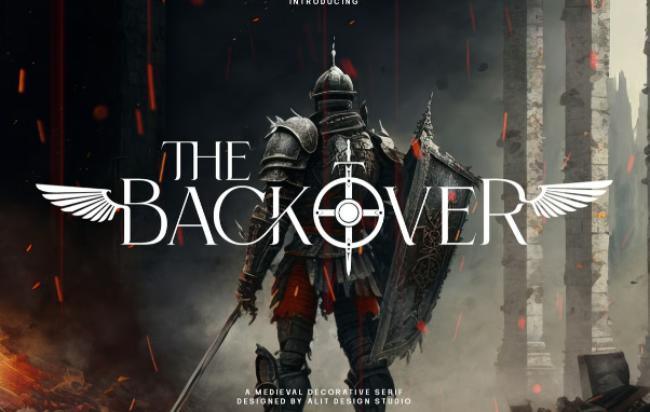
A modern twist on traditional nordic font styles, Back Over combines runic elements with contemporary design sensibilities to create typography that speaks to both past and future. This typeface represents the ongoing evolution of Nordic design principles, showing how ancient wisdom can inform modern solutions without losing relevance or impact. The runic elements provide cultural authenticity and historical depth, while the contemporary design sensibilities ensure the font remains fresh and accessible to modern audiences. The modern twist approach allows designers to tap into the powerful associations of Nordic culture while creating work that feels current and forward-looking. This combination makes Back Over particularly valuable for technology companies that want to suggest both reliability and innovation, fashion brands that blend traditional craftsmanship with contemporary style, or any organization that sees itself as a bridge between past wisdom and future possibilities. The font’s ability to honor tradition while embracing change makes it perfect for brands and projects that are evolving while maintaining their core values.
NCL Jurgen Farbache – Nordic Font
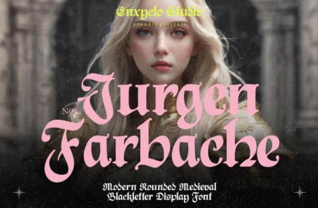
This ornate nordic font features intricate knotwork details between characters, perfect for creating authentic-looking Norse artwork that captures the sophisticated decorative traditions of Nordic craftsmen. NCL Jurgen Farbache represents the highest level of Nordic decorative art, where functional objects were transformed into works of beauty through the addition of complex, meaningful patterns. The intricate knotwork details aren’t random decorations; they follow traditional Nordic patterns that carried symbolic meaning about the interconnectedness of all things, the cycles of nature, and the relationship between humans and the divine. The ornate approach reflects the Nordic appreciation for craftsmanship and attention to detail, where even utilitarian objects were opportunities for artistic expression. The authentic-looking Norse artwork this font enables makes it invaluable for museums, cultural organizations, and artists working with Nordic themes. The sophisticated decorative traditions it represents also make it perfect for luxury brands that want to suggest quality, attention to detail, and cultural sophistication.
Nilfgard – Nordic Font
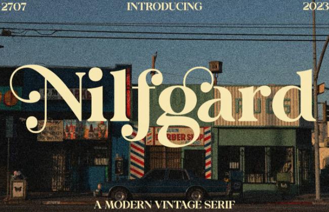
With its cold, sharp edges, Nilfgard is a nordic font that evokes images of frozen fjords and Viking longships cutting through icy waters with determined precision. The typeface captures the harsh beauty of the Nordic maritime environment, where survival depended on the ability to navigate treacherous waters and unpredictable weather. The cold, sharp edges reflect both the physical environment of ice and snow and the mental toughness required to thrive in such conditions. The imagery of frozen fjords speaks to the dramatic landscapes that shaped Nordic culture and continue to inspire contemporary design, while the Viking longships represent the technological innovation and adventurous spirit that allowed Nordic peoples to explore and influence cultures across the known world. This evocative combination makes Nilfgard particularly effective for projects related to exploration, adventure, or overcoming challenges. Maritime companies, adventure travel organizations, and outdoor equipment manufacturers will find the font’s authentic connection to Nordic seafaring traditions invaluable for building brand credibility and emotional resonance.
Iorek Byrnison – Nordic Font
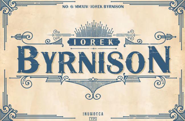
Named after the armored bear from Nordic mythology, this nordic font combines animalistic energy with Norse rune aesthetics to create typography that pulses with primal power and ancient wisdom. Iorek Byrnison captures the unique Nordic understanding of the relationship between humans and the natural world, where animals were seen as powerful allies and sources of spiritual guidance rather than mere resources to be exploited. The animalistic energy in the font suggests the raw power and instinctive wisdom of creatures adapted to survive in harsh environments, while the Norse rune aesthetics provide cultural context and historical authenticity. This combination creates letterforms that feel alive and dynamic, perfect for projects that need to convey natural power, environmental awareness, or the integration of modern technology with ancient wisdom. Wildlife conservation organizations, outdoor adventure companies, and brands focused on sustainable practices will find Iorek Byrnison provides a powerful way to communicate their values while maintaining visual impact and cultural authenticity.
Helmswald Post – Nordic Font
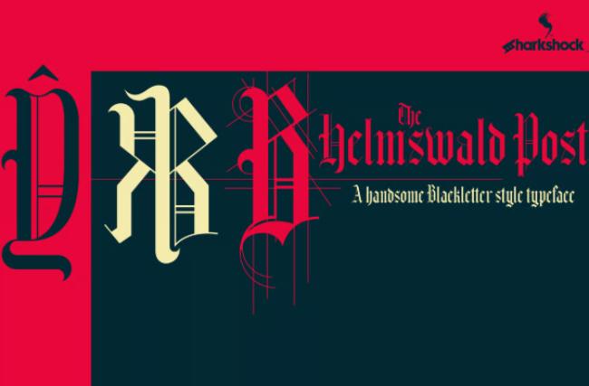
This nordic font mimics the appearance of carved wood, as if taken straight from a Viking longhouse or ship’s prow, bringing the warmth and craftsmanship of traditional Nordic woodworking to modern typography. Helmswald Post represents the sophisticated woodworking traditions that were central to Nordic culture, where trees were transformed into everything from simple tools to elaborate architectural elements through skill, patience, and deep understanding of natural materials. The carved wood appearance captures both the texture and the spirit of this ancient craft, with each character showing the subtle variations and organic qualities that distinguish hand-carved work from machine production. The Viking longhouse and ship’s prow references connect the font to the most important structures in Nordic society: the communal halls where social bonds were forged and maintained, and the vessels that carried Nordic influence across the known world. This combination of warmth, craftsmanship, and cultural significance makes Helmswald Post perfect for projects that want to suggest quality, tradition, and human skill in an increasingly automated world.
The Blowar – Nordic Font
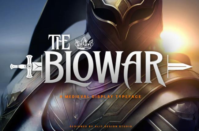
A brutal, heavy nordic font that looks like it was forged from iron, perfect for warrior logos or battle cry graphics that need to project uncompromising strength and metallic resilience. The Blowar embodies the Nordic mastery of metallurgy, where iron was transformed from raw ore into tools, weapons, and decorative objects that could last for generations. The brutal, heavy appearance reflects the demanding physical processes involved in traditional metalworking, where success required strength, skill, and the ability to work with dangerous materials at extreme temperatures. The forged from iron quality gives each character a sense of permanent strength and reliability that can’t be achieved through softer materials or gentler processes. This makes the font particularly effective for projects that need to convey durability, strength, or the ability to perform under pressure. Military organizations, heavy industry companies, and sports teams focused on strength and endurance will find The Blowar provides the visual impact their brands require while connecting to authentic traditions of Nordic craftsmanship and metallurgy.
Malegroth – Nordic Font
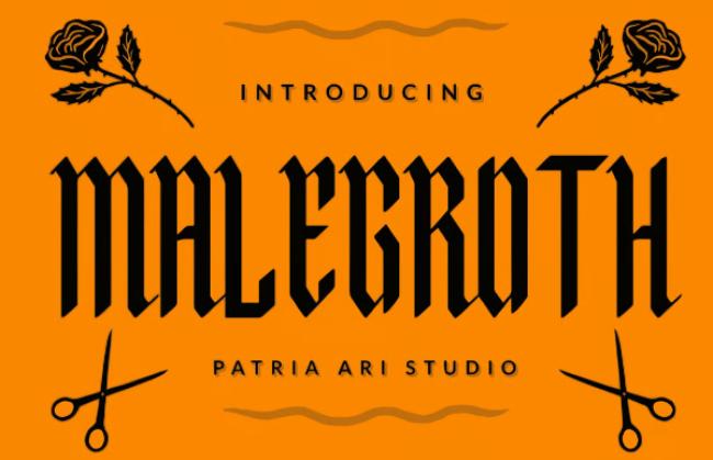
Malegroth’s twisted, gothic appearance makes this nordic font ideal for dark fantasy projects or Norse mythology themes that explore the shadowy aspects of Nordic culture and belief. The typeface acknowledges that Nordic mythology, like all complete mythological systems, includes dark as well as light elements, with gods and heroes who are complex, flawed, and sometimes dangerous. The twisted, gothic appearance reflects the Nordic understanding that beauty and horror, creation and destruction, are often intertwined in ways that resist simple moral categorization. The dark fantasy applications for which Malegroth is perfect include gaming, literature, and film projects that want to explore the full spectrum of Nordic cultural themes rather than limiting themselves to the heroic or romantic aspects. The Norse mythology themes the font supports include stories of betrayal, revenge, and supernatural horror that balance the more commonly depicted tales of heroism and adventure. This comprehensive approach to Nordic culture makes Malegroth valuable for creators who want to work with authentic complexity rather than simplified stereotypes.
Onec Nords – Nordic Font
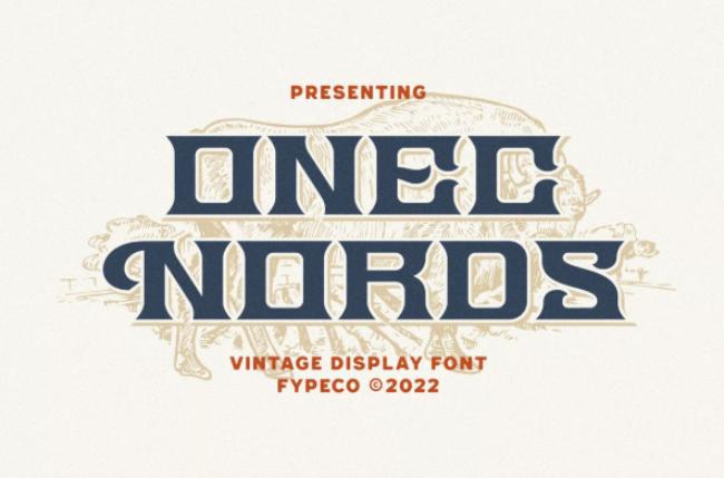
A vintage-inspired nordic font that combines Norse aesthetics with 19th century typography for a unique historical blend that speaks to the romantic rediscovery of Nordic culture during the Victorian era. Onec Nords represents the fascinating period when Nordic mythology and culture experienced a renaissance among European intellectuals and artists who saw in ancient Scandinavian traditions an alternative to rapid industrialization and urbanization. The vintage-inspired approach captures the particular way that 19th century scholars and artists interpreted Nordic themes, often emphasizing the romantic and heroic aspects while adapting ancient forms to contemporary sensibilities. The Norse aesthetics provide authentic cultural foundation, while the 19th century typography reflects the specific historical moment when Nordic themes gained renewed influence in literature, art, and design. This unique historical blend makes Onec Nords perfect for projects that want to evoke the romantic adventure literature of the Victorian era, steampunk designs that incorporate Nordic elements, or contemporary work that wants to reference the specific way Nordic culture was understood and appreciated during the 19th century revival.
Gorck Helozat – Nordic Font
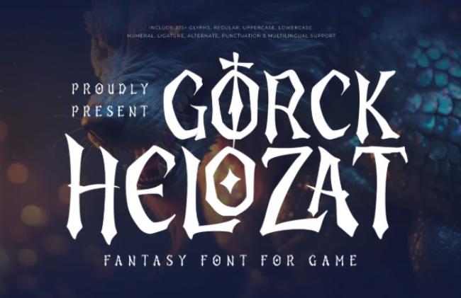
This final nordic font in our collection features dramatic swashes and weapon-inspired details, perfect for creating impactful Norse designs that capture the theatrical and martial aspects of Nordic culture. Gorck Helozat represents the performative elements of Nordic society, where public displays of skill, courage, and artistic ability were essential for maintaining social status and community respect. The dramatic swashes reflect the elaborate ceremonial aspects of Nordic culture, from the complex poetry performed at feasts to the intricate decorative work that adorned important objects and buildings. The weapon-inspired details acknowledge the central role that martial skill played in Nordic society, where the ability to fight was not just practical necessity but a mark of personal honor and social responsibility. The impactful Norse designs this font enables are perfect for projects that need to capture the full theatrical and martial complexity of Nordic culture, from gaming and entertainment properties to historical educational materials and cultural exhibitions. The combination of dramatic flair and authentic cultural grounding makes Gorck Helozat an excellent choice for any project that wants to suggest both artistic sophistication and warrior spirit.
Whether you’re designing a Nordic-themed game, creating historical artwork, or just want to add some Norse power to your projects, these nordic fonts offer the perfect combination of authenticity and design flexibility. From rune-inspired letterforms to battle-worn textures, each font captures a different aspect of Nordic heritage and mythology, providing designers with the tools they need to create work that honors the past while speaking to contemporary audiences.


