This is out daily free font of the day post.
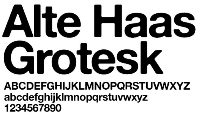
In the vast world of typography, where sleek modern sans-serifs dominate, Alte Haas Grotesk stands out as a charming throwback with personality. Designed by Swiss type designer François Rappo in 2009, this font is a revival—or rather, a loving reinterpretation—of 19th-century grotesque typefaces. But don’t let the word “grotesque” fool you; this typeface is anything but ugly.
Alte Haas Grotesk takes inspiration from early sans-serifs like Akzidenz-Grotesk and Helvetica’s predecessors, but it adds a distinctive, slightly irregular touch. Unlike the cold precision of many modern fonts, Alte Haas Grotesk has a handcrafted feel—subtle imperfections, uneven curves, and a warm, approachable vibe.
What makes it special?
-
Soft, rounded edges – Unlike rigid geometric fonts, Alte Haas Grotesk has a gentle, almost human touch.
-
Slightly condensed proportions – It feels compact yet readable, perfect for both headlines and body text.
-
A touch of quirkiness – Some characters, like the lowercase ‘a’ and ‘g’, have a playful, almost handwritten quality.