

Handwritten font design represents one of the most personal and expressive forms of typography in today’s digital landscape. While we live in an era dominated by crisp, clean sans-serif typefaces and perfectly geometric designs, there’s something undeniably charming about fonts that mimic the natural flow of human penmanship.
The appeal of handwritten fonts goes far beyond mere aesthetics. These typefaces carry an inherent warmth and authenticity that resonates with audiences on an emotional level. When you see a handwritten font, your brain doesn’t just process letters and words – it perceives the subtle imperfections, the natural variations in stroke width, and the organic rhythm that only comes from human touch.
Choosing the Right Handwritten Font
Not all handwritten fonts are created equal, and choosing the right one requires careful consideration of context and purpose. A font that works beautifully for a artisanal bakery’s signage might be completely inappropriate for a law firm’s letterhead. The key is matching the personality of the handwritten font to the message you’re trying to convey.
Consider the stroke weight, letter spacing, and overall rhythm of the font. Does it feel rushed or deliberate? Casual or formal? These subtle characteristics will communicate different messages to your audience before they even begin reading your content.
Handwritten Fonts
Aaron’s Hand
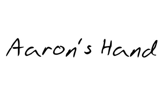 Aaron’s Hand brings a touch of sincerity to every word. With clean strokes and a casual charm, it feels like a personal note scribbled by a thoughtful friend.
Abdomentality
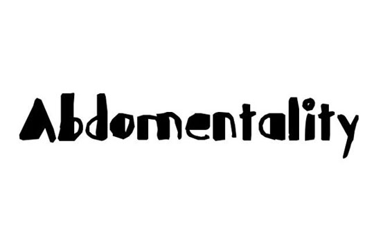 Abdomentality is bold, quirky, and full of personality. This handwritten font walks the line between chaotic energy and expressive style—perfect for creative headlines.
A Hundred Miles
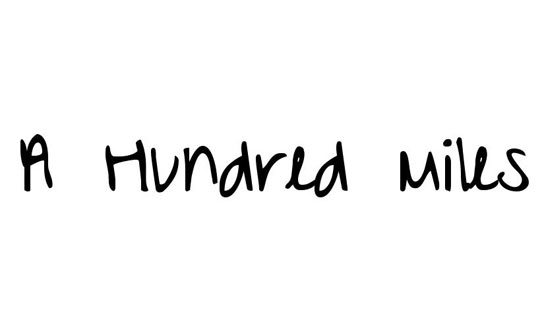 Like a letter from the road, A Hundred Miles is wistful and adventurous. Its slightly uneven lines make it feel heartfelt and full of emotion.
A Little Pot
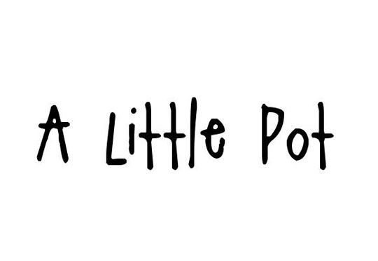 Short, sweet, and full of charm, A Little Pot is the kind of font that warms you from the inside out. It’s cozy, cheerful, and perfectly imperfect.
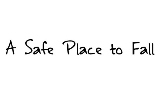
A Safe Place to Fall
Baby Potato
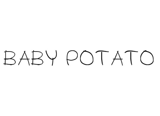 Fun and slightly silly, Baby Potato is round, friendly, and full of childlike joy. Great for playful designs, cute quotes, or anything that needs a lighthearted tone.
Bobsfrantic True Type
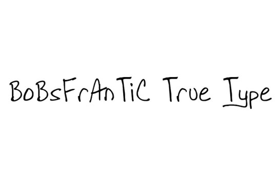 Unpredictable and fast-paced, Bobsfrantic True Type captures the energy of a hurried scribble. It’s raw, edgy, and full of motion—great for rebellious or urban-themed work.
Boring Boring
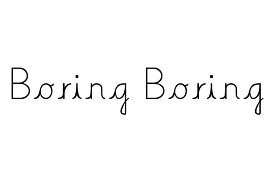 Despite the name, Boring Boring is anything but dull. Its understated and relaxed style makes it effortlessly cool—perfect for low-key, minimalist designs.
Callie Hand
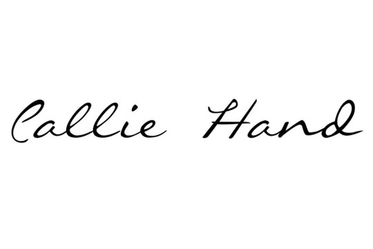 Callie Hand is graceful, neat, and naturally stylish. It’s the kind of handwriting you wish you had in your own journal—clean, approachable, and beautifully balanced.
Craptacular
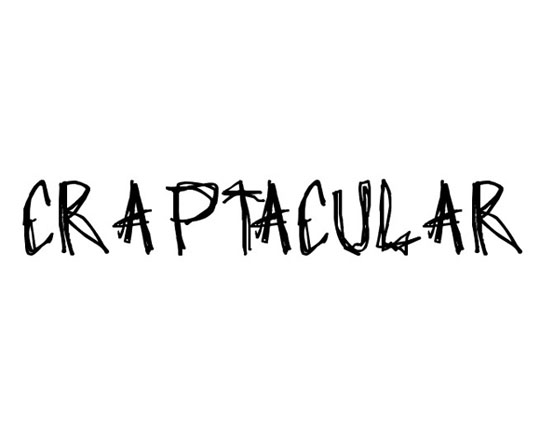 Messy in the best way, Craptacular embraces chaos with a smile. It’s unfiltered, real, and a little wild—ideal for grunge, zine, or experimental projects.
Crushed Out Girl Pen
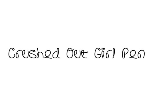
Delicate and dreamy, Crushed Out Girl Pen looks like a love note passed during class. It’s sentimental and nostalgic with a sweet, personal edge.
DearJoe
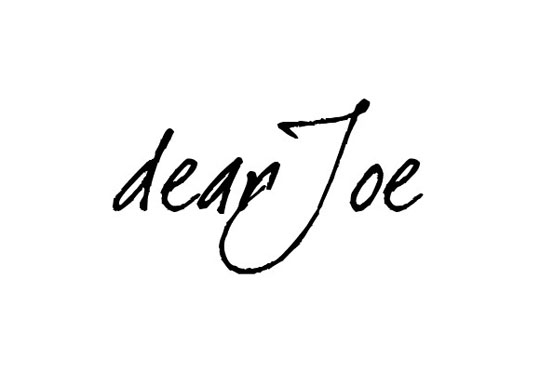
DearJoe feels like it came straight from a diary. It’s elegant yet grounded, with a sense of honesty that makes it perfect for storytelling and intimate messages.
Emperors Scrawl
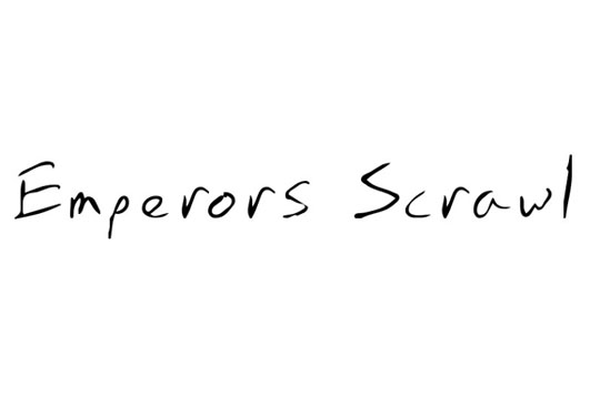
Regal yet rugged, Emperors Scrawl is dramatic and commanding. It carries an ancient energy, as if scrawled by a ruler onto parchment—ideal for fantasy or historical themes.
Franz Kafka
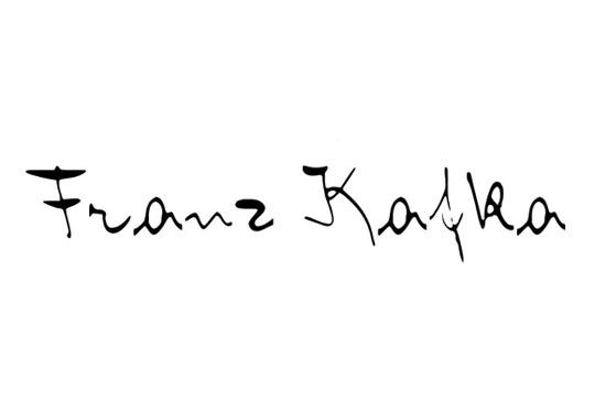
Intellectual, mysterious, and slightly intense—Franz Kafka lives up to its name. This font brings a literary, introspective feel to anything it touches.
Hakee2
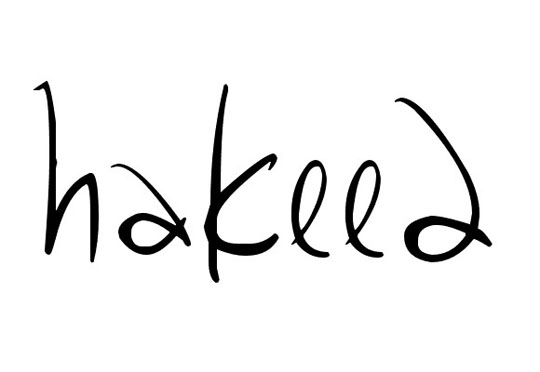
Smooth and spontaneous, Hakee2 feels like a quick note jotted down with flair. It’s lively and versatile, bringing a casual handwritten charm to your designs.
Herbert
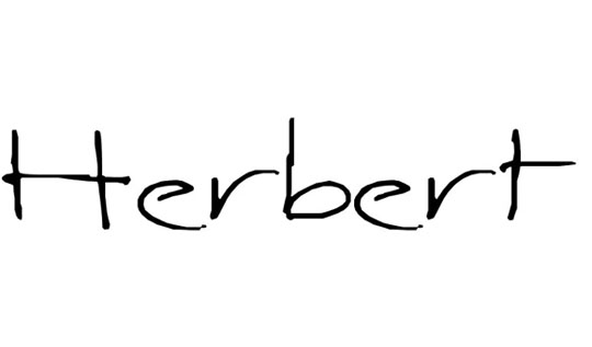
Herbert is structured but not stiff. It’s confident and clean, with a refined flow that works beautifully for both playful and professional uses.
Little Days
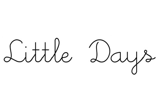
Whimsical and light, Little Days feels like childhood memories in type. It’s charming, soft, and ideal for designs that want to evoke warmth and innocence.
Octember

Strange and seasonal, Octember feels like a whimsical dream. It blends spooky and sweet in a style that’s great for quirky, offbeat projects.
Popsies
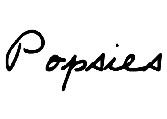
Popsies is bubbly, cheerful, and irresistibly fun. Its rounded letters bounce with energy—perfect for kids’ projects, fun branding, or anything that needs a pop of personality.
Prophecy Script
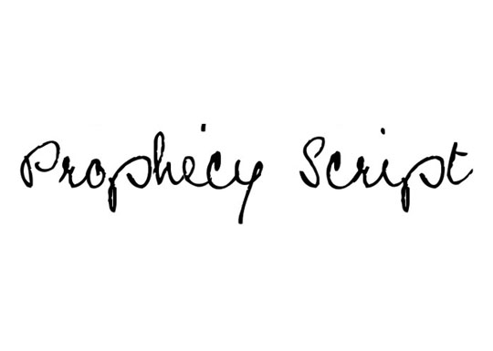
Elegant and flowing, Prophecy Script looks like it was written with care and intention. It’s poetic and refined, great for quotes, wedding invites, or soulful branding.
Rap Jack
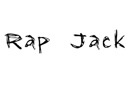
Rap Jack is bold and messy with a street-art vibe. It’s sharp, expressive, and designed to stand out in creative, urban-inspired compositions.
Scribblicious
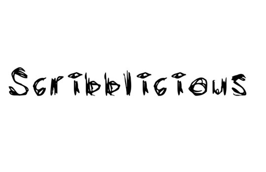
Just like the name suggests, Scribblicious is all about free-spirited, spontaneous doodling. It’s youthful and energetic, full of character and chaos.
Sketchbook
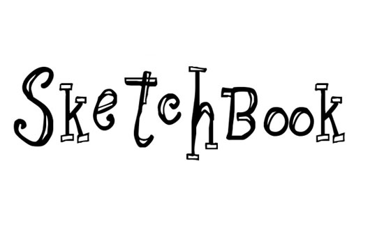
Sketchbook captures the feel of a well-loved notebook—personal, expressive, and creative. It’s perfect for planners, scrapbooks, and artistic journaling.
The Only Exception
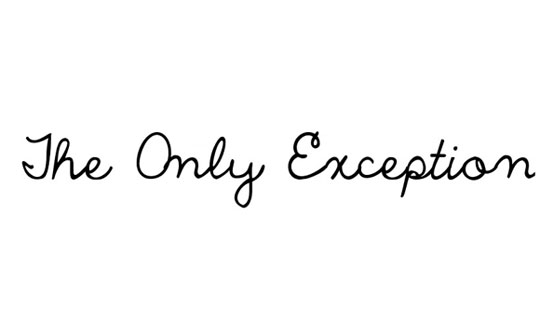
Romantic and emotional, The Only Exception is handwritten storytelling at its best. It feels like lyrics or heartfelt confessions captured in a single stroke.
Vadim’s Writing
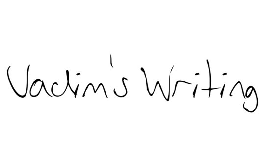
Vadim’s Writing is clean and classic, with just enough flair to keep it personal. It’s great for formal notes, branding, or anything that needs a subtle handwritten vibe.


