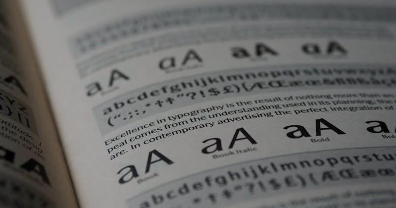
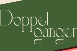
Free Sans serif fonts have become the cornerstone of contemporary design, widely appreciated for their clean lines, simplicity, and versatility. Whether you’re designing a website, creating a brand identity, or crafting user interfaces, sans serif fonts offer a modern and minimal aesthetic that resonates with today’s audiences.
What Are Sans Serif Fonts?
At their core, sans serif fonts are typefaces that lack the small decorative lines (known as “serifs”) typically found at the end of strokes in serif fonts. This seemingly small omission creates a significant visual impact. Sans serif fonts appear sleek, straightforward, and highly legible, especially on digital screens. Popular examples include Helvetica, Arial, Futura, and Montserrat.
Why Designers Love Sans Serif Fonts
One of the main reasons designers gravitate toward sans serif fonts is their clarity and readability. On screens of all sizes—from mobile phones to large monitors—sans serif fonts maintain a crisp, clean appearance. This makes them ideal for user interfaces, app design, and responsive web design.
In branding, sans serif fonts project a modern and approachable feel. Many startups and tech companies choose sans serif typefaces because they suggest innovation, accessibility, and professionalism without appearing overly formal.
Sans Serif Fonts
Origin

There’s something beautifully honest about Origin—it doesn’t try to reinvent the wheel, but instead perfects it. This clean, geometric sans-serif speaks in a voice that’s both contemporary and timeless, making it perfect for projects that need to feel approachable yet professional. Whether you’re designing a startup’s brand identity or crafting headlines for a modern magazine, Origin delivers that sweet spot of readability and personality that every designer craves.
Bebas Neue

Bold, unapologetic, and impossible to ignore, Bebas Neue is the font equivalent of a confident handshake. Its condensed letterforms pack serious punch into tight spaces, making it a favorite for headlines, posters, and anywhere you need text that commands attention. This isn’t a font that whispers—it speaks with authority and gets things done. When you need typography that means business, Bebas Neue delivers every single time.
Walkway

Walkway embodies the perfect balance between friendliness and sophistication, like that colleague who’s both approachable and incredibly competent. Its rounded edges soften the geometric structure just enough to feel welcoming without losing any professional credibility. This versatile typeface works beautifully for both body text and display purposes, making it an excellent choice for brands that want to appear trustworthy and modern simultaneously.
Sansation

Sansation lives up to its name by creating a genuine sensation wherever it appears. This contemporary sans-serif combines clean lines with subtle character quirks that prevent it from feeling sterile or corporate. It’s the kind of font that works equally well for a tech startup’s website or an art gallery’s exhibition catalog, bringing just the right amount of personality to any project without overwhelming the message.
Caviar Dreams
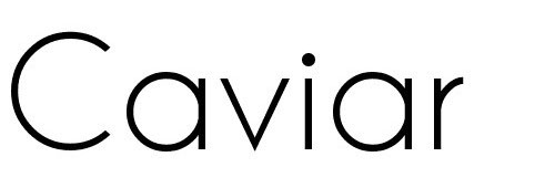
Luxurious yet accessible, Caviar Dreams brings an air of refined elegance to any design project. This font manages to feel both exclusive and welcoming—like being invited to an upscale dinner party where everyone’s genuinely glad you’re there. Its smooth letterforms and balanced proportions make it ideal for brands that want to convey quality and sophistication without appearing pretentious or out of reach.
Steelfish

Industrial strength meets digital age sophistication in Steelfish, a typeface that could have been forged in a high-tech foundry. Its bold, angular construction gives off serious cyberpunk vibes while remaining surprisingly readable. This is the font you choose when your project needs to feel cutting-edge, powerful, and just a little bit dangerous. Perfect for gaming brands, tech companies, or anyone looking to make a strong, futuristic statement.
Eurofurence

Eurofurence captures that distinctly European sense of design refinement—clean, purposeful, and effortlessly stylish. This font feels like it could comfortably headline a Scandinavian design magazine or guide visitors through a contemporary art museum. Its letterforms strike a perfect balance between geometric precision and organic warmth, making it an excellent choice for projects that need to feel both modern and human.
Clemente

Named with a nod to classic elegance, Clemente brings a sense of understated sophistication to contemporary design. This font doesn’t shout for attention—instead, it draws you in with its careful proportions and thoughtful details. It’s the typography equivalent of a well-tailored suit: polished, professional, and appropriate for almost any occasion where you need to make a good impression.
Existence Light

Existence Light proves that sometimes less really is more. This delicate, airy typeface brings a sense of breathing room to your designs, perfect for projects that need to feel spacious and uncluttered. Its thin strokes and generous spacing create an almost meditative quality that works beautifully for wellness brands, minimalist designs, or anywhere you want text to feel like a gentle whisper rather than a bold declaration.
Steiner

Steiner brings architectural precision to the world of typography, with letterforms that feel like they were drafted by a master craftsman. This font has a distinctly structural quality that makes it perfect for brands in construction, engineering, or design—anywhere you need to convey reliability, precision, and professional expertise. It’s sturdy without being boring, technical without being cold.
Regencie

Regencie carries itself with the quiet confidence of a font that knows its worth. This elegant sans-serif manages to feel both contemporary and classical, making it perfect for projects that need to bridge the gap between tradition and innovation. Whether you’re designing for a law firm that wants to appear progressive or a startup that needs to establish credibility, Regencie delivers that perfect blend of authority and approachability.
Roboto

Born from Google’s design labs, Roboto has become the friendly face of modern digital communication. This font feels simultaneously human and technological—warm enough for personal messages but structured enough for professional interfaces. Its versatility is legendary among designers, working equally well for mobile apps, websites, and print materials. Roboto is that reliable friend who adapts to any situation while maintaining their authentic character.
Advent

Advent brings a sense of anticipation and forward momentum to any design project. This font feels like it’s always looking toward the future, with letterforms that suggest progress and innovation without losing their grounding in solid design principles. It’s particularly effective for brands in technology, education, or any field where growth and development are central themes. Advent makes promises that it can actually keep.
Blue Highway

Blue Highway evokes the open road and endless possibilities, capturing that quintessentially American sense of adventure and optimism. This font has a casual confidence that works beautifully for brands that want to feel approachable and trustworthy. Whether you’re designing for a travel company, a local business, or a community organization, Blue Highway brings that perfect combination of friendliness and reliability that puts people at ease.
Yanone Kaffeesatz
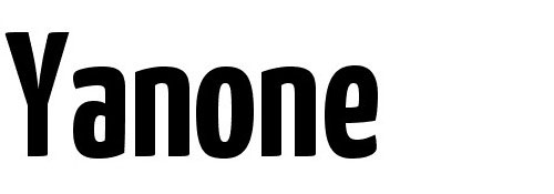
With a name that literally means “coffee break,” Yanone Kaffeesatz brings that perfect café atmosphere to your designs—relaxed but focused, casual but purposeful. This condensed sans-serif has personality in spades, making it ideal for creative projects that need to stand out from the crowd. It’s the font equivalent of that perfectly brewed espresso: concentrated, memorable, and guaranteed to wake people up.
Hit The Road

Hit The Road captures the spirit of adventure and spontaneity in every letterform. This font doesn’t just sit on the page—it moves, suggesting motion and energy that’s perfect for brands all about exploration and discovery. Whether you’re designing for a outdoor gear company, a travel blog, or any project that celebrates the journey over the destination, Hit The Road brings that essential sense of wanderlust and possibility.
Rawengulk Sans

Rawengulk Sans brings an artisanal quality to digital typography, feeling like it was crafted by hand rather than generated by algorithm. This font has character quirks that make it memorable without sacrificing readability, perfect for brands that want to feel authentic and handmade in our increasingly digital world. It’s particularly effective for creative agencies, craft businesses, or anyone looking to add a touch of human warmth to their communications.
Designosaur

Designosaur proves that prehistoric doesn’t mean outdated—this font brings ancient strength into the modern era with style. Its bold, distinctive letterforms command attention while maintaining excellent readability, making it perfect for brands that want to feel both powerful and approachable. Whether you’re designing for a fitness company, an outdoor brand, or any business that values strength and endurance, Designosaur delivers prehistoric power with contemporary polish.
Accidental Presidency

Sometimes the best things happen when you least expect them, and Accidental Presidency embodies that delightful sense of surprise. This font brings an unexpected elegance to projects, with letterforms that feel both authoritative and approachable. It’s perfect for brands that want to convey leadership without arrogance, confidence without pretension. Accidental Presidency suggests that sometimes the most qualified leaders are those who never sought the spotlight.
FV Granada

FV Granada carries the warm sophistication of its Spanish namesake, bringing Mediterranean elegance to contemporary design. This font feels like sun-warmed stone and afternoon conversations—comfortable, cultured, and completely confident in its own skin. It’s ideal for brands that want to convey heritage and quality without feeling stuffy or old-fashioned. Granada knows how to honor tradition while embracing the future.
Final Thoughts
Sans serif fonts are more than just a design trend—they’re a staple of modern visual communication. With their clean lines and straightforward style, they continue to dominate both digital and print spaces. By choosing the right sans serif typeface, you can ensure your design not only looks great but also communicates clearly and effectively.
Whether you’re revamping a brand or designing a mobile app, sans serif fonts remain a reliable and timeless choice.

