

Best CSS Frameworks for React are essential tools for developers who want to build beautiful, responsive, and efficient web applications without reinventing the wheel. As React continues to dominate the front-end ecosystem, choosing the right CSS framework can significantly streamline your development process and enhance your app’s performance and user experience.
React is a powerful JavaScript library for building user interfaces, but it doesn’t come with built-in styling solutions. That’s where CSS frameworks come into play. They provide pre-designed components, utility classes, and responsive design tools that help developers save time and maintain consistency across their projects. Whether you’re building a startup MVP, a personal portfolio, or an enterprise-grade application, using one of the best CSS frameworks for React can give your project a professional look with minimal effort.
In this article, we’ll explore the best CSS frameworks for React in 2025, comparing their features, ease of use, flexibility, and community support. From utility-first frameworks like Tailwind CSS to component-rich libraries like Bootstrap and Material UI, we’ll break down the pros and cons of each to help you make an informed decision. By the end of this guide, you’ll have a clearer understanding of which CSS framework fits your React project best.
Tailwind CSS: Utility-First Approach
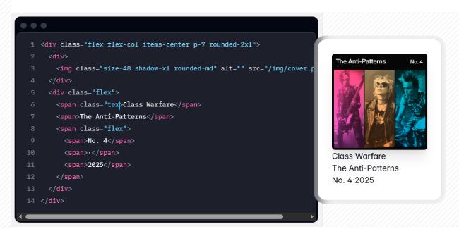
Tailwind CSS has revolutionized how developers style their React applications with its utility-first approach. Instead of predefined components, Tailwind provides low-level utility classes that let you build completely custom designs without leaving your HTML (or JSX in React’s case).
What makes Tailwind particularly powerful is its focus on composability. By combining small, single-purpose utility classes, you can create complex UI components that are both maintainable and responsive. The framework’s JIT (Just-In-Time) compiler ensures your production CSS only includes the utilities you actually use, resulting in remarkably small file sizes.
For React developers, libraries like @headlessui/react provide unstyled, fully accessible UI components that pair perfectly with Tailwind’s utility classes, giving you the best of both worlds: accessibility and design freedom.
Material UI: Google’s Design Language
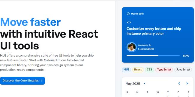
Material UI remains one of the most comprehensive React component libraries implementing Google’s Material Design. Its mature ecosystem provides everything from basic input components to complex data visualization tools.
The library’s recent versions have introduced an improved customization system that makes it easier to adapt components to your brand while maintaining the familiar Material Design look and feel. The framework also excels in accessibility features, ensuring your applications remain usable for everyone.
With strong TypeScript support and extensive documentation, Material UI continues to be a go-to choice for enterprise applications where consistency and reliability are paramount.
Chakra UI: Developer Experience First
Chakra UI has gained tremendous popularity by focusing on developer experience without compromising on performance or accessibility. Its component-based API is intuitive and easy to learn, making it an excellent choice for teams with varying levels of CSS expertise.
What sets Chakra apart is its thoughtful defaults and prop-based styling system. By handling complex styling logic like responsive design, dark mode, and focus states through simple props, Chakra UI significantly reduces the cognitive load typically associated with styling complex interfaces.
The framework’s “style props” approach, which allows for inline styling that connects directly to your theme, strikes an elegant balance between the flexibility of CSS-in-JS and the consistency of design systems.
Bootstrap for React: The Classic Reimagined
React Bootstrap and Reactstrap have modernized the classic Bootstrap framework for React applications. These libraries replace Bootstrap’s jQuery-dependent JavaScript components with pure React components, while still leveraging Bootstrap’s extensive CSS utilities.
The familiarity of Bootstrap’s grid system and components makes these libraries particularly appealing for teams transitioning from traditional web development to React. The extensive collection of pre-styled components helps accelerate development for applications with conventional UI requirements.
Recent versions have improved the customization options, addressing one of the primary criticisms of Bootstrap – the “Bootstrap look” that many websites share.
Ant Design: Enterprise-Level Components
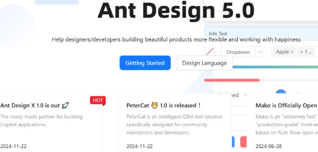
Ant Design provides a comprehensive set of high-quality React components specifically designed for enterprise applications. Its component library covers virtually every UI need, from basic inputs to complex data tables and visualization tools.
The framework places strong emphasis on data-heavy interfaces, offering sophisticated components for filtering, sorting, and displaying large datasets. This focus on enterprise needs extends to its internationalization support, making it an excellent choice for applications with global reach.
Ant Design’s opinionated aesthetic might require more effort to customize, but for teams that value consistency and comprehensive documentation over design flexibility, it remains a top contender.
Styled Components: CSS-in-JS Power
Although not a traditional CSS framework, Styled Components has transformed how React developers approach styling. This CSS-in-JS library lets you write actual CSS inside your JavaScript files, creating component-scoped styles that eliminate namespace collisions.
The ability to access component props directly in your CSS enables powerful dynamic styling patterns not easily achievable with traditional CSS. This approach particularly shines when building complex interactive UIs where styles need to respond to state changes.
Combined with a design system like System UI, Styled Components offers a flexible foundation for creating consistent yet customizable interfaces.
Mantine: The Rising Star
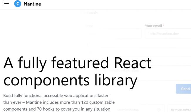
Mantine has quickly established itself as a feature-rich React component library with a focus on accessibility and customization. It offers over 100 customizable components and hooks that work seamlessly in both light and dark themes.
What distinguishes Mantine is its balanced approach – providing enough pre-built components to accelerate development while maintaining the flexibility for custom designs. Its TypeScript foundation ensures type safety across your application, reducing runtime errors.
The framework’s modular architecture allows developers to import only the components they need, optimizing bundle size without sacrificing functionality.
Emotion: Powerful CSS-in-JS Library
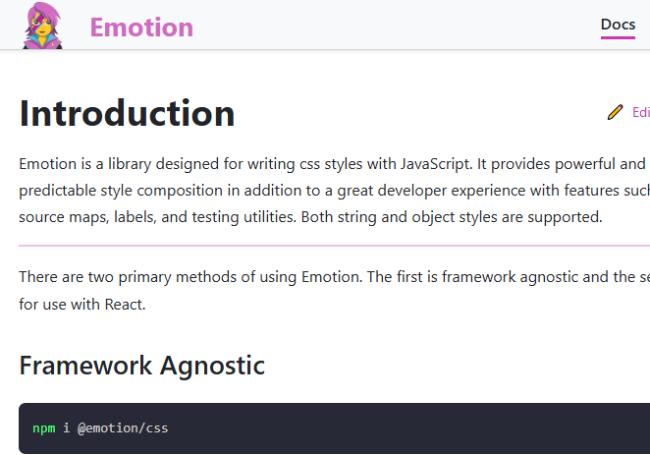
Emotion has emerged as a powerful competitor in the CSS-in-JS space, offering a flexible and performant styling solution for React applications. It combines the best aspects of Styled Components with a more lightweight implementation and additional features like composition and theming.
What makes Emotion particularly attractive is its dual package architecture, allowing developers to choose between string styles or object styles depending on their preference. This flexibility, combined with its exceptional performance optimizations, makes it suitable for projects of any size.
Emotion’s ability to extract critical CSS for server-side rendering and its shallow composition model have made it a favorite for developers building complex interactive applications where style recalculation performance matters.
Theme UI: Design System Foundation
Theme UI bridges the gap between custom styling and design systems by offering a constraint-based design approach. Built on top of Emotion, it provides a theming solution that makes it easy to maintain consistent spacing, typography, and colors across your React application.
The library’s sx prop combines the convenience of inline styling with the consistency of a design system, limiting style values to those defined in your theme. This constraint-based approach encourages design consistency while still providing flexibility for component-specific adjustments.
For teams looking to implement design tokens and maintain design consistency without the overhead of a full component library, Theme UI offers an elegant middle ground.
Stitches: Performance-First Styling
Stitches has gained attention for its near-zero runtime styling approach that combines the developer experience of CSS-in-JS with the performance benefits of static extraction. The framework’s variants API makes it easy to create component variations without the performance overhead traditionally associated with dynamic styling.
What distinguishes Stitches is its focus on build-time generation of CSS, resulting in minimal runtime code. This performance-first approach makes it particularly appealing for applications where every kilobyte and millisecond matters.
The framework’s theming capabilities and deterministic class names also facilitate server-side rendering and contribute to its growing popularity among performance-conscious development teams.
Radix UI: Unstyled Component Primitives
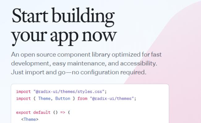
Radix UI takes a unique approach by providing completely unstyled, accessible component primitives that can be combined with any styling solution. This composable, headless UI approach gives developers full control over the appearance while ensuring proper accessibility, keyboard navigation, and focus management.
While not a CSS framework per se, Radix UI is worth mentioning because it pairs exceptionally well with CSS frameworks like Tailwind or CSS-in-JS libraries like Styled Components. This combination allows teams to build accessible, customized component libraries without reinventing complex interaction patterns.
For projects with strict accessibility requirements or unique design languages, the flexibility of Radix primitives combined with your styling solution of choice can provide the perfect balance of functionality and design freedom.
Panda CSS: The Next Generation

Panda CSS represents the next evolution in styling solutions for React applications. As a zero-runtime CSS-in-JS library, it combines the developer experience of CSS-in-JS with the performance benefits of static CSS extraction.
The framework’s atomic CSS generation approach results in highly optimized stylesheets with minimal redundancy. Its powerful style composition system allows developers to create complex style combinations without duplicating CSS rules.
Panda’s robust design token system and style recipes facilitate creating consistent design systems, making it particularly appealing for larger teams working on complex applications where both design consistency and performance are priorities.
HeroUI: Modern React UI Library
HeroUI has emerged as a modern, beautifully designed component library for React applications. Built on top of Stitches, it combines elegant default styling with exceptional customization capabilities and performance.
The library’s commitment to accessibility alongside its fresh, contemporary aesthetic has made it increasingly popular for teams looking to create visually appealing interfaces without compromising on inclusivity or performance.
HeroUI’s comprehensive set of components covers everything from basic inputs to complex data visualization tools, making it suitable for a wide range of applications from marketing sites to data-heavy dashboards.
Practical Integration Considerations
Working with CSS Modules
CSS Modules deserve mention as a styling approach that works well with any React project, either standalone or alongside other frameworks. By automatically scoping CSS class names to specific components, CSS Modules provide encapsulation without runtime overhead.
For teams with strong CSS expertise or those working with existing CSS codebases, CSS Modules offer a familiar syntax with added component isolation. They integrate seamlessly with build tools like webpack or Vite and can complement component libraries that don’t provide comprehensive styling solutions.
Framework Compatibility with Meta Frameworks
When choosing a CSS framework for your React application, consider its compatibility with meta frameworks like Next.js, Remix, or Gatsby. Some styling solutions require special configuration to work with server-side rendering or static site generation.
Frameworks like Tailwind CSS generally work well with any meta framework due to their static nature. CSS-in-JS libraries might require additional setup for server rendering, though most modern options like Emotion and Styled Components offer dedicated integrations for popular meta frameworks.
Design System Implementation
For teams implementing design systems, the choice of CSS framework significantly impacts the developer experience. Consider frameworks that:
- Support design tokens or theming
- Make it easy to enforce design constraints
- Provide utilities for common patterns like spacing and typography
Solutions like Theme UI, Chakra UI, and Material UI offer robust theming systems that facilitate design system implementation, while approaches like Tailwind + headless UI components provide more customization flexibility at the cost of additional implementation effort.
Performance Optimizations
Performance considerations extend beyond initial bundle size to runtime performance. Modern CSS-in-JS libraries like Stitches and Panda CSS focus on minimizing runtime overhead, while traditional CSS approaches like Tailwind have near-zero runtime cost.
Consider these performance aspects:
- Initial bundle size
- Style recalculation costs during interactions
- Tree-shaking capability
- Code splitting support
- Server-side rendering performance
Atomic CSS Generation
The concept of atomic CSS generation (used by Tailwind, Panda CSS, and some Styled Components optimizers) has proven highly effective for production applications. By breaking styles into small, single-purpose utility classes, these approaches minimize CSS duplication and maximize the effectiveness of compression and caching.
For large-scale applications where CSS bundle size becomes a concern, frameworks that utilize atomic CSS generation typically offer better scaling characteristics as your component library grows.
Making The Final Decision
Selecting the optimal CSS framework for your React project remains highly contextual, depending on specific project requirements, team skills, and business constraints. Here are some additional factors to consider:
- Community and Ecosystem: Evaluate the size and activity of the community around each framework. Larger communities typically mean better documentation, more third-party integrations, and faster resolution of issues.
- Long-term Maintenance: Consider the framework’s maintenance history and backing. Projects supported by companies or with consistent contribution patterns tend to be more reliable for long-term use.
- Framework Lock-in: Assess how much effort would be required to migrate away from the framework if needed. Some approaches create more coupling than others – for instance, utility classes are often easier to refactor than deeply integrated component libraries.
- Testing Implications: Different styling approaches affect how you test your components. CSS-in-JS solutions often make component testing more straightforward as styles are included in the component definition.
- Build Tooling: Evaluate compatibility with your build toolchain and deployment process. Some frameworks require specific plugins or configuration to work optimally.
Remember that many successful projects combine multiple approaches to leverage their respective strengths. For example, using utility classes from Tailwind for layout combined with styled headless components from Radix UI for complex interactive elements represents a powerful hybrid approach that many teams have adopted successfully.
As web development practices continue to evolve, staying informed about emerging patterns and tools will help you make styling decisions that balance immediate productivity with long-term maintainability.


")


")


