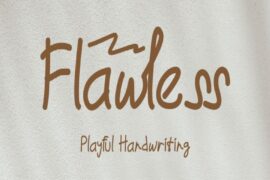
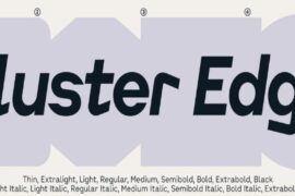
Font pairing is one of the most critical aspects of graphic and web design. Whether you’re working on a website, logo, brochure, or any other piece of visual communication, the right combination of fonts can make all the difference in how your message is perceived. This guide explores the essential principles of font pairing, the science behind it, and offers practical tips on how to create harmonious and effective font combinations.
What is Font Pairing?
Font pairing is the practice of selecting two or more fonts that complement each other while maintaining readability and conveying the right mood or tone. The goal of font pairing is to ensure that the fonts work together seamlessly and that each one plays a specific role in the design. The right pairing can add elegance, create hierarchy, and provide contrast, while the wrong combination can make the design feel chaotic or unprofessional.
The Importance of Font Pairing in Design
When it comes to visual design, fonts are more than just text—they are a powerful tool for communication. Fonts have the ability to convey mood, tone, and personality, all of which play a huge role in the way your audience perceives your content. Proper font pairing enhances readability, establishes a clear hierarchy, and creates a balanced design.
- Readability: One of the most critical aspects of font pairing is readability. Your audience needs to be able to easily read and digest your content. A mismatch of fonts or poorly chosen pairings can make the text difficult to read, which could alienate your audience.
- Tone and Mood: The typeface you choose says a lot about the mood or emotion you’re trying to evoke. Serif fonts, for instance, often convey tradition and professionalism, while sans-serif fonts can give a more modern, clean look. Mixing the right fonts can help reinforce the tone you’re aiming for in your design.
- Visual Hierarchy: Font pairing helps establish a visual hierarchy in a design. By combining fonts with different weights, sizes, and styles, you can direct the viewer’s eye to the most important parts of your design, whether that’s the title, subtitles, or body text.
- Brand Identity: For businesses and brands, font pairing plays a critical role in the consistency of their visual identity. Well-paired fonts can convey a brand’s personality—whether it’s playful, professional, luxury, or creative—helping to establish a lasting impression on customers.
Key Principles of Font Pairing
While font pairing may seem like a subjective art, there are several key principles that can guide you in selecting the best combinations.
- Contrast: Contrast is a fundamental principle in font pairing. Pairing fonts that are too similar can create a monotonous or confusing look. Instead, opt for a contrast between different font styles. For example, combining a serif font with a sans-serif font can add visual interest and balance. A bold font can also be paired with a light or thin font to create distinction between headers and body text.
- Harmony: While contrast is important, it’s equally essential to ensure that the fonts work well together. The fonts should share a similar visual rhythm or tone, even if their styles are different. For instance, pairing a modern sans-serif with another clean, minimalist sans-serif font will likely work better than pairing a decorative font with a highly stylized one.
- Hierarchy: A well-designed hierarchy makes the content easy to read and navigate. Use different font weights (bold, regular, light) or styles (italic, all caps) to differentiate between different levels of content. Headers, subheaders, and body text should each have their own visual style to guide the reader’s eye naturally through the design.
- Legibility: Above all else, legibility should be your primary concern. Even the most beautiful font pairing won’t be effective if the text is hard to read. Avoid pairing overly decorative fonts for body text. Always prioritize clarity, especially for important content like call-to-actions (CTAs) or legal disclaimers.
- Consistency: Font pairing is all about consistency. While contrasting fonts can make a design pop, they should not disrupt the overall harmony. Ensure that the fonts you choose align with your project’s visual identity and brand guidelines. This helps maintain consistency across all your communications.
Practical Tips for Font Pairing
- Start with a Single Font Family: One of the easiest ways to create a harmonious pairing is to start with a single font family. Many font families come with multiple weights and styles (regular, bold, italic, etc.), making it simple to pair them with themselves. For example, pairing a bold weight for the header with a regular weight for body text will provide visual interest while maintaining consistency.
- Use a Serif and Sans-Serif Combination: A classic approach to font pairing is combining a serif font for the header with a sans-serif font for the body text, or vice versa. Serif fonts (like Times New Roman or Georgia) are often associated with traditional, formal designs, while sans-serif fonts (such as Arial or Helvetica) tend to be cleaner and more modern. This combination provides a pleasing balance of old and new, making it easy for readers to digest content.
- Pair High Contrast Fonts: Bold, thick fonts paired with lighter, thinner fonts create a stark contrast that can effectively establish hierarchy. For example, pairing a bold sans-serif for headings with a light serif for body text can make the header stand out without overwhelming the body copy.
- Pair Fonts with Similar X-Heights: The X-height refers to the height of lowercase letters in a font (specifically the height of the letter ‘x’). Pairing fonts with similar X-heights ensures that the fonts appear visually aligned and balanced. If you pair a font with a low X-height with a font that has a taller X-height, the overall look can feel uneven.
- Don’t Overdo It: It can be tempting to experiment with multiple fonts, but overusing them can make the design look cluttered and chaotic. Stick to two or three complementary fonts at most. Using too many fonts dilutes the impact of your message and distracts from the content.
- Test Fonts on Different Screen Sizes: With the rise of mobile usage, it’s essential to test your font pairings on different screen sizes to ensure readability and legibility. Fonts that look great on a desktop might be harder to read on a mobile device. Always preview your designs on multiple devices to check for any readability issues.
Font Pairing Examples to Try
Here are some tried-and-true font pairings that are effective for a range of design projects:
- Montserrat (sans-serif) + Merriweather (serif): Montserrat is a modern, clean sans-serif font, while Merriweather offers a classic, readable serif option. This combination creates a nice contrast while ensuring legibility and balance.
- Lora (serif) + Open Sans (sans-serif): Lora is a serif font with a touch of elegance, and Open Sans is a versatile sans-serif font that’s highly readable. This pairing works well for both body text and headers, providing clarity and visual interest.
- Playfair Display (serif) + Source Sans Pro (sans-serif): Playfair Display is a sophisticated serif font with a high contrast design, perfect for headings, while Source Sans Pro’s clean and modern style makes it a great choice for body text.
- Roboto (sans-serif) + Slabo 27px (serif): Roboto is a highly popular sans-serif font, and Slabo offers a refined, modern serif look. This pairing strikes a balance between readability and visual appeal, suitable for web and print use.
Conclusion
Font pairing is a vital aspect of design that requires careful consideration and a good understanding of both aesthetics and functionality. By combining the right fonts, you can guide your audience through your content, establish a clear visual hierarchy, and reinforce your brand’s message. Whether you’re working on a website, marketing materials, or a logo, mastering font pairing is essential for creating professional, visually appealing designs that communicate effectively.
Remember to prioritize contrast, harmony, and readability while also considering the tone and purpose of your project. With the tips and examples provided, you’re now equipped to explore the world of font pairing and create beautiful, cohesive designs that will resonate with your audience.
This article covers both the theoretical aspects and practical applications of font pairing in design, while offering professional insights and actionable advice. Let me know if you’d like to refine or expand on any specific sections!

