

We constantly talk to our clients about the importance of web positioning when working on a web page. It must be essential when building a digital marketing strategy in any business. Creating traffic to the web is a fundamental value, and we have talked about it in other posts. However, what happens when you have the traffic you expected or think should be enough, and yet you cannot transform those visitors into customers or, at least, repeat visitors? Maybe something is lacking when it comes to your eCommerce customer experience strategy.
Here are the top 10 reasons your customers leave your website. Take a look at them and try to improve at points which you feel you are lacking so your customers will visit your site more.

1. Your Website is Slow to Load
According to the KISSmetrics study, load times are crucial when examining the effectiveness of any website. Here are a few of the most important figures from their analysis:
- 47% of users anticipate that a web page will load in up to two seconds.
- When a website takes over three seconds to load, 40% of users leave.
- Customer satisfaction has decreased by 16%, even with a one-second delay.
Check it out right now if you haven’t already. Put this item at the top of your list of priorities if you have already realized it needs improvement.
2. Your UI is Outdated
A reduction in conversions indicates that fewer and fewer visitors are interested in your service. The reasons you used to persuade the user to pick your firm are no longer valid. On the one hand, this may signal rival activity; on the other hand, internal elements must be carefully evaluated.
So, for example, on every page of the site, you talk about free shipping, but it is required to specify the order’s arrival time. Or a price in the top market limits necessitates argumentation (for example, extended warranty, original product, unique production technique, limited edition), and you rely on the power of the brand and the audience’s established ideas about the company’s reliability.
The makeover will emphasize the advantages of your service to customers. This issue is most apparent in items with emotional demand when demand depends on tapping into the audience’s misery. Instead of just one product page, you may create numerous landing pages and test them for different audiences. When deciding how to appeal to the audience, there is another equally essential issue relating to the site’s design, such as your ad not matching the material on the site.
3. Your Navigation is Unclear and Unoptimized
Raise your hand if you’ve ever visited a website searching for a particular piece of information only to get lost in a confusing array of poorly organized navigation options. In addition to negatively impacting your on-site eCommerce customer experience, confusing navigation is also bad for your SEO. The basic rule of navigation is to design your website as though you were your customer. If you were a complete novice to your website, how would you anticipate finding the content organized? How would you go about finding the solutions to your queries?
If you redesign your navigation to serve your visitors better, you’ll stop losing prospective customers to poorly organized material. You should boost your eCommerce customer experience to make them come back again to your website. Try using a service such as UserTesting to find potential issues if you need clarification on whether you can restructure your content to match client expectations.
4. You Lack Clarity in Your Product/Service Offers
Consider the famous example of the first Apple iPod. You need to adequately describe your product’s benefits to your clients on your website to persuade them to go down the sales funnel.
The ability to carry thousands of music with them wherever they went was more critical to Apple’s early customers than 1GB or MP3s. This is known as selling advantages rather than features. Your website Isn’t Mobile Responsive It’s an essential idea to comprehend (and execute) when you seek to troubleshoot conversion issues on your website.

5. Your Content is Difficult to Read
On a similar point, remember that design is more than simply colors, pictures, and graphics. The typefaces you employ, as well as the colors of your text and backdrop, can influence how easy it is for visitors to read and absorb the material on your website. Your text must be read clearly to convert smoothly. There are no hard-and-fast rules on which fonts to use and which to avoid – save that you should never use Comic Sans.
For optimum effects, adhere to color schemes with solid contrast and simple, ornament-free serif or sans serif typefaces. Here are some ideas and suggestions for selecting the best fonts for your marketing materials. Regarding font size, keep with bigger fonts to improve the eCommerce customer experience optimization for visitors, whether they’re on a desktop or mobile device. Use a font size of at least 22 pixels for headings. Keep body text at 14 px or bigger.
6. Your Content is Not Organized
These days, a website’s content is, without a doubt, the most crucial component. Therefore, always bear the following things in mind when posting content:
- Is the grammar in the text correct?
- Are the numbers offered there current and accurate?
- Is the information well-written and simple to understand?
- How is the eCommerce customer experience on the website?
Unorganized material is also a major turnoff, particularly when customers seek information. Images and videos have a significant role in attracting customers’ attention and enhancing the eCommerce customer experience. Therefore, the rate of website desertion will be lower the more substantial your content is.
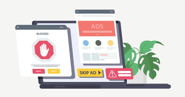
7. Too Many Ads
Recognize that these pop-ups and redirection are annoying. Very few customers voluntarily click on these pop-ups out of curiosity. However, there are several websites with a lot of sign-up pop-ups or other advertisements related pop-ups that not only annoy users but also push them to quit those websites.
So, if you know that you, as a website user, would never want such pop-ups or redirection, why put them on your website? Simply thinking about it will provide you with an immediate response!
8. Complicated Checkout Process
Clients nowadays expect everything to be fundamental and straightforward. They prefer to save time filling out difficult paperwork or going through other processes for online payments. If your website’s checkout procedure is complicated and time-consuming, your clients will leave unsatisfied due to a poor eCommerce customer experience. So make your checkout experience as clear and straightforward as possible.
For example, on an e-commerce website, when a consumer goes through the checkout process to purchase anything, she should find the procedure simple and comfortable. Otherwise, she could exit your website without completing a purchase.
9. Too Many Redirects
Too many redirects mean that your browser has become caught in an endless redirection cycle. That indicates your browser is attempting to access one URL, which points to another, points back to the original, and is therefore stuck. This loop might carry on indefinitely, but your browser ultimately gives up and shows the “too many redirection” message. Too many redirects worsen the eCommerce customer experience, and your web visitors might find it annoying.

10. Your Website isn’t Mobile Responsive
Almost 62% of site visitors originate from mobile devices. Therefore if your website isn’t mobile-friendly, mobile consumers will be irritated and quit. Ensure your site provides an excellent mobile user experience, such as a responsive design, readily clickable buttons, mobile-friendly navigation, lower file sizes, and simpler forms.
How to Make Your Web Visitors Stay Longer?
Most businesses rely on their websites to generate and retain inbound leads. Once they arrive on your site, the objective is to keep them there longer, convert them, and maintain them. The average time spent on a page provides significant clues regarding a website’s performance, usability, and engagement. Furthermore, it may give insights into the top and worst-performing sites, allowing you to study and modify accordingly.
According to Hubspot, however, around 55% of web users spend less than 15 seconds on each website. And only if you give them a compelling cause to stay. Another indicator that might help you determine how many of your website visitors go to your pages, do nothing, and then depart is the bounce rate. A high bounce rate is frequently a concern for most websites since it usually indicates something is amiss. It might be the performance, the content, the design, technological issues, or even the ecommerce customer experience.
It might also mean you’re targeting the incorrect audience since they’re leaving because it’s not what they’re searching for. A high bounce rate also indicates that the general quality of the website may be lackluster and uninviting. However, remember that a badly constructed tracking code might create data oscillations.
Simply said, you must evaluate the performance of your pages and their components.

Conclusion
Misleading your clients and neglecting to provide them with what they want will harm your company’s image. Maintain a tight ship on your website by delivering relevant, fast-loading content that surpasses expectations through customer experience optimization.
Remember that people only want to use a site they can trust, which they cannot learn, or is unavailable. Downtime is costly, and a lack of mobile compatibility is fatal. Assisting in a transaction is the primary purpose of almost any website. Keep your audience focused. Clean navigation, clear calls to action, and a quick route to success are all required. You can even use a background remover to clean your images.
Remove spammy advertising and videos to build trust. Instead, develop a brand voice that connects with your target audience. The correct words at the right moment may make a big difference. Finally, consider how you may motivate your audience when they come. Know your audience and voice, then talk confidently about the changing seasons.
Build trust in whatever you do. More extended site visits, reduced bounce rates, and more satisfied consumers will result.

")


