Software as a Service (SaaS) has been mainstream for a while. Growing automation and the need for flexibility in business are contributing to the rapid growth of the SaaS market. According to Statista, in 2022, the SaaS market is estimated to be worth roughly $171.9 billion compared to $145.5 billion in 2021.
Speaking about the future of this market, it is expected to keep growing. Companies around the globe use SaaS products to perform various business tasks. These products include those for web hosting, customer resource management, enterprise resource planning, project management, customer relationship management… the list goes on. But there is still room for new solutions.
In this article, you can find practical cases, actionable insights, and recommendations concerning custom SaaS app development. In the post you’re reading, we discuss the importance of quality UI and UX SaaS design, steps to take to ensure this quality, and its trends in the current year.
Why is great design essential for your SaaS solution?
What are the reasons for the achievements of leading brands like Amazon and Facebook which can boast huge visitor traffic? Multiple things come to mind: the product’s idea, promotion strategy, quality coding, etc. All of them are the components of success. However, great design also significantly contributes to the platform’s success. Unfortunately, business owners often lack this understanding.
In fact, quality SaaS design helps to attract and retain an audience and should be considered as an immutable component of your SaaS solution development. Before proceeding to the list of effective SaaS design patterns, let’s determine the characteristics a good UI/UX design should correspond to.
Quality UI/UX:
– Looks decent and doesn’t repel users
– Provides SaaS experience claimed by your marketing campaign
– Enables your customers to achieve their goals
– Meets the founders’ or stakeholders’ expectations
Keep in mind that your SaaS product doesn’t necessarily require flashy design. For almost any business, the usefulness of your SaaS solution will be way more important. So, the question remains as to how do you achieve the winning design?
Some key principles of SaaS product design
UI/UX is a mix of multiple elements including information architecture, user interface design, and visual design and covers the entire user journey. In other words, UI/UX is responsible for an effective IT solution’s performance, including its availability, accessibility, and even customer support. Here are the principles of SaaS design to mention a few:
Put users’ needs first. For a proper SaaS development, you should not only validate design choices but also conduct user research. User research has to be performed during the stage of discovery. This complex approach is required since decision-makers and future customers belong to two separate groups. In case user research isn’t conducted, this is likely to harm the final product.
Easy and fast start. A cumbersome onboarding procedure is likely to repel users. In turn, simple and swift onboarding can be a convincing competitive advantage. In case early users aren’t aware of all the useful capabilities of your product, you risk losing them before they become your loyal customers. To inform users about your platform’s main and essential functionality, provide them with interactive tutorials.
Navigation and information architecture. Your purpose is to ensure that users, having different levels of permissions, won’t find it troublesome to find what they want using your platform. Thereby, make sure that navigation is simple and information is kept on hand thanks to corresponding functionality.
Data visualization. We recommend providing users with an informative and clear dashboard. Make sure that this dashboard’s UI/UX is thoroughly thought-out as users will spend some time learning it. Analytics shouldn’t also be neglected. Enable users to generate visualized reports providing KPIs essential to them. Such a dashboard should be a central hub for all the data your users need while working with your product.
Customization capabilities. Providing users with multiple customization abilities is a great approach to achieve a high level of personalization, which leads to immense customer satisfaction.
Customization might include changing color themes, flexible dashboards, configurable filters, etc. The SaaS best practice is to keep approximately 20 percent of features customizable. Keep in mind that too extensive customization might overwhelm end users.
UX and UI trends for SaaS apps in 2022
Lots of SaaS companies are increasingly implementing new technologies like Artificial Intelligence and low-code development to keep up with the times. There are also UI and UX trends to follow that are worth your attention.
Mobile and cross-device experience
Mobile-first approach is one of the prevailing trends to follow in software development and SaaS solutions are no exception. Individuals tend to use the software even when they are not at the computers. Ensuring a state-of-the-art mobile experience will definitely come with an array of SaaS UI design issues to resolve. They occur when trying to adapt interfaces to the needs of neurodiverse and senior users and those with vision and hearing problems who may require hearing aids to hear properly.
Of course, you can decide not to add all your web product’s functionality to the mobile version. But pay attention to the following areas to possibly include in your mobile app:
– Enhanced accessibility functionality
– Augmented reality and virtual reality-based immersive mobile experiences
– Improved responsivity, gestural design, and machine learning-based intuitive filtering variants
Clear and user-friendly navigation
All complex SaaS solutions have to provide strong navigation capabilities. This helps to have at hand links to each useful tool, functionality, and graphical data. Here are a few tips on how to ensure this kind of navigation.
Using badges embedded in your vertical navigation menu enables users to easily manage their work with your SaaS app. Adding tags near the badges will help users understand what the link corresponds to.
You can accommodate navigation at the very top of specific pages and sideways. Thereby, users have a few ways to access all the pages, the interface is understandable and simple to navigate. Information about the project can provide dropdown menus that can be opened or closed if needed.
Flexible search capabilities
A complex SaaS product has to provide users with great search abilities. It’s useful if users can adjust what they search depending on their final goal. That’s when dynamic sorting comes in handy. You can conceal all sorting opportunities below a menu that offers a list of options. This enables users to enlarge or minimize the sorting opportunities if needed.
Simple and full representation of data
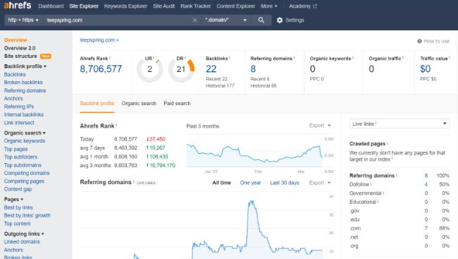
In case your SaaS app idea involves a large amount of information, you need to properly visualize it. It’s common and efficient for large SaaS solutions to consolidate data in a dashboard. Take for example SEMrush and Ahrefs. Similarly, you can implement a dashboard that presents a number of various diagrams.
The above-mentioned marketing platforms segment the graphs on their pages. Such platforms also provide a dashboard filled with data. However, as a user navigates the platform, they see that all the pages present only a graphical representation of data visualization relevant to the search query.

Conclusion
In general, a great design of a SaaS application helps users easily fulfill their needs and achieve their goals. Well-thought-out visual components and an interface improve users’ workflow and simplify the user journey. Following the best practices viewed in this post, will enable you to attract, retain, and engage your SaaS customers.


