2020 has rung in the new decade, and what a decade it has been so far! It has brought with it a new evolution of design within the graphic design world. Almost as if marking the start of a new era, new trends, ideas and looks have started appearing and making themselves seen and heard on the global front.
We decided to unpack the biggest trends coming through in graphic design. We took a look at what has dominated the industry over the last few months, and what you can expect going forward into 2021.
Minimalist Landing Pages
This trend started taking off about two years ago and has established itself as one of the most popular designs for websites globally. Companies started veering away from cluttered, copy and image-heavy pages to sleek, white or light-colored backgrounds with one or two images and sharp, eye-catching copy.
Not only does this do wonders for the loading speed of the page, and significantly increases SEO rankings, but has been proven to be more user friendly for the visitor. Visitors are less likely to bounce from a page when there is a clearly defined path and simple easy instructions to follow.
Realism with 3D Depth
With graphic design software rapidly evolving, the obvious step in the design world was to start creating incredibly real looking animations and designs. 3D has become one of the most dominant design elements in the new decade, and you can see why.
Designers are able to create mascots and characters for companies to add to the storytelling ability of brands online. They also combine 3D designs with 2-dimensional objects, photos and text to create eye-catching textures and depths on a page. 3D design is ideal for that added texturing to really sell the product, to make it incredibly realistic.
Muted Color Palettes
Going hand-in-hand with the minimalistic look are the muted color tones that are gaining popularity at a record rate. The previously popular bright colors have almost had their edge taken off of them by adding white or black into the color to give it a more subdued tone.
These blend and work perfectly with the white backgrounds and minimal look mentioned above as they add that much needed, yet understated, color palette to the whole image. Text over it can be bold and dark to really draw attention to the copy. Gradient colors are also incredibly popular and give the product that modern edge needed to speak to the younger generation.
Bold, Handwritten Text
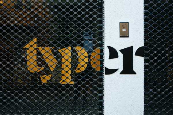
On the topic of text, let’s have a look at what is really hot right now for copy. What has taken center stage for copy and text is bold, dominant lettering, which seems to be handwritten. Not only does it give the brand a personal, unscripted feeling, but it is eye-catching and eccentric and allows personality to be conveyed through this medium.
Bold font is definitely in, and it is really important to make every letter really unique and almost out of place to capture the attention of the reader. Some lettering can be bigger or smaller than the other, and in some cases, lettering is also flipped backward to really mix things up.
Masking of Image and Text
Although not a new technique, this is being used especially to mold into the minimal looks that are trending. The design blends the use of text and imaging into one to create bold eye-catching catchphrases.
It is a subtle way of introducing an idea of coloring and images into an otherwise minimal look and offers the viewer an idea of the brand and the message the brand is trying to convey. With a lot being left to the imagination, it aims to spark an interest in the customer to want to find out more.
Abstract Illustrations and Shapes
Another fad sneaking into 2020 is the use of abstract illustrations, shapes and flowing lines. Melded with the muted color tones, you can almost imagine a Clockwork Orange look and feel pushing through into the new decade.
The idea is to spark imaginations and to create an almost dreamy effect in an otherwise minimal modern design world. Coloring centers around the very earthy tones that were highly popular in the ’50s, with dark oranges, olive greens and mustards coming through, creating a defined blast from the past. It is important that the illustrations tell a story about the brand and product, being as detailed and artsy as possible.
Plain, Heavy Bold Text
To counter the wispy, hand-drawn texting and illustrations, designers can choose to add in an incredibly simple, bold text. It is meant to be heavy and eye-catching on what can either be a very minimal background, or up against the storytelling abstract illustrations.
The text’s role is to catch the eye of the reader and convey a simple, long-lasting message with them.
Remember though, try not to have too many minimalist looks on one page. If you are using an abstract illustration, balance it out with heavy simple text. Or if you are aiming to achieve the reminiscent ‘50s feeling, this is definitely the text to choose to add that modern twist to the page.
Street Art Is Back In
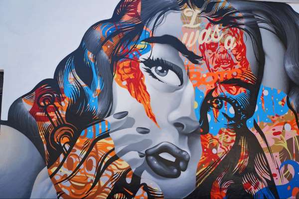
2020 is clearly breaking all of the rules, and this is no different in the design world. Think the grunge of the ’90s mixed with the neon ’80s and then top it off with the punk of the ’70s. Graffiti looks are back in, and they are edgier than ever.
Integrate ultramodern photos with hand-drawn illustrations, graffiti type tagging, eye-catching text and even bright colors. Designers are outlining the photos with their hand-drawn lines and illustrations to give the look a surreal 3D feel, and it really works! Here, it is all about experimentation, and if you are trying to capture a younger generation’s eye, you certainly won’t go wrong.
Last Thoughts
We are halfway through 2020, and still seeing new trends emerging. With COVID-19 and the globe having to retract into isolation and sheltering, a lot of these designs have had to be put on ice. More brands are opting for muted, empathetic tones to identify and console customers, while less are trying to break the mold with vibrant looks. It is currently all about setting the right tone. So, the question is, will these be pulled through to 2021? Will edgy be the new black? We believe it will, and can’t wait to see how brands break out of their shells in the new year.


