What does it take to create a killer company logo? What are the ingredients of a design that speaks a thousand words and gets the message across without facing any resistance? If you are looking for answers to questions like these, then you have come to the right place.
Creating a “winning logo” is easy. All you have to do is keep the following points in mind:
Design Tool
Unless you are taking help from a professional, you are going to use a logo design tool on your own. So, it’s important that you make your decision carefully.
There are all kinds of graphic design tools on the Internet like Crello and Snappa but many SMBs are turning to logo creator tools instead. This is because dedicated logo design tools are easier to use, inexpensive, and get the results faster. So, it’s better if you pick such a tool yourself rather than spend time with complicated software that you may not even need to use again for a long time. As outlined by Looka you don’t even need to be a designer to create a stunning logo.
Logo Fundamentals
There are certain qualities that are particular to quality logos. So, you must ensure that your logo also has the same which are:
– Simplicity
Most of the classic and powerful logos, you will see, are simple. Don’t get the wrong idea though- there are situations when a simple logo isn’t the best choice. However, for the most part, you want to stick with simple.
When you create complex designs, then you actually dilute the impact and message. On the other hand, a simple design can send across the message loud and clear by getting rid of all kinds of visual distractions that may exist.
– Originality
When you are creating your logo, always remember- design can build your brand if done right. However, you need to put on your thinking cap for that and come up with original ideas and concepts. Sure, you can check out the logos of other popular designers for inspiration but your own design should be 100% original.
– Scalability
It doesn’t matter what kind of logo you have created, you want to use it in as many places as possible. For the design to look good, it should be scalable. In other words, you should be able to use it on a small object like a pen and also a large object like a banner.
– Timelessness
Great logos aren’t based on trends but rather on time-tested principles. It’s important to remember that what’s popular today may simply lose its charm in a few years. So, you are free to check out the latest graphic design trends for inspiration, but you should make the final decision for your logo keeping “futureproofing” in mind.
Common Mistakes
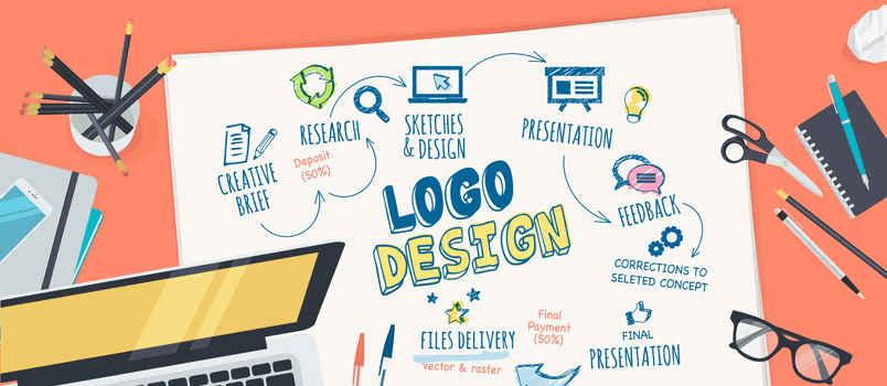
Many people tend to oversimplify the design process for logos. The truth is that logo design is as laborious and time-consuming of a task as is creating a website or an app from scratch. So, be sure to take your time and avoid these common mistakes:
– Avoid using more than 2-3 colors in a logo. The same goes for the number of different fonts.
– Always keep your target demographic in mind when you create a design. So, if you want to create a brand for women, then you may focus on pink or purple and use cursive fonts. Similarly, if you want to target top executives of large enterprises then you can use a formal and authoritative color like black and use a formal font like Times New Roman, Bookman Old Style, etc.
Conclusion
Designing a beautiful and original logo doesn’t have to an ordeal. If you are intimated by the entire process, then don’t be. Just get your basics right and you will be fine. Of course, if you are taking help from a professional or an advanced logo maker, then the process will be even easier. Good luck!


