Having a well-designed website is no longer an option for anyone with ambitions of having a successful business—it’s a requirement. This article discusses how a great web design helps businesses, and provides tips that can help increase customer conversion.
How great web design helps businesses
In this increasingly digital world, your website often serves as your main platform to make a good first impression. This is especially crucial for smaller business that don’t have the established reputation of larger entities. Below are some of the ways a good web design can help your business.
– Builds trust
How many times have you Googled something, clicked on a result, only to leave that website because it doesn’t have a professional-looking design? In this age, people expect a clean website layout that they can easily navigate and find the information they’re looking for. Even if it’s their first interaction with the business, they immediately associate a good website design with a reputable brand.
In fact, according to a Stanford University research, 46.1% of people say a websites design is the top criteria for deciding whether a company is credible or not. A well-designed website communicates dedication and trustworthiness to visitors, laying the foundations for potential conversion down the line.
– Impacts SEO
A website design that lacks proper planning (scattered content, un-optimized images) can lead to slow loading times, which ultimately affects how the page ranks in search results. When search engines like Google crawls into a well-organized website (like having business-related keywords in the HTML text), it makes the site more searchable, allowing more people to see it.
Here’s an SEO checklist to help your website rank better.
– Builds relationships
Something as simple as making it easy for potential customers to contact you goes a long way in cultivating relationships. A good web design makes lines of communication clear, leading to a pleasant user experiences (UX), which entice return visits.
The main goal should always be to provide good experiences to your customers, and a great web design is a sure fire way to accomplish that.
How to boost conversion rates with great web design
In the competitive digital space, coupled with dwindling attention spans, you only have a few seconds to convince visitors to stay on your website. If your web page loads slow, or if they can’t find what they need right away, they’re bound to move on to the next search result.
Here are some tips that can help you boost conversion with your design.
– Hick’s Law
The popular theory by British psychologist William Edmund Hick states that the time it takes for an individual to make a decision is directly proportional to the possible choices the person has. This was supported by a popular study where a display with 24 varieties of jam attracted less interest than one displaying only six varieties of jam.
The study found that people who saw the larger display were only one-tenth as likely to buy as people who saw the small display. You can follow this concept in web design by limiting the number of choices users have. Succinctly put, don’t do this:
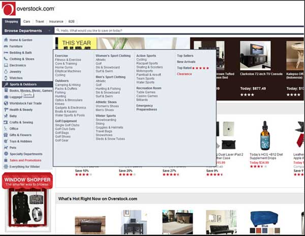
Being inundated with choices can put users into a sort of paralysis where they resist making any kind of action altogether. While the navigation bar is where designers commonly limit users’ options, you can even take it a step further by installing a full-screen welcome gate like the one below.
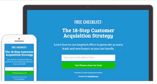
This allows you to minimize distractions and point users towards the direction you want them to take.
Find out what the bottom line is for every page and design it accordingly. There are a number of free web design tools to help you accomplish this.
– Call to Action
Speaking of the bottom line, the call to action button is a powerful way to help you achieve exactly that. Whether it’s having users opt in to your email list, or put a product in their shopping carts, what you want users to do should be perfectly clear.

Netflix does a great job at this, not only with its eye-ctaching red button with the CTA “Join free for a month,” but also with the text “Cancel at any time.” The latter takes away users’ potential fear of being tied up to something they no longer want.
– Responsive Design
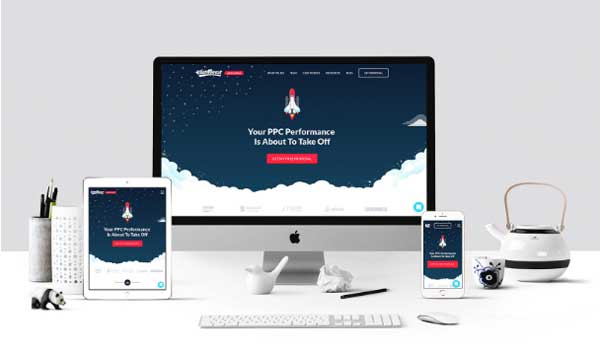
According to Hackernoon, users are 5x more likely to abandon the task they’re trying to complete if the site isn’t optimized for mobile use. And with mobile traffic responsible for 52.2% of all internet traffic in 2018, having a responsive web design that fits any screen perfectly is essential for optimizing conversions.
– Keep it simple
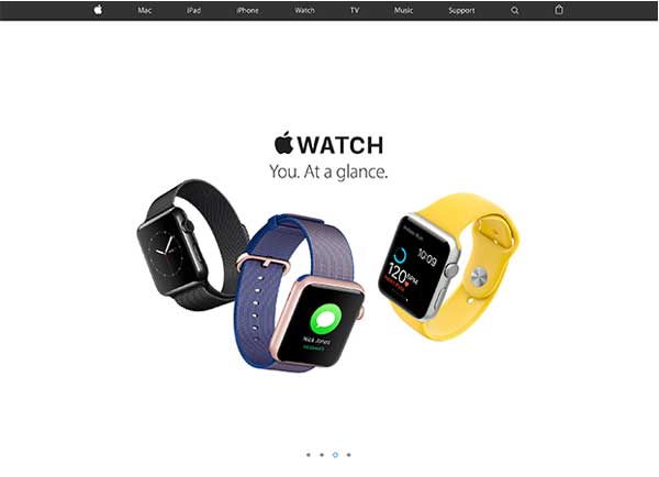
76% of consumers say the most important factor in a website’s design is making it easy to find what they want. So when you’re starting your ecommerce website, for example, make it common practice to ask yourself if there’s a way to make it simpler. Not only does it play into Hick’s Law, and is often more aesthetically pleasing, it also tends to convert more.
Takeaway
There are a number of techniques that lead to a good web design (content layout, color use, consistency, etc.), but the most important will always be allowing users to accomplish what they came there to do. Making it easy for users to achieve their goals should always be the priority. And having a good design is often necessary to accomplish that.
What elements of your website design do you think you can improve on? Let us know in the comments below.


