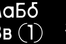
You are reading this article about fonts, it means you completely agree with us: there’s nothing more important than details.
Besides, today’s trends call us to use less pictures, more texts in the newsletters unless it is a greeting one.
We’ve done some research and analysis, and now we want to share the results on the best fonts for emails with you.
Here, we want to review some examples, offer useful tips based on our analysis and show you how to insert special characters into newsletters.
Some examples of the best and the worst fonts for emails are given below:
– Logo
Logos are always displayed correctly, because all mail clients “see” them as images. Do not hesitate to make logos as creative as possible. Besides, they are done once and forever.
But when it comes to the body of messages, we should stick to definite rules, as there are only 15 web safe fonts which most companies use in their newsletters. Sort of boring. Consequently, you want to optimize your emails and apply a different font to make them stand out.
Note! Applying a decorative font, you have to place it over a picture.
– Header
1. Fashion
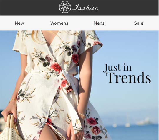 This is an example of a perfect header. They applied web safe Verdana 16.
– Content Part
2. CampaignMonitor
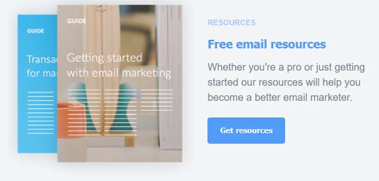 Roboto Font with size 9-13.5px. Perfect example of a color combination. You are not supposed to use only black and white. Choose any color you like. Just make sure it is not too bright, nor too pale. Both variants make it impossible to read the text.
3. National Geographic
 Great example of a professional font for email. The offer text is big enough, likely to be written in Trebuchet Font, size 12, uppercase. The main text is written presumably in Georgia font, size 12. The text is clear, legible, contrast color is present, the text is written in a business style.
4. HomePolish
 Positive Example. Homepolish used 3 following fonts here, supposedly: for the introductory text size 18, Spectral Font for the explanatory text, size 12, and Arial Font, size 10, uppercase to emphasize the button.
The fonts, used here, are not too reserved, nor decorative. They match the theme of the newsletter. Homepolish applied contrast colors. All these features make the text legible.
5. SalesForce

Footer
6. Postable
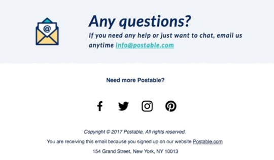 Example with a bad Font Modifiers Combination. Not appropriate to use Bold text for complete sentences in emails, as it looks aggressive. Of course, you can type a word or two that way to emphasize the CTA or the main phrase in a newsletter.
Also, they used Italic font. Apply Italic just to separate words.
Important! Avoid using more than two font modifiers in your message, i.e. Italic, Bold and Normal should not be used together.
7. NoName
 Very small size of the text. Reading is impossible. Even the Company name is not clear.
The font size is much less than acceptable 10px.
Note! Which are the worst email fonts ever? Those which are not legible. Those which are too small, pale. The preferable font size for mobile devices is 16px.
8. InkBrush
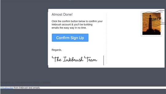
Note! Avoid using a background for the text with the similar color.
9. Kimberlyn
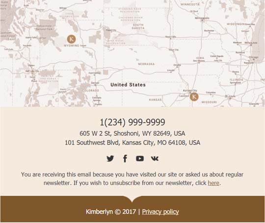 Example of a perfect, reserved footer. Just three colors, proper size and proper font used. Kymberlyn applied Tahoma Font, 13 and 14px sizes.
A good footer contains your company information: post mailing and web mailing addresses, links to your accounts on different social nets, and sometimes the name of the CEO. In rare cases, footers have maps in them. Footer is kind of a signature of the company. Make it clear and visible.
10. Electros
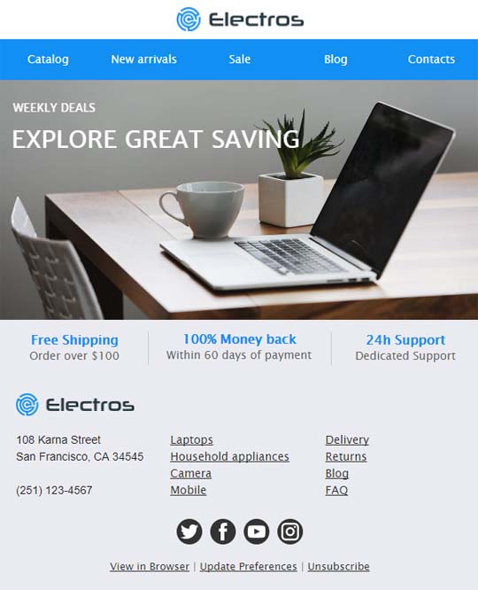 This is a perfect email. Good colors, fonts Helvetica and Lucida Sans Unicode matching the situation, font size 14 – this all makes the text easy to read.
For more best examples, for inspiration to find, please visit ReallyGoodEmails. They offer thousands of successful newsletters.
– Family Fonts
Not all fonts are correctly displayed and supported by numerous mail clients. That is why you should apply “Family Fonts” to your email messages. Thus, your text will be correctly displayed on all devices. When making changes in HTML code and applying family fonts, start with the preferable one for you. Paul Airy explained it in details in his article.
Special characters should be discussed separately
When adding special characters to the newsletters, you will have to make some changes to the HTML code.
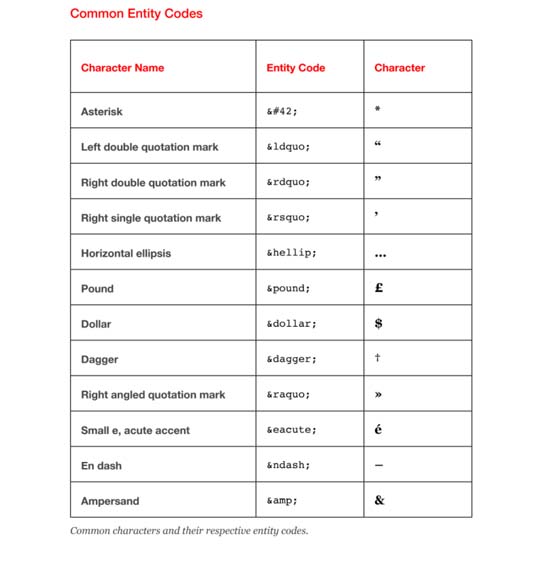
Source: “A type of Email”, book by Paul Airy.
Summary
As we mentioned above, the font type depends on the goal of the newsletter.
So, what are the best fonts for business emails? Bloomberg recommends using Georgia and Verdana fonts in this kind of emails. And as a fallback, you are welcome to use any of the 15 web safe fonts.
CTA words, buttons and footers should be always written in one of those web safe fonts.
Speaking of the fonts, we could not omit sizes. The best size is 10-16px, while size 16 is strongly recommended for mobile devices.
When using a new or a decorative font or adding some special characters to your newsletter, we strongly recommend checking the text readability with Litmus. They test how your email is displayed in more than 70 mailing clients, operating systems and desktop and mobile devices, and send you the screenshots.
The tips on fonts you should stick to when creating a newsletter, in order to make your messages look professional:
– Use only proven fonts and apply family fonts to your emails
– Keep the font size within norms
– Pay attention to the colors
– Make the font match the purpose of an email
– Avoid using Font modifiers in business email Footers
– Before sending out an email, test it out for correct display of the text itself and its special characters
Implement your ideas within minutes with the Stripo Email Template Builder.
We sincerely wish you best luck in your future endeavors.


