If you want your startup business website to produce sales, use the many web tools available that make online selling easy.
Don’t be fooled into thinking that an attractive website is all you need.
Talk to a shrewd website designer and you will discover there is often a difference between a nice-looking website and one that encourages a shopper to hit the “buy” button.
Startups and small businesses depend on the internet as an additional channel to increase sales. Some rely totally on the internet to drive sales. New businesses often share the same fate; they have a visually compelling website yet it doesn’t get the sales job done.
Here’s the good news; there are positive steps you can take to improve your odds of securing online sales. It all hinges on your website’s ease of use.
Components of A Successful Website
Keys for a website design that can successfully sell your product or service:
Easy Navigation
 https://bitbucket.org
A visitor ready to buy will be frustrated if they are unable to easily navigate through your website, find what they want and pay without playing 20 questions.
Categories should be clear and logical with a way for buyers to narrow options to those that fit their needs.
Details but Sparingly
Your internet website can provide multiple levels of extensive product details to customers.
Don’t overwhelm them with more information than immediately needed. Offer the option of clicking for more information if they wish.
Compelling Graphics
 https://www.baianat.com/
Yours is a real company so don’t bore customers with a generic website by using the usual stock photos and graphics your competitors use.
Let your customers see who you are with a few digital photos of your place of business and smiling staff. Use your own logo for graphics. Customers are more comfortable buying from real people with a personality so let your website reinforce that comfort.
It’s all about the Product
 https://www.scaleapi.com/
You may use all the sizzle of social networking, blog posts, surveys, and live chat to promote your business.
However, each addition to your website should earn its keep by drawing visitors to your product or service and converting them to buyers.
You are promoting a product or service for sale. Five thousand “hits” and as many “likes” are worth your investment if they convert to buyers. However, if you add them, make sure the return on your investment of time and money is more buyers.
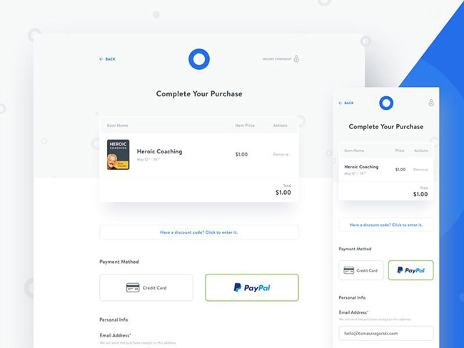
Your customers want to check out effortlessly when they buy your products on your website.
Don’t use checkout as a tool to get unnecessary information, promote other products, give them a survey, or distract with pop ups.
There is a place on your website for each of those tools but the checkout is not that place. Make the checkout process on your website fast and simple, not annoying.
Meet Customers High Expectations
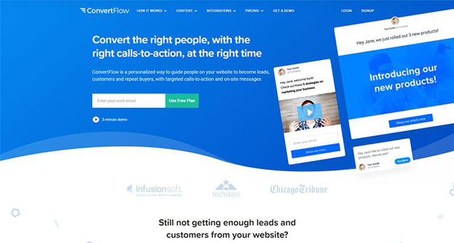
Mega-sites deliver amazing checkout speed and follow up confirmation and delivery service. Customers expect the same service from all e-commerce sites.
Make sure they get that easy checkout, instant email confirmation and fast delivery from you. Superior service will give you an edge over your competitors.
Don’t Overwhelm the Customer
If filling out multiple forms or questionnaires is necessary, keep it interesting. Be sure the site is visually comfortable with white space and bold fonts.
Customers will walk away from small pastel text barely distinguishable from the background. Try to group the forms or questions in small increments so as not to overwhelm.
You Want a Customer Focused Website
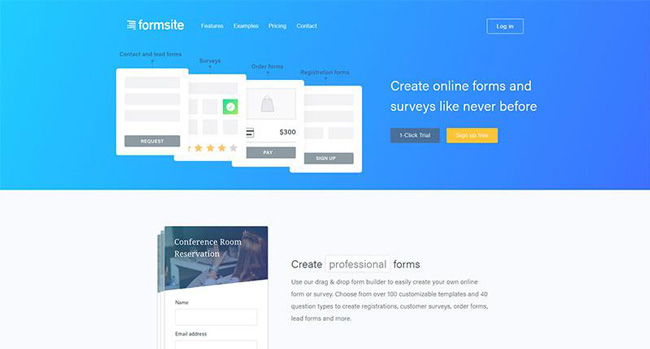 https://www.formsite.com/
Your product or service meets a customer want or need therefore your website should be customer focused.
Devote your website space to promoting your product or services so customers’ needs and goals are seriously considered. Make sure they know how any information collected about them is to be used.
Positive Subliminal Influences
According to research and our own experience, our decisions are influenced by images and objects surrounding us.
For instance, the sights and sounds of the winter holiday season are filled with symbols that trigger the joy of giving and sharing.
Holiday music, special foods, religious and secular symbols and even the weather can trigger a positive reaction to take part in the festivities.
Choose images for your website that elicit positive reactions and send the message you want customers to receive.
If you are selling candles, choose images of your own candles in a real setting that will draw a positive reaction from the viewer.
The image of a six-hour candle slowly burning down could be a meaningful image that embodies your message. Candlelight loving customers are positively inspired.
Ineffective graphics on your website are useless because they fail at the job of securing more buying customers. Use only original graphics of your products that inspire positive action. Anything less does not belong there.
Make an Offer with Real Value
Stand apart from your competitors; offer a proposition to your buyers that has real value.
Your valuable proposition encourages your buyers to try your product or service. Be specific about the value benefit they’ll get from buying it. Successful startups do this with their site designs and it works well.
Your value proposition will depend on your understanding of critical factors. To create a great value proposition, you must understand the following factors:
– What exactly are you offering?
– How do your buyers benefit?
– Why is your product or service a wiser choice than your competitors?
– For whom is your product or service intended?
Acquire Sales Skills
Contrary to popular beliefs, sales skills can be taught. Marketing and selling is how you get your products or services in front of customers.
Without implementing these skills your business will likely fail even if your products and services are superior.
If sales are not a comfortable skill -set for you, then hire someone for whom it is with a proven record of accomplishment. You will gradually learn how to sell through your association with salespeople.
Stunningly Clear Website Copy
The purpose of site copy is to draw customer interest. Reading clarity is essential and understanding must be easy and quick. Avoid jargon and insider terminology on your website.
Usually, you are not selling to insiders so speak in easily understood terms so all customers know instantly what your product or service can do for them.
Prove the Value of Your Product or Service
– Once a customer uses a product, they are involved in it. They make it their own by entering data into it. Every second a user spends trying out features is an investment in their use of the product.
– When presented with the option to purchase or subscribe to a useful product they will more likely say “yes” because they are already invested in it. Of course, if after a trial period customers find no use for the product your priority should be product improvement until it reaches a high level of customer satisfaction.
– Consider the value of freemium service. Your customers will be allowed to use part of your service but if they want all services they will have to purchase the premium product. This lets customers use the product for free and then upgrade if they like it.
– Freemium is an ideal model for many online Software businesses because once they begin using your product, they depend on it and will want the premium version to enjoy all the benefits available. They’re comfortable buying this way because by the time they buy they know what they are getting.
– Letting customers try your product for free takes the guesswork out of buying. Offer them a demonstration of the program, a free trial period or a freemium is an excellent way for your product to close the sale for you. Letting people try out your product is an excellent way to win customers.
That is, after all, what a successful website is designed to do.


