A corporate website is a virtual entrance to your business. Through it, your potential clients get to know your company. Thus, it should be appropriately developed to create the desired attitude and engage your customers to action. In this article, we will suggest a checklist for a good site and see some stunning corporate website examples.
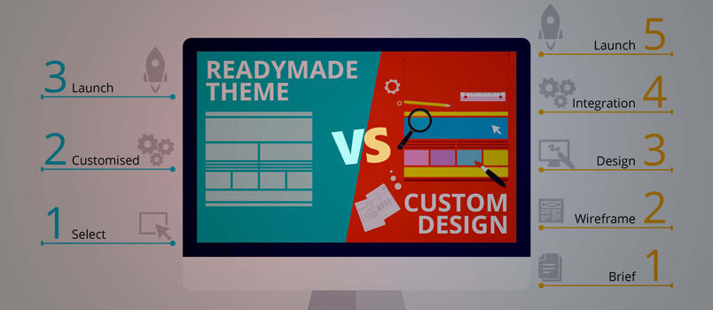
Experts suggest there are two options for creating a design concept: either through choosing a template or building a customized corporate website. In both cases, you will be able to reach benefit. However, some agree that a custom-made software is always better than templated for business.
However, it takes more than just visually appealing layouts to gain respectable and trustful clients’ attitude. The best corporate websites also work really well.
Among the top qualities of a modern corporate website design are:
- Fast loading
- Stable backend (i.e. reliable CMS)
- Minimalistic layout
- Extraordinary design solution
As modern society still judges a book by its cover, it is crucial for a business to address this issue through creating a stunning web design.
So:
What makes a good corporate website design
1) Purposefulness
First of all, a corporate website should have a clear objective. It may be different depending on the specifics (to sell a product, to raise awareness, to gain subscriptions, etc.). Proceeding from that goal, it is advisable to develop a concept for the overall design of the site.
2) Focus on target audience
It is also crucial to correlate your message with the people you expect to interact with. After all, your business exists for that people, so they expect something from you. It is all about the UX – clients want a specific experience browsing your website. So you give it to them through a usable UI.
3) Compelling value proposition
To make your target audience act like you expect them to, you should indicate the sense for them to do so. That is – to create a value proposition for whatever you are selling. To make this happen you should answer the big “WHY”: why do your customers need your product. A value proposition should be clear as it is a basic part of a successful corporate website design.
4) Responsiveness
If you want to expand your reach and increase the number of your customers, your site should be designed in accordance with all types of browsers (at least for popular ones). It is extremely important to take this into account when starting the development of a corporate site. In addition, today there are many users who browse the sites from their mobile phones. Make sure that your site is created specifically for your smartphone clients.
5) CTAs
Calls-to-action are your business’s best friends because they lead your customers to the right places on the website. They shape customer journey to look like you expect it to. You can see some good examples here.
6) Dynamic design
People enjoy visiting elegant and brightly designed websites. If you are planning on long-term customer retention, you should maintain that feeling. It can be achieved through dynamic design. It is a rather modern option and refers to a site being flexible to correspond to user needs. You may either change your website from time to time based on the results of A/B testing or use dynamic content (i.e. if you have an online shop).
7) Effectiveness
Last but not least, your website needs to be usable and effective for your set business objective. The navigation should be simple and intuitive to ensure your visitors won’t be lost. Moreover, to gain most of your website, the user interface must be clear and client-oriented. You should serve the best to achieve more.
Now we introduce you to the list of corporate website design examples for inspiration:
DENSO Brand Site
 The layout of this advanced automotive technology supplier demonstrates unique transitions between the page sections. One can see appealing visuals and minimalistic features as the core elements of the overall concept.
Charco & Dique
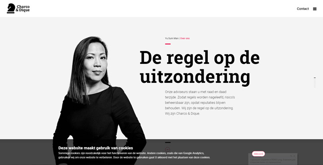 This is the website for a risk management consultancy firm from Netherlands. Designers did a good job in creating a bespoke layout with smooth transitions. The website has a clear understandable structure providing a great UX.
CoreCompete
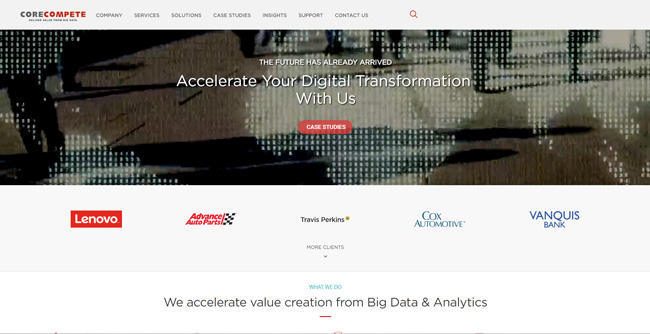 This financial analytics company presents a complex yet understandable navigation. The overall design concept is user-friendly and intuitive. It does not confuse a visitor but guides smoothly through the site.
Crosstrees House
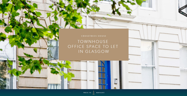 Crosstrees House letting office demonstrates a startling way to scroll – you need to go up (not down) to see the contents. In addition, the website is visually attractive and engaging.
AND CO
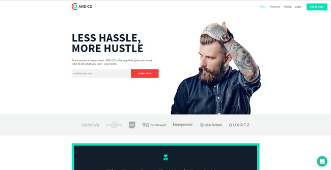
Inmarsat Research Programme
 The website is full of stunning visuals: parallax effects, graphs, and transitions. It also implemented a dynamic design. The menu navigation is worth separate mentioning: it is extremely usable and user-friendly.
Dome
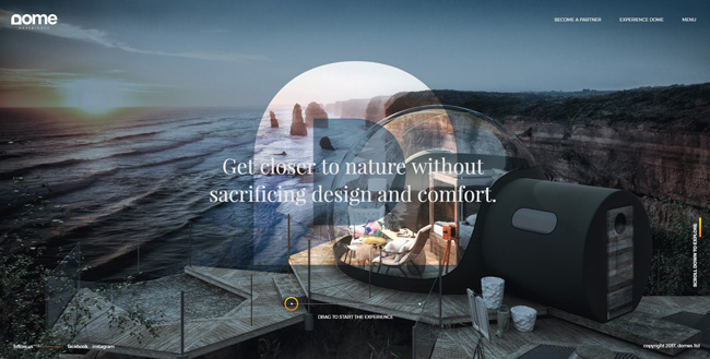
Honders/Alting
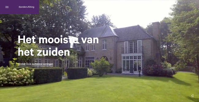 First, you see on the homepage of this broker company is a video with sound effects. It is clearly engaging and keeps the clients interested. The website is brilliant in its simplicity and minimalism (which creates a good UX).
Sunseeker Brokerage
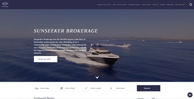 This website for yachts seller is greatly serving its purpose. The navigation is intuitive and simple, you see a lot of visuals. Despite its external simplicity, it demonstrates an extremely usable UI.
Dataminr
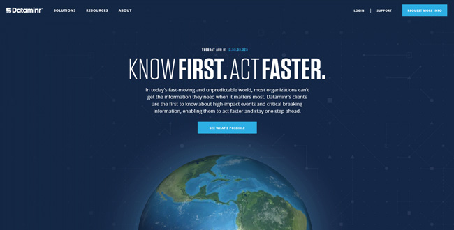 This real-time information discovery company created a great example of dynamic design. In addition, it has a convenient side menu and nice visuals (i.e. parallax).
Final Words
After you saw our list of the best designed corporate websites, did you make any conclusions to yourself? We hope now you will have much fewer concerns about the ways of building a corporate website. Just keep in mind the major features of a good one: purposeful, effective, and targeted.

