To begin with, we all know that owning a popular online project is not the easiest thing for today. Needless to say, there are a lot of different colorful and attractive websites that already exist. Thus, you have to create something that is truly unique in order to stand out from the crowd. Without a doubt, you know a lot about such trendy things as Parallax or Lazy Load effect. Unquestionably, these techniques are cool but know almost everyone uses them. All in all, would you like to know more about web design?
Don’t you think that there are many awesome things that you still can use? Seeing that, in this post we are going to tell you about top 5 unusual trends that will help you to create a fresh look of your site. Are you ready to meet them? Let’s create a brilliant appearance for your website together!
 more details
Use More SVGs /Cinemagraphs
Remember about these awesome animated pictures in high-quality? First of all, scalable vector graphics provide shining look for your future website. Needless to say, these files have many pluses comparing to GIF, PNG, JPG and other traditional image formats. For example, the most important advantages of SVG files you can see just from their name! In a word, they are vector and scalable. As you may know, these files consist of vectors, so they are not pixel-based. To make a long story short, SVGs are the resolution-independent files. For these simple reasons, SVGs will look great on all the devices as well as on any screens. Seeing that, you can forget about worries! All in all, using SVGs you don’t need to make everything Retina-ready.
What else should you know about this amazing format? Needless to say, one can easily animate their SVG files but these are not all the good news. What is more, SVG files do not require any HTTP requests. Why is it so cool? Well, you can simply run a usual speed test to check your online project and see that the mentioned requests, actually, slow down its work.
To sum everything up, with the help of SVGs you not only get a charming web design but also improve the work of your website! Seeing that, don’t hesitate to use some SVG files for your own online project! All in all, there are a lot of different beautiful images, so you can always find something special for you.
 more details
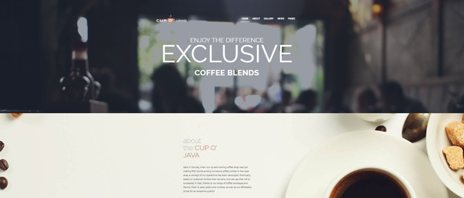
Here is another impressing thing you may use for your website! As you may know, cinemagraphs are the high-quality pictures that include some animated elements repeating movements. In fact, cinemagraphs are extremely popular today. Would you like to know why? First of all, they can either be GIFs or videos. Needless to say, these formats provide you with a high quality of an image. Actually, you can easily find a cinemagraph for any personal needs. For example, it could be a cup of tasty coffee with moving steam or an inspiring landscape with floating clouds. Shortly, don’t hesitate to google more about this marvelous format. To summarize, a properly chosen cinemagraph can be visually striking!
Animation is Trendy Again
Needless to say, animation has always been a popular thing. What is more, these days various web designers are searching for the new visual tools that allow building an attractive and impressing animation. In addition, don’t forget that now it is pretty easier to create animation. Seeing that, you may ask: but why animation is unusual? Well, it is because some people think that it is not trendy in 2017.
Well, in this case, you are wrong, as animation does play an important role in web design. Still not sure about it? Thus, just try to use some eye-catching animations for your online project and then ask your visitors about your site’s look. Believe us, people enjoy worthy animation when it is not overused. All in all, don’t be afraid of changing!
Card Design and Grid Layouts
Without a doubt, card design is still changing and influencing the web design trends. Needless to say, we will certainly view these bright changes during the next couple of years. So, why you should think about using card design for your online project? Firstly, such design provides your site with great organization. Secondly, card design means simplicity.
By the way, haven’t you forgotten that simplicity is an indispensible part of success? What is more, card design is also popular because of its responsiveness and flexibility. To sum everything up, it can be suitable for pages that have an abundance of data. Thus, such online pages make the information more accessible and enticing. Seeing that, don’t you think that today is a perfect time to try some grids for your site’s design? All in all, there are a lot of variations that you can use.
Greenery
And now let’s think about the color palette of your website! Well, it is not a secret that a successfully chosen palette of colors for your site quickly evokes the pleasant emotions among its guests. Unquestionably, it easily makes people active on your website. What is more, according to the statistics, almost 90 % of all the online shoppers state that the color scheme of a site is the first thing they look at.
Moreover, color palette literally makes users to view the shown items and even buy them! In the end, with the help of a good color palette you get both an incredible appearance of your project and a great way to introduce your products. Thus, now you should more about the trendy colors!
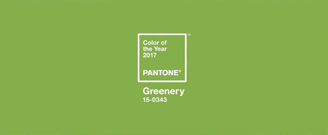
Without a doubt, you have already heard about Pantone… So, they called greenery the most fashionable color of this year. Well, just look at these charming and calm shades! Needless to say, greenery is the color that creates an awesome contrast with all the possible tones. All in all, there are many color combinations you can create for your web design with the help of greenery! Thus, don’t waste your time and create your own trendy website right now. Would you like to hear about the other popular colors? In a word, all of them are bright and bold. They are: red, pink, purple, deep purple, indigo, blue, cyan, teal, lime, amber, brown, deep orange and blue gray. As you can see, these days you have all the opportunities to express yourself!
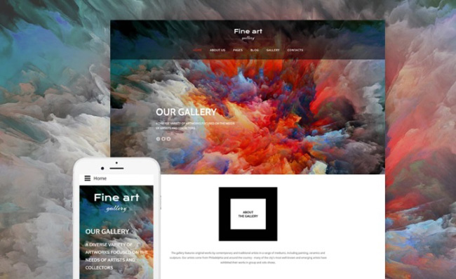
To finish with, keep in mind that duotone (an image that includes 2 colors) is another trendy thing in 2017! Unquestionably, you have already seen a lot of gorgeous web designs made with duotone. Still, it becomes even more popular this year. What is more, today people use duotone not only for images but for videos as well.
Create Contrast Using Bold and Non-bold Typography!
Undeniably, typography is the thing, which performs a great role in the visual look of every online project. For these simple reasons, you need to think twice about typography while designing your long-awaited online project. In this case, you can just open your browser and search for the most unusual web fonts in Google.
Without a doubt, you will quickly see a lot of different interesting and useful posts. Thus, you may think that now your main task is to be inimitable. Well, the thing is that rare and unusual doesn’t always mean good. To begin with, quality is the first think you should remember about! Basically, these days there are nearly 55 000 various incredible web art fonts you may use for your site. Still, not all of these fonts are good and readable enough to be used for your website’s design.
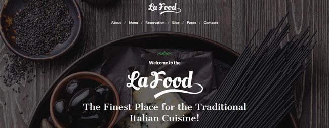
In general, during last years the most popular web fonts were the simple neo-grotesque ones. Such as: Roboto, Open Sans, Helvetica, Lato and much more. Yes, these web fonts are readable enough and quite comfortable to use them for the paragraphs. Still, fashion is an unpredictable thing, even if we are talking about web design. Would you like to figure out what is popular among the web designers now? Well, contrasts are trendy again! To illustrate, various serif fonts (contemporary looking fonts without some decorative finishes, e.g. Arial, Circular, Gotham, Futura, Avenir, Verdana, Franklin Gothic, etc.) are commonly used with the non-serif ones now.
What is more, these days animated texts are also in use! As a result there are a lot of videos, images and effects placed on them. Finally, here is the list of 10 worst web fonts you should avoid, if you would like to get a worthy site.
- Impact
- Vivaldi
- Courier New
- Bradel Hand ITC
- Lobster
- TheSans
- Symbol
- Kristen ITC
- Curlz MT
- Comic Sans MC
Well, these were all the news for today. Don’t hesitate to tell us what you think about the mentioned web trends. Maybe you have something to add? In this case, don’t forget to leave your comment below this article!
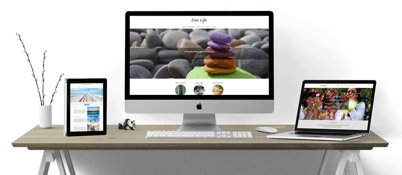
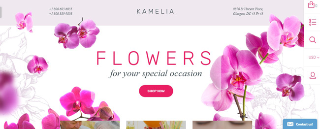
P.S. The screenshots above are from TemplateMonster. You can visit their Service Center in order to get more information about these wonderful and well-running themes.

