Have you considered turning your breakthrough idea into a profitable business?
A great mobile app is the right solution for you! Mobile apps are trendy and accessible, and they open a lot of opportunities for startups and prospective ideas.
When performed properly, creating and launching apps can be the ‘deal of a lifetime’ for many designers. However, the task is challenging and there are many things to be considered in advance.
For the purpose, we set up a list of common mistakes in app design which can help you deal with complex obstacles, or at least to avoid them. Let’s go through them:
Underestimating platform compatibility
 When designing an app, have a precise idea on the platform where you’re going to display it (IOS or Android).
Every designer faces this dilemma, but there are only few that dissect options in a comprehensive manner. Inexperienced ones base their decisions on common stereotypes (for instance, many designers design for IOS, because they were told monetization is easier within their App Store).
What is true for certain apps may be a fatal mistake for others, so you might consider all circumstances before launching an app.
Small clicking targets
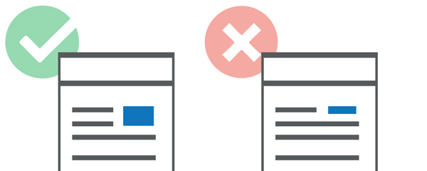 Doesn’t take to be a designer in order to estimate the size of this problem-we’ve all been annoyed by small clicking areas, especially when we miss them and we open a completely different page.
Some of the users perceive it as an internal failure and they think the site/app is not responsive. Not even to mention how problematic these small clicking targets are for older people or users with sight disabilities.
Before you start, consider that the average width of human fingertips is between 1.5 and 2 cm. Even if it was smaller, the user’s finger moves very fast and it scrolls on the screen without being able to tap reliably on a particular part.
Therefore, don’t heap the screen with a pile of buttons, but make sure you have the right ones and in an appropriate size.
Focusing on one screen-size only
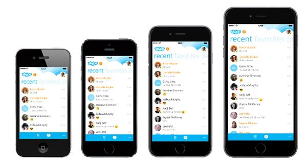 Whatever you do, make sure your app will be equally good-looking on all size/shape devices. Have you designed for one screen-size only, your app will face problems to scale and function, and users will be disappointed in the quality of your product.
To start with, have an idea on how the app is going to look on various screens. Take the average size (tablet) measure and try to resize it. Previews are available through many different tools, which also offer rotating and landscape orientating options.
Take IOS as an example-this operating system has four personal sizes to worry about!
If going for the IOS platform, we recommend you start with the commonly chosen highest resolution and to reduce size from there on. If you can, substitute scaling bitmaps and manual adjustment with vector graphics. It will make your work more simple and accurate.
Blind-copying of other designers’ ideas
As we already said, what is perfect for one app may be devastating for another! You can literally replicate mobile OS conversions, but that doesn’t guarantee you they will match your app’s features. In fact, you could end up annoying potential users.
Blind-copying is especially not recommendable from one platform to the other.
Mobile operating systems were created with the purpose to be unique. Therefore, copying can cause even legal troubles with huge players such as the App/Google Play stores. Instead, you could check their guidelines and suggestions and you could develop ideas based on them.
Besides, isn’t all the effort about originality? Why wouldn’t you personalize your work and add some branding to the app? Not all apps have to be overwhelmed with the operating system they were created for (however, try to remain clear when informing users about the platforms).
Losing focus from the final user
Users should always be on your mind when creating apps. In fact, it is recommendable to put yourself in their position and to think about their needs and expectations. How would they interact with your product? What could motivate them to choose your product between similar ones?
As good as your app may appear to you, test it! You have a wide range of tools (from beta communities to family gatherings) through which people could give you an opinion on the interface. You must know this before you release the app.
A good designer should always predict how users will react to his UI/UX.
You don’t want to create an app only you would enjoy, do you? Start focusing on your users and you’ll develop an awesome app design.
Repeating information requests
Nobody likes to be asked the same question twice.
In fact, that was the original purpose for creating computers-using machines to memorize information.
Users should not be bothered to fill in the same data, just because the programmer was too lazy to transfer it to the other parts.
Crowding the app screen
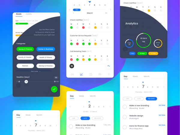 Example of how it should be done. Source
You’re good and you’re always there. Your customers will know this even when you don’t stare it constantly in their faces.
Make sure that all of your features are present, visible, and applicable and your work will be done. You don’t have to ‘throw’ everything on the starting screen and add hundreds of unnecessary buttons.
The more complicated it gets, the more risks you’ll be facing. Too many features can expose the system’s insight on data which can confuse users and it can make them think there is something wrong with your app.
This can happen especially when you are designing dashboards. You’ll feel an urge to add everything there, at the users’ fingertips.
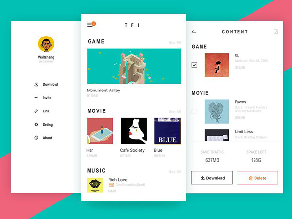
People don’t like to be overwhelmed with features from the beginning. They want to explore and to be challenged, while sometimes they only want to use the simplest features you have.
At the end of the day, don’t you think that some features are cut for the future? What would you do when you need improvement and there are no means to achieve it? Think about this if you want to remain relevant and to maintain customers for as long as possible.
Excluding users from the process
Giving your users a bit of control is not going to take your leading position away. With proper navigation schemes, users should be able to control movement and to direct actions according to their needs and traditional workflows.
Designers have the unpleasant practice to gray out controls and to keep it to themselves, which is not exactly what users are expecting.
Launching a design career is just as difficult as launching any other. It takes time and mistakes until you finally become popular and you get your own audience. If you fail, try again! You should never be discouraged, neither by your own failure or other designers’ achievements. It will be slow and possibly painful, but success always takes its toll.


