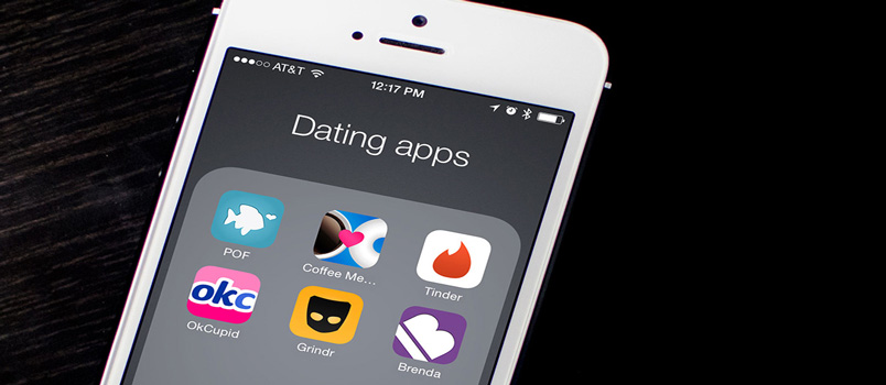
Telling that you have met your spouse or significant other through a dating app is no longer shameful or surprising. In the past two years, the number of online daters have tripled and today, over 15% of Americans have had an online date (or more than one).
From the business perspective the dating industry seems rather lucrative as well:
– The average annual in-app spending is $243 per user.
– The annual revenues are currently estimated at $2 billion with a projected 4.9% growth over the next few years.
While the above sounds promising, you are probably wondering how to make a dating app that stands out from the crowd? After all, the competition is already there – Tinder, OkCupid, eHarmony and Zoosk to name a few. Here’s how you can overcome it.
So What Do The Best Dating Apps Have in Common?
Applause has recently conducted a major research to discover the best and the worst dating apps in the US based on user’s reviews of Android and iOS apps:
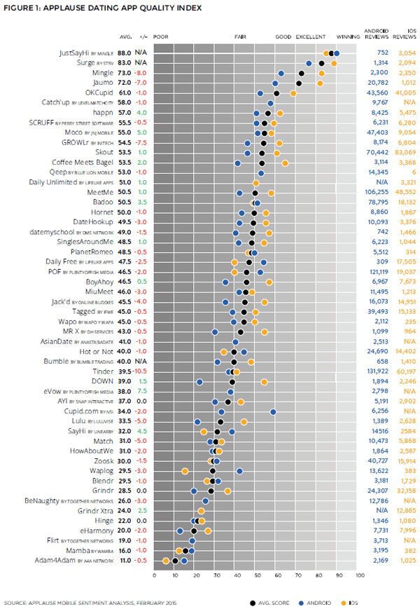
Let’s take a closer look at the winners and what they have in common:
– A clearly defined niche e.g. dating for gay men like Jaumo and Scruff.
– Unique set of features e.g. video chat and public group chat (JustSayHi and Mingle).
– A non-standard approach to dating. Happn app shows you the users you have crossed paths with today (or those nearby right now) that you can meet.
So before you hire dating app developers, work on refining your app concept. Will it be a social app or a purely dating app? The one geared towards establishing long-term relationships or just having a casual hookup? For startups, the best option is to design an MVP first and test their concept assumptions with a selected audience.
And below are some extra tips to give your product a competitive advantage and help it make to the next “best dating apps” list.
Create a Refined Matchmaking Algorithm
The worst online dater’s nightmare is running into some real creep during a date, especially for female users. Others are mortified with a thought of getting matched with a co-worker or a distant relative (and yes that happens quite often at popular dating websites).
Here’s how the matchmaking magic works there:
– Match and eHarmony have lengthy personality and interests surveys that users are expected to fill in order to get matched. This option isn’t really great for a mobile app as typing gets cumbersome.
– Tinder matches are based exclusively on your profile pics and physical attractiveness. The app, in fact, rewards users, whose looks are prettier by showing their profile more often. They have an internal “Elo score” to rate users for “desirability” based on the amount of yay/nay swipes they receive, and some additional factors.
– Zoosk has a simpler yes/no questionnaire to assess user’s personality and suggests relevant matches.
And here are some folks, who have enhanced their algorithms:
– Hinge app matches you only with friends-of-friends at Facebook and users tend to say that this app has less of a hookup tendency. The number of matches per day is also limited and you are expected to start a conversation within 14 days since the match.
– Coffee Meets Bagel – a trendy new app gives you just one match (a bagel) per day, again only from friends-of-friends.
– Happn encourages users to immediately get together in real life. It will notify the user when there’s another member nearby and suggest you meet immediately.
These are just a few ideas how you can improve the matchmaking. Additionally, you may ask the dating app development company to add certain custom filters into an existing algorithm e.g.
– Do not match people working at the same company
– Go invisible for friends/certain connections.
– Get matched only with people who you have 5+ common friends with.
If you want an entirely custom matchmaking algorithm to create a dating app for relationships, rather than just casual hookups, here’s another idea to consider:
You can create an app that will import user’s friends from Facebook (or another social network) and allow rating everyone on an attractiveness scale e.g. would date, just friend, secret crush etc. Now, when two people rank each other with the same/similar parameter, they get notified and can start chatting together. This should help avoiding the common drama and doubts like “Should I ask her out or we are just friends?” and “Does he flirt with me or is just being nice?”
Introduce Better Photo Verifications
Another oh-so-common frustration is when your online date doesn’t look even remotely close to their profile photo. While of course, personality matters more…we are still attracted to people who possess certain looks. Some prefer folks with facial hair, other’s don’t like peeps with visible tattoos and so on.
So, if you want to develop a dating app on iOS that is significantly better than the competition, consider implementing some additional photo requirements. Here are a few ideas we came up with at Alty Inc.:
– All pictures should be taken through the app as a selfie.
– Selfies or imported pictures shouldn’t be older than 30 days.
– Pics with sunglasses, blurred or dark photos get automatically rejected.
– You are required to upload one portrait and one full body picture.
– Limit the number of prospects or functionality unverified users can access.
Badoo recently made a curious change to their photo verification process, which now requires users to upload a picture where they perform a distinctive gesture:
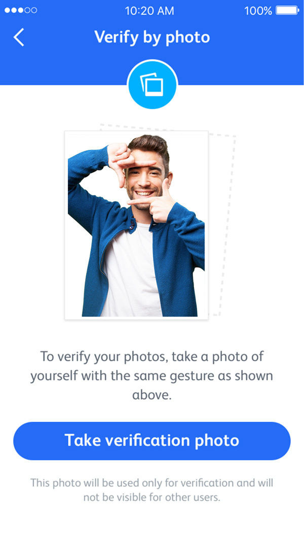
The app will later compare the uploaded selfie to other pictures on your profile to verify you. Quite clever, right?
Reduce The Creep Factor
Online harassment is a serious issue and the stats are rather disturbing within female users (who are more reluctant to use online dating apps in the first place).
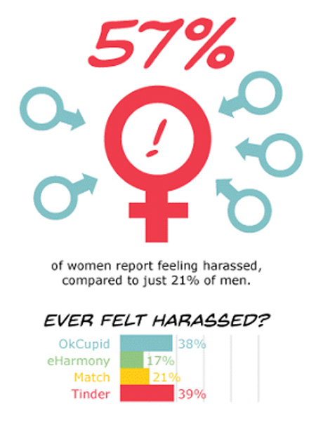
The question you should be asking is – how build an app like Tinder, which is more appealing towards female users?
Here are a few solutions that took off lately:
– Women-first messaging. Only girls can initiate the conversation with a matched user.
– Gradually revealed profile photos. Users can choose to initially blur their profile picture and reveal those gradually only to certain prospects.
– Minimum friends/connections requirement should reduce the number of fake accounts created for harassment purposes.
– If you choose to build an LGBT dating app, you may want to have additional user verification mechanisms in place as this user segment often receives, even more, harassment online. For instance, require users to be verified/recommended by their friends or in-app connections.
Another tricky aspect of dating app development is whether you should ask users to share sensitive data for verification purposes such as government-issued photo IDs or social security numbers.
On one hand, it can help you build a more reliable community. On the other, a lot of people will feel reluctant about providing this kind of data, especially after the Ashley Madison case.
To wrap it up, dating market can already seem like a crowded space, yet there’s still plenty of room left for improved user experience – from choosing to build a “safer” dating app to building a more advanced matchmaking algorithm. The key here is to come up with an intriguing product concepts and thoroughly test it with the target audience first.

