

Seconds.
That’s about the amount of time it takes for online visitors to decide whether to stay on a web page.
Online users are less forgiving now than in the past. Anything from slow loading times to illegible content and poor navigation are all likely to make visitors quickly click the back button. Your website has to make a great first impression as it serves as the first point of contact for potential customers. Otherwise you risk losing sales to competing businesses.
Good web design matters for the following reasons:
– Creates a lasting impression: Online visitors are quick to make impressions based on what they see. A design that is riddled with cluttered elements or even grammar mistakes reflects poorly on your business. So invest in a quality web design.
– Builds trust: Web design also conveys a sense of trust. If your pages are filled with ads or lack certain trust symbols, potential customers would be less likely to purchase from your site. Building trust is incredibly important especially in industries like health.
– Facilitates online purchases: Even outside of business hours, your site can be turned in a sales machine. A well designed site is one that helps visitors find exactly what they are looking for, and complete their purchase. Awful designs do the exact opposite.
Those first few seconds to your site are absolutely crucial.
But with tons of sites on the Internet (and more created each day), building a site with an engaging design can be daunting. Here we highlight some of the many web design mistakes that we continue to see today. Any of these can push visitors to bounce out of your site just as quickly as they arrive.
1. Poor Navigation Structure
Visitors should be able to seamlessly navigate through your site.
If visitors cannot find the right page, they will simply bounce out. The best way to handle categories and subcategories is to implement a navigation bar at the top or side of your site. That way visitors can easily find the information they are looking for.
Here is an example of a simple and effective navigation structure for a dental practice:
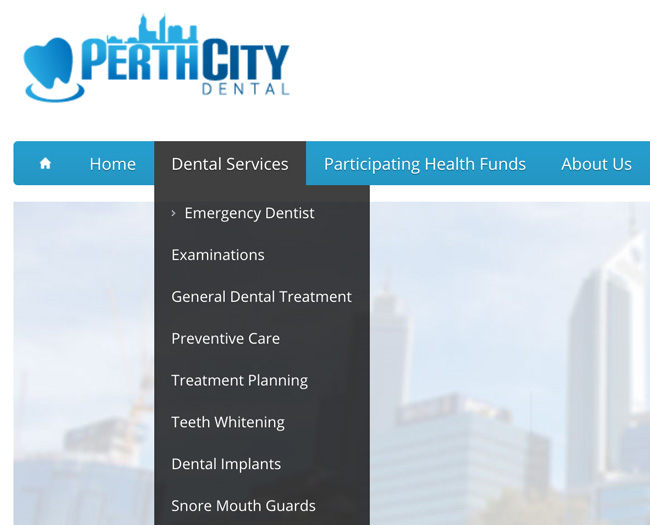
The navigation bar is clearly visible at the top and visitors can hover over the Services tab for the services they need. Visitors can also find out more about the practice and contact them to make an appointment.
What to do: Implement a logical structure to your site and be sure to keep all pages within only three clicks or less. Use categories and subcategories to organise the different products or services that your business offers.
2. Unreadable Text
This is another crucial aspect of web design.
You might have a beautiful and engaging design for your site. But if the text is too small or contrasts too sharply with the rest of the page, visitors will not be able to read the content. Blocks of text without any breaks or images also contribute to poor readability.
Consider the following examples:

In the first block of text, the content is too small and the colours make it difficult to read. But the second block of text uses a font style and size that is easily readable. Remember that visitors tend to scan text rather than read each individual word. So your pages should also include multimedia such as images and even video to break up content.
What to do: Use a Sans serif typeface and a decent font size to allow for better readability. Avoid any contrasting colours that make it difficult to read. Be sure to use paragraphs, headings, and images to make your content scannable.
3. Overly Cluttered Pages
A feature rich site may seem beneficial for visitors. But having too much clutter on a page can actually have a negative impact. Some of the best websites in the world are those that take a minimalistic approach (e.g. Google) with their web design and make ample use of whitespace.
Whitespace refers to unused space between different elements on a page. It is essentially the parts of a website that are not used.
Some benefits of whitespace include:
– Improved readability: A design that is free of clutter makes it far easier to read the content on the page. Simply adjusting line spacing or adding more space around images can help visitors find what they are looking for.
– Easier navigation: With only a few elements on page, visitors are able to quickly get a sense of a site in a short glance. This makes for improved navigation and an overall better browsing experience.
– Higher conversions: Less clutter means fewer elements that compete for attention. The use of whitespace is an effective way to highlight call to actions and get your visitors to purchase a product or sign up for a trial.
What to do: Eliminate unnecessary clutter from your pages and make ample use of whitespace. Remember to also put the most important aspects (e.g. call to action buttons, etc.) above the fold.
4. Lack of Responsive Design
Mobile is another area that cannot be neglected.
Data from comScore shows that traffic on mobile devices has already surpassed traffic on desktops:
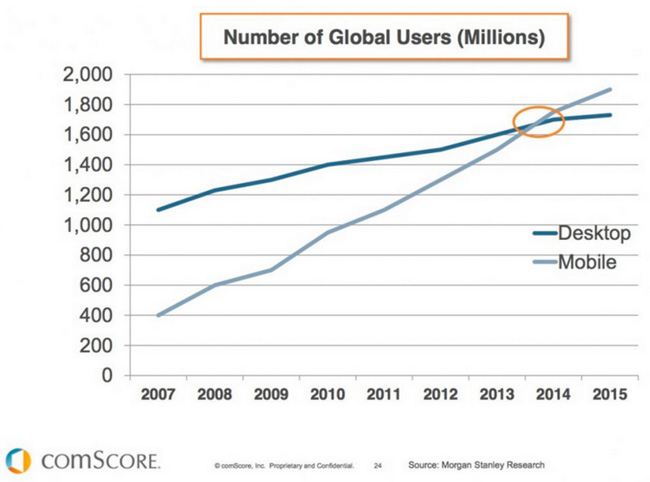
The bottomline is that more people are connecting online using mobile devices than ever before. Which means that your business risks losing a major competitive advantage without a mobile friendly site.
This is where responsive design comes in.
Responsive design is based on a grid like layout that dynamically changes to fit all screen resolutions. This means that users on desktops, tablets, and smartphones get an optimised experience for their device. It’s not surprising then that responsive design is actually Google’s recommended solution for meeting all mobile requirements.
What to do: Implement a mobile friendly design for your site, preferably responsive design as it is recommended by Google and has a number of SEO benefits.
5. Slow Loading Websites
Nothing is more frustrating than landing on a page only for it to continue to load after a few seconds.
An intuitive design is important but performance is another factor that cannot be overlooked. Extensive research has shown a strong correlation between bounce rates and loading times. In other words, visitors will not hesitate to exit a page if it takes too long to load.
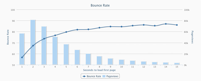
This chart from Torbit illustrates just how much of an impact that a few seconds delay has on bounce rates:
What to do: Use the PageSpeed Insights tool to see how your site (mobile and desktop) scores in terms of speed. Take steps to improve site performance from using caching plugins to optimising images and removing extraneous elements.
6. Not Staying Up to Date
Web design is constantly changing.
The early days of the Internet were populated with sites that had music playing in the background and heavy use of imagery and multimedia such as Flash. Other trends included fancy buttons and fonts that are mostly no longer used. Using any of these may have been acceptable in the past but implementing them now will certainly make visitors turn back.
Here is what Apple’s site looked like back in early 2000:
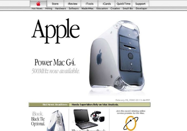
While the site was certainly fairly modern for its time, now it looks outdated.
This example illustrates why it is important to stay up to date on new developments in web design. Some trends may be just that (e.g. Flash intros) but others can give your site a major competitive advantage (e.g. responsive design).
What to do: Stay up to date on new developments in web design and look to see what other sites in your industry are doing. No need to overhaul your site each month but do take note of any new web design trends that you see around the web as they may be worth implementing.


