Over the years, the debate of whether inbound or outbound marketing is more effective has slowly waned in inbound marketing’s favor. Content marketing is king, they said in 2011, and content marketing is still king, they said in 2015. There’s no doubt content is valuable to businesses. The incredibly high ROI of email marketing and the growth of social media marketing are dependent on regularly published informative and intelligent content. Content can demonstrate value and help retain visitors, great copy can convince consumers to make a purchase, and shared articles and posts can help businesses gain exposure around the web.
However, content isn’t everything, and there are situations in which prioritizing content can be detrimental to success. Instead, more focus needs to be given to design, and design decisions, whether UX, UI, or graphic, will be the determining factor in user behavior. Here are 3 situations in which design is king, not content.
Creating a first impression
Much fuss has been made about the decline of people’s attention span in today’s world. The internet, smartphones, the proliferation of media outlets. All of these elements mean that the youth of today can’t focus on any one thing, and it’s true. People now have an attention span of 8 seconds, which is shorter than the attention span of a goldfish. This means that content will have a minimal impact on your first impression with consumers. Instead, this falls to design.
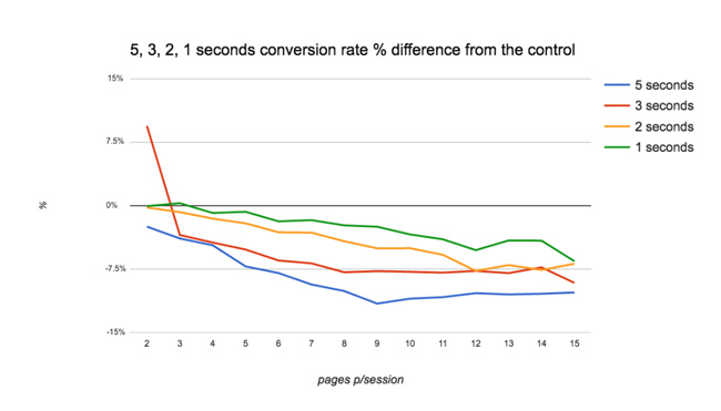
First impressions are everything when it comes to the digital world, and smart design choices will make or break a business online. 25% of website visitors will abandon a website if it takes longer than 4 seconds to load, so if a landing page is poorly designed and is slow to load, many consumers won’t ever see the website, let alone convert and making a decision. Indeed, a well-designed landing page is crucial to not only engage visitors in those first few seconds, but to create an impression that one website is better than the competition. As it turns out, 94% of consumers cite design elements as the primary reason that they distrust a website. Without great design, consumers will quickly turn away from that website to the next, better-designed one that they trust.
Targeting mobile devices
Everyone knows that mobile is on the rise, but how quickly it has grown is surprising. Between 2013 and 2015, mobile internet browsing increased 78%, and last year, mobile search finally outpaced desktop search. Mobile search shows no signs of slowing down, meaning catering the digital experience to smartphones is crucial to maximizing your online reach. This means responsive design is a must, and without it, you will lose the mobile audience before you have a chance to win them over.
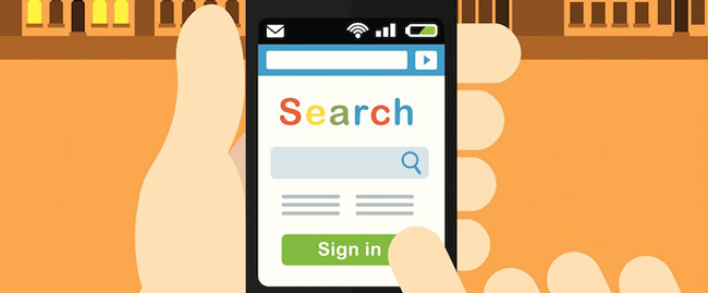
However, successful mobile design includes more than simply changing fonts and page structure to meet a mobile device. It involves rethinking the layout of your entire website. Users need to be able to easily navigate between pages without returning to a home page or using more than two finger taps to get there.
A well-designed search bar can also replace the need for a robust menu if you have too many web pages to make a traditional menu feasible. This interconnectivity of pages will actually help build your website’s SEO as well.
Converting a consumer
Design and content can be thought of as a one-two punch. Great design can delight and attract consumers, and great content can convince them to become a customer. However, it’s at this final stage, the actual conversion, where design becomes king once again. A business can have great content, but if signing up for a subscription is a hassle, they will walk away despite the impressions they gained from the content they read. Because of this, designing an amazing conversion funnel is a priority for any business online.
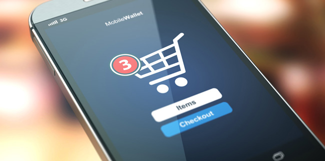
It isn’t enough to offer value and to wow consumers aesthetically; at the end of the day, simplicity and ease-of-use through good design are paramount. What good is great copy if a consumer then needs to fill out 30 fields attempting to buy it? Design not only impacts the call to action button, and whether consumers even know they could be signing up or buying on the spot, but also how the sales process works.
The layout of an ecommerce store and how consumers can navigate it is of more importance than the content copy you can read about individual products. After all, each product will likely include pictures, which go a long way on their own to building trust and showing relevant information to consumers. Perfecting the sign-up forms, the conversion funnels, and how your products are arranged for sale are key design elements that can significantly boost conversion rates.
Do you know any other situations in which design is more important than content? Leave a comment below!


