Every idea in the world is a copy of something else, either from previous works or real life. There’s nothing new under the sun but that doesn’t mean you shouldn’t look to improve upon existing ideas and relay them into your design work.
And finding quality design inspiration doesn’t have to be difficult. Below I’ve curated a handful of the best websites, galleries, and tips for finding & refining your creative muse during the design process.
From initial concept to wireframing and final mockup there’s so much room for interpretation. Browse through many different ideas to improve your creative strategy and to add a variety of unique design traits into your work.
On The Search For Inspiration
There are countless free websites you can browse for design inspiration. These range from online galleries to blogs and even viral sites shared on social networks like Twitter.
But you won’t find valuable inspiration just browsing through cool websites. You need to target your search to whatever fits your current project.
If you’re building a law firm website then you probably won’t get many ideas by studying software landing pages. You might find certain colors or fonts that could work well on your site. But you’ll find more practical inspiration browsing through galleries that target your current project’s theme.
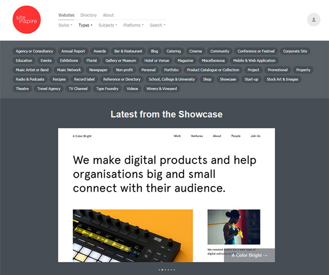
My favorite is siteInspire because it lets you sort by website types and business styles.
I’d also recommend a handful of other web inspiration galleries which get updated frequently. They’re all worth saving for the future if you’re looking for usable web design ideas.
For more specific design inspiration just check Google. Many design blogs have their own inspiration categories including Designbeep. The best design sites include really specific inspiration galleries that’ll help you find ideas for all of your projects.
For my previous example you might try something like “law firm website inspiration” in Google. But you can also browse through popular blogs to see what they have to offer.
Here are some of the best web design inspiration blogs to check out if you’re in the mood to do a little browsing.
Every year it seems like more inspiration galleries find their way online. There is no single best resource for this type of work so I recommend just searching online and seeing where you end up.
But the inspiration hunt is just the first step. Once you find some great ideas you’ll need to organize them properly.
Organizing Your Thoughts
I often take notes on paper so I’ll write down my favorite design ideas and include links to the sites using these trends. But it’s far easier to save your thoughts online with digital boards.
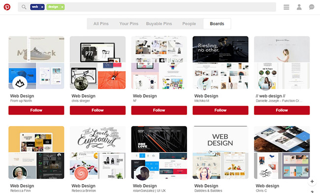
My #1 favorite webapp for mood boards is Pinterest. Most boards are public but you can sign up for an account and build your own private boards too. The site works like a visual mood board so you can save all your favorite designs on a single board for each project.
This makes it super easy to use and even share with clients if they want to see your direction for the project.
Once you have a small list of designs you can start organizing your goals for the project. Every layout should have a natural flow starting with the homepage and moving through all internal pages.
What should visitors do once they land on your site? Where should the nav links go? What are the primary functions of your website?
I like to make a list of goals to ensure that my UX design work aligns closely to the expected user experience. Most of the time I’ll just write my goals on paper.
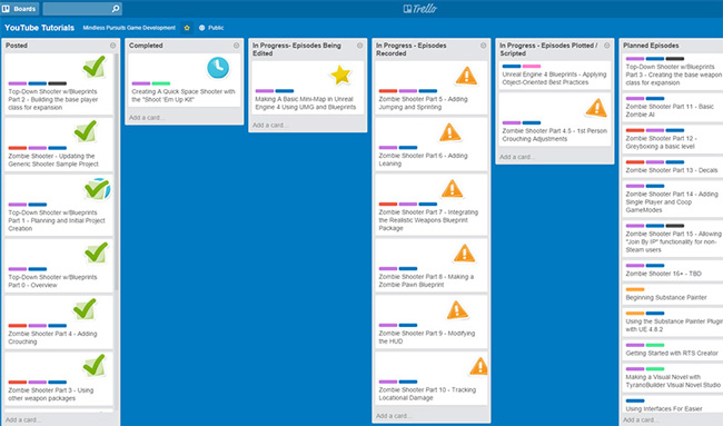
But you can also use free task management tools like Trello.
Some designers may call this over planning. I think it’s just the right amount of planning because ideas can be rather vague in your head.
By getting them down on paper(or in Trello) you’ll have an easier time articulating how these ideas translate visually into a layout design.
The specific tools you use don’t really matter as much as just following the process. As long as you’re finding quality inspiration online & logging your ideas somewhere then you’re on the right track.
Ideas For Wireframing
Once you have a solid list of websites, design trends, and have them all organized, it’s time to put these ideas to work.
Wireframing is the best place to start because it’s simple yet efficient. You put down your ideas rapidly and you can quickly change them if they don’t look right.
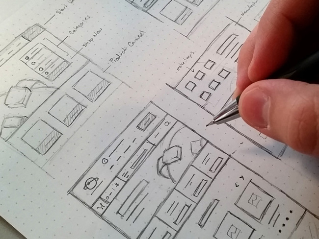
Many designers prefer digital wireframing because they try to avoid drawing. But paper wireframing is quicker and easier since a pencil offers quicker input than a mouse & keyboard.
Also you don’t need to draw well to wireframe. It’s actually more about sketching than drawing. And if you practice daily even just 10-20 minutes per day you’ll see improvements.
I’m big into wireframing on paper because it’s easier, but it also saves time and money. Free wireframing software is OK but it can be clunky for big projects. And the top tier wireframing programs cost good money.
Thankfully with so many great wireframing templates you don’t need to worry about software.
The free Interface Sketch website offers dot-grid templates for mobile and web browsers. They’re perfect if you prefer sketching on a dot grid, although it’s just as easy to sketch on a plain piece of printer paper.
Now you might prefer digital wireframing because it makes the mockup design stage a little easier. In this case I’d recommend using your design program of choice, likely Photoshop or Sketch. You can even grab free wireframe templates and cool resources like Blokk Font to make your life easier.
You can export wireframes as digital files and import them as backgrounds for your new mockup files. Then re-create the wireframe objects with shapes and add more detail from there.
I recommend creating at least 2-3 different wireframes before moving onto the full mockup design. Creating a brand new mockup takes time.
Wireframes give you a blueprint to work with so you’re not building a design that looks terrible and starting over from scratch.
Once you’ve chosen a final wireframe you should also try sketching some of the internal pages. These often have altered layouts compared to the homepage so it’s all a matter of saving time in the end.
Mockup Design Trends
At some point during the wireframing process you’ll stumble onto the “perfect” concept. Don’t spend too much time looking elsewhere.
Just go with your gut and move into the mockups phase. By now you should already have plenty of great ideas that look good on paper. The next stage is rendering into a full mockup with software like Adobe Photoshop or Sketch.
This is where your inspiration list comes in handy. Whether you use Pinterest or just save links in a text file, the goal is ultimately to render your design cloning from a variety of trends you found on other websites.
Go through your list and figure out which features you want to replicate. I encourage you to change up the designs so they better suit your mockup.
Alter the colors, fonts, textures, whitespace, or anything else that makes the layout work better.
Since mockups take so long to complete you’ll benefit from heavy planning in the earlier phases. So when you open Photoshop(or Sketch) you’ll know exactly what you want to do and how it should be designed.
Wrapping Up
The early stages of any project are the most important. It can be difficult finding enough time to research your ideas and collect inspiration. This is time consuming but the end result will always be fantastic.
I’ve outlined all of the initial design phases starting from idea generation to digital mockup design. After that you move into development and there’s not much room for new design concepts. So if you pour your energy into the early stages and get everything right early on you’ll have a much easier time building great websites without many revisions.


