This year some of the biggest brands across the board have changed up their logo design. Changing branding seems to becoming a very popular in 2016 decision. Rebranding is often a hit or a miss with consumers, especially for well-loved and known brands.
However, changing up your business logo design could be a great way to enhance your brands image on social media and online. Let have a look at just some of the brands who have taken a leap of faith with their new logo design.
Instagram Brings Their Logo to Life
Social media users went wild when they heard that one of our favorite platforms changed their logo design. This was definitely the biggest of 2016 so far and it looks like it is here to stay! Instagram have ditched their vintage looking logo for a more modern camera icon. When Instagram announced the change they said they wanted to represent what Instagram looks like now:
The Instagram community has evolved over the past five years from a place to share filtered photos to so much more — a global community of interests sharing more than 80 million photos and videos every day. Our updated look reflects how vibrant and diverse your storytelling has become.
A New Look for Instagram
Instagram have branched out with this rebranding move and have changed the faces of their sister apps too! Boomerang, Hyperlapse and Layout, have all had a facelift with the colouring of the new Instagram logo.
Instagram is hoping that this change in direction will freshen up with appeal of the brand and didn’t stop at logo design. The social media platform has made changes to the in-app UI. The flatter design cleans up the look of the app internally with new colours and font styles. Instagram want users to feel the benefit of all the changes as they put “more focus on your photos and videos without changing how you navigate the app.”
Netflix Logo/Icon Debate
If you have been on twitter lately you will surely have seen the debate surrounding Netflix’s new icon. The power of social media is that if users don’t like change, the organisation will soon know about it.
Netflix have been trying to keep their users cool by reassuring them that the brand isn’t changing but they are just making their icon slightly more simple. The Netflix Twitter Account has been responding to concerned fans regarding the changes to their branding:
Not a new logo! The N is an icon and a new creative element to live with our logo. The current Netflix logo is here to stay
Designers will know that there is a big difference between icons and logos, however some Netflix users have been confused by the changes. The new folded “N” icon has appeared on the company’s social media platforms, but it seems that the original (revised) logo will be kept also.
The single “N” icon shows the power of the brand as they enter mid-2016. Company Logo Designer, Repeat Logo have praised Netflix’s change in direction: “This is a great time for Netflix to change up their logo design as they are more popular than ever! Netflix are representing their diversity and status in the media world by launching an icon which is simply just the first letter of their brand. They have lost the excess lettering because they now do not need it.”
Things To Consider When Rebranding
It’s great for businesses to give their consumers a little excitement every now and again and even slight changes can make the difference, but even the biggest brands struggle to get it right.
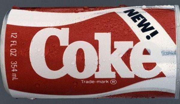
Netflix have confused their consumers with their now variety of brand identities. Brand confusion can be unsettling for some users even for trusted organisations. This occurred when Coca-Cola in launched their “New Coke” branding back in the 1980s.

As you might have guessed Coca-Cola changed their branding right back to their magnificent vintage logo design soon after, as it caused an uproar with fizzy pop fans. This has happened with a number of brands including Tropicana and Gap.
Changing Your Design Direction?
It seems like Netflix changed their direction so their icon looks better and is more visible on portable devices, which seems justified considering most users will be watching on tablets or iPads.
But it is important that you have a real think about the needs and desires of your customers before you rebrand. Ian Spalter, Instagram’s head of design, wrote in a blog post on Medium that: “brands, logos, and products develop deep connections and associations with people, so you don’t just want to change them for the sake of novelty”.
Instagram and Netflix are BIG brands, therefore they can take the risk, changing their logo may have affected their users in the short term however it will not change their consumer engagement.


