In order to stay competitive, you need to keep up with the latest trends in your chosen trade or profession. Web design trends come and go. Some of them, like responsive design, have a lasting effect. Others are tied more closely to user tastes and interests, which can vary with time.
Whatever the case, these design trends are generally based upon new and innovative techniques that catch on because they are popular with end users, or have a pronounced positive effect on clients’ conversion rates.
Even as these trends may change from year to year, Be Theme, with its powerful core features and huge library of pre-built websites, keeps pace. As you will discover, Be’s latest pre-built website releases feature a modern look, a look that can include everything from long scroll and hero images, to innovative usage of design lines and the clever use of white space.
These recent launches share the following characteristics:
– They respect and are supportive of visual hierarchy principles.
– They make excellent use of UX enriching special effects and subtle micro effects.

– Many introduce the UX with a hero image.
– Full-width layouts are becoming the norm.
– Patterns are used with greater effectiveness to focus on the message.
Notice How the Most Recent Pre-Built Websites Have Incorporated the Latest Design Trends
While the following pre-built websites differ significantly in appearance, they actually have much in common. Every one of these quality websites has features that are in concert with the recent web design trends. In addition, they are extremely easy to install and customize, and coding is not required.
Observe how different approaches are used to draw in and engage the user. The message varies, but it is always clear, and is always supportive of the brand.
Be Car
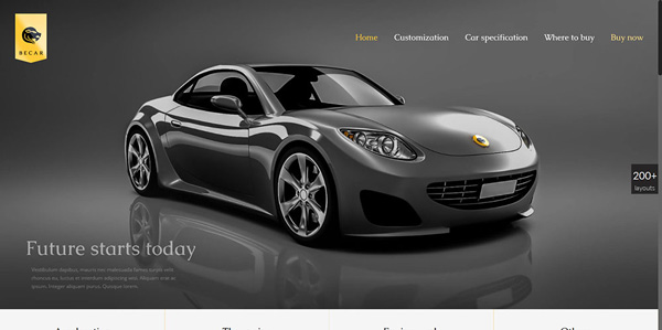
This website illustrates why using hero imagery has become a new and popular design trend.
– The hero image is a perfect fit for the website’s concept.
– Color choices are smooth and well organized.
– There is a carefully planned use of white space.
– The gallery hover effects are smooth and engaging.
This web design is an excellent example as to how a tasteful color scheme and the use of white space, in combination with a full-width layout, can convey a sense of balance, luxury, and elegance.
Be SmartHome
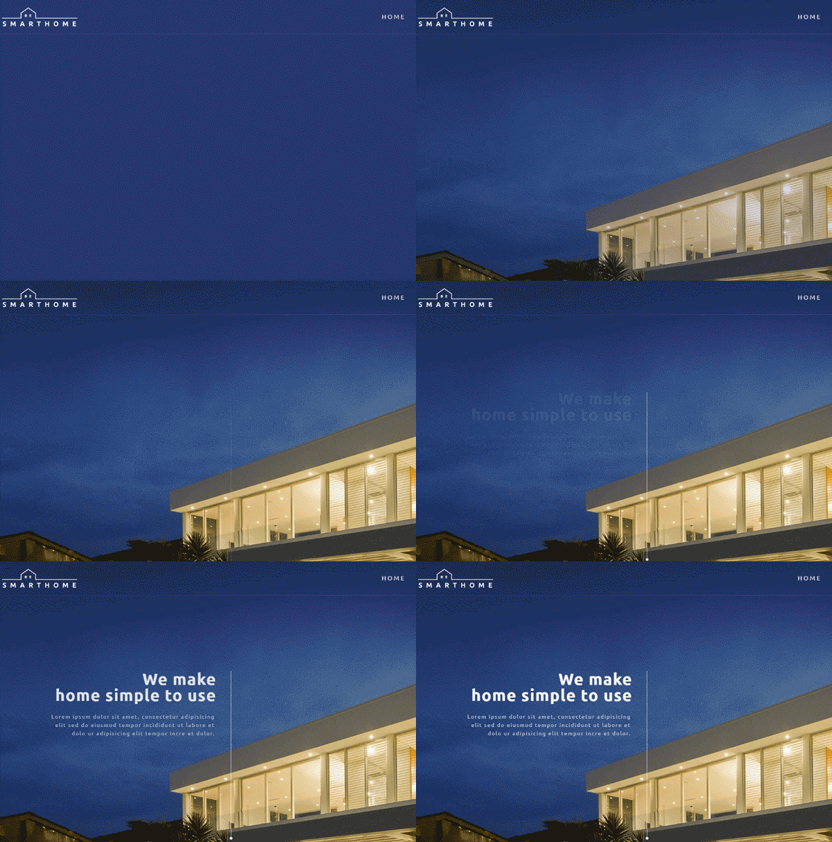
Several of the design features of this website particularly stand out.
– The subtle use of header effects. The information is there, but it does not intrude.
– Minimalist icons effectively point the user to key information.
– The conceptual relationship between the site theme and its graphics point to consistency in design.
– The pricing page illustrates an interesting use of perspective.
Be Architect2
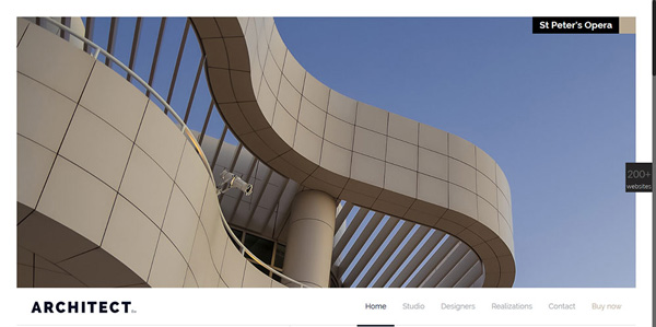
What sets this modern pre-built website apart?
– It is a great example of taking a minimalist design approach.
– Its visual hierarchy scheme places all of the design elements in their proper relationship.
– Its play on perspective gives the user a unique and interesting view.
Be SEO

The outstanding features in this pre-built website, are slightly different.
– The corporate identity is represented in a friendly, rather than a stiff and formal, manner.
– This website’s design trend makes good use of warm neon vintage 80s colors.
– It displays an effective use of white space.
– The icons match the website’s look, feel, and color scheme.
– The popular card-like web trend has been put to good use.
Be Makeup
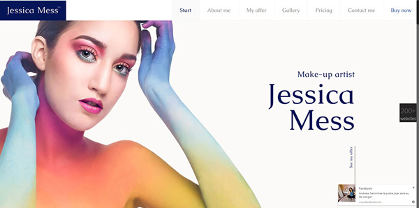
This website puts several modern design trends to good use.
– The header effect is subtle, but not to the point of being inconspicuous. It is just right.
– The use of minimalistic icons is all that is needed to point the user in the right direction.
– This single page website features a perfect UX for the theme.
– The graphics clearly articulate the message.
– The hero shot tells the story of the artistic nature of the enterprise.
Web Designers Have Much to Gain by Using Pre-Built Websites
It’s easy to see why pre-built websites such as these can get a project off to a quick start. Of even greater importance is the fact that, since the designs take into account the latest trends, the web designer can present his client with a website featuring an exceptional UX, and one that will draw traffic and realize great conversion rates.
Be Theme provides even more benefits. There are over 200 of these pre-built websites to choose from, covering every website type and the great majority of popular website themes. Each can be installed with a single click, after which Be’s 40 powerful core features come into play.
The Muffin Builder/Admin Panel combination is easy to use, and will do most of your heavy lifting. The pre-built websites are totally customizable, and with the help of Be’s Shortcode Generator, you can incorporate fine detail and the all-important subtle special effects into your website without needing to add a single line of code. Should you decide to create a page from scratch – no problem. Simply select the layout and header types and turn things over to the Layout Configurator.
The combination of prebuilt websites, core features, and a huge user base has made Be Theme the biggest WordPress theme ever. Big is good, but where this website-building tool really shines is in the quality of its performance and the quality of the websites it is capable of producing.
Be is SEO and WooCommerce ready, responsive, and a whole lot more. You will find yourself turning out page after page of top quality UI and UX deliverables in record time. You will love working with Be Theme, and should you ever have a question or hit a small bump in the road, Be’s world-class support team is there for you 24/7.


