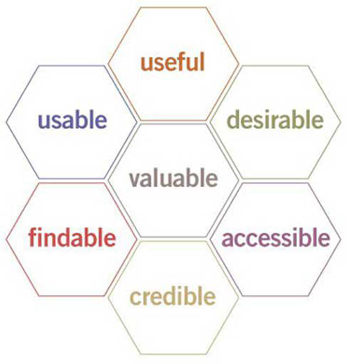
A good web design is all about creating a user experience that is focused on a deep understanding of users, their needs, their value, their limitations and their abilities. It should also take into account the objectives and goals of a business.
However, knowing your customer behavior is a tough subject that often gets hard to deal with. Despite the implementation of advanced CRMs and beacon integrated web application and services that make a retailer’s job easier by helping to track down activities, it is not necessary that a single customer might display the same behavior.
Customers and Their Classification of Behavior in Retail Stores
For this, a retailer needs to understand the term ‘customer’ first. Who is a customer by the way? You may identify a customer to be anyone who walks into your store. But then, you must understand that a customer can be classified down into you categories – the shopper and the purchaser.
A shopper can be the customer who purchases a particular product from your store, but it is not necessary that he or she is buying it for his or her need. Again, a purchaser might be in need of a particular product that your e-commerce sells but it is not necessary that he or she might become the customer who converts.
The business of consumerization is really very complicated. The term customers can be further divided into business purchasers and consumer shoppers. While consumers can be susceptible to impulse shopping and can readily switch from one brand to another if influenced by special coupons, deals, advertising, recommendation; this is not the same in case of business purchasers. This group of customers will do a lot of research, follow a formal buying and procurement process and even look at the specifications carefully before making the conversion.
Therefore, it is important to understand that there is practically no proper definition of a customer behavior online based on which a web design with the best user experience can be created.
With changing trends, the market is always up with new web design practices. It is not always necessary that a new web design can improve your e-commerce conversion. You may find many examples of beautiful websites that have failed to properly convert. That is why, sometimes, marketers believe that an old layout of a web design should be left alone if it generates conversion satisfactorily. Your immediate question would be – should you not change your web design then? Definitely! Keeping your website updated with the latest web design trends is essential in order to keep up with the changing times. For example, when Responsive web design became no-more-an-option, it was mandatory that all websites adapt to it. Now that users have become multi-screeners, a website must take into consideration the device usage behavior to ensure that an e-commerce business is not letting any drop target audience spill out from the conversion funnel. Adaptation to the trending device usage behavior is the good UX practice. It is a wonderful explanation that indicates the need of improved web designs for Human-computer Interaction.
So Do Old and Gold Principles of Web Design UX Apply No More?
Some may and some may not. For example, while it is important to add proper information to your web pages that will help to guide customers on their research or purchase, make sure that you do not spoil the ‘good intention’ by providing something very complicated.
Following the basic web design principles is essential to begin placing the first blocks to a great user experience. But make sure that the implementation of the undercover user experience design runs parallel to the modern trending practices.
Based on Nielson Norman Reports, here are certain trending practices that have been embraced by websites and how they have helped to evolve customer experience to better website conversion.
1. Bigger Product Images
Big images help to complete the product description of a service. Based on NNG usability testing, customers are observed to glean service details directly from the images.
According to studies, 90 percent of the information that get transmitted to the human brain is visual. They are pleasing to look at and are said to improve web page comprehension by 400 percent.
It is said that websites fail to provide customers with the same touch and feel that one might be able to experience offline. A big image can do the work of both visually by providing customers to view the image at its full size. To some extent it might not apply for certain websites like the ones selling home decorative services. Nevertheless, large images tell customers something more about a particular product that is impossible to do with just words. The visual appeal that a picture can give, allows customers plenty of reasons to keep exploring for the right products.
Addition of multiple images enables a customer to visualize a product properly from front, back, sideways and top. Make sure that the product image and the product description (in words) are consistent for that is what the customer wishes to see.
2. More Robust Reviews
Without proper product reviews and ratings, how will your customers decide which of the items are best? First impressions matter at every stage, whether your site is being visited by a new customer or an old customer. Every customer is going to go through the reviews first before they proceed to click on the buy button.
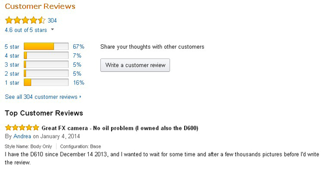
Reviews should be able to convey the quality and the usage of a product from the customer perspective. That’s because these have been written by real users who need, want and have actually used your service. Every e-commerce websites today have customer reviews for the products and services sold online. But there are some websites like Amazon for example, have taken their customer reviews to a whole new level. If you visit the website, you will find that the reviews are rated and ranked in order of helpfulness.
There are other practices as well and some of these are –
– Providing review summaries
– Adding relevant details like age, gender, product criteria such as size and quality
– Allowing readers to rate the relevance of a review
– Highlighting the key phrases used both positively and negatively
The Customer Review Page of OrientalTrading.com (Ref Link – https://www.nngroup.com/articles/e-commerce-usability/)
The practices help to make customers’ lives easier, shortening the distance between customer decision and customer conversion.
3. Proper Use of Coupons
You need to have certain tactics in your conversion system that will help your website begin making conversion.
The implementation of key tactics that will help to drive customer conversion can be termed as Grooming for Conversion and can be applied on bounced customers, abandoned customers and even those who have already purchased a product from your web page.

It is a bad user experience if customers are unable to use a particular coupon code or qualify for discounts on your website. Your web design should be make it easier for the customers to reach the page where your coupons and discounts are.
If your website has an advertisement on a special discount offer, then automatically apply it to users who qualify for it. Make it easy for your customers to apply the codes long before they get to the checkout page. This will motivate them to convert faster. Preventing customers to avail an offer can frustrate them and even erode a sense of trust. Therefore, place your elements like special offers and discounts in such a way that makes it impossible to miss and not unknowingly ignored.
The Comfortable Web Design UX
A website design should be consistent with the latest trends and technologies to ensure comfortable shopping experience. This will ultimately be the key drive to better customer conversation.
References:
– The Basic Principles That Make a Web Design UX
– Graphic Description V/S Textual Description
– The Amazon Customer Review Page

