There is a time-worn expression – “Don’t judge a book by its cover.” And it is a well-meaning statement that speaks to our judging of other people by their appearance. When it comes to websites, however, people will totally judge a “book by its cover” as soon as they land. Typical initial impressions may be “sleek,” “great color,” “cheap looking,” “confusing,” “fun,” “professional,” “cluttered,” etc. When a visitor arrives, that first impression will cause him/her to stay or to bounce – it’s that simple.
With this in mind, as you design your site, here are 7 blunders that you will want to avoid.
Not Having a Clear and Prominent Headline
If you want your visitor confused about your product or brand. What exactly do you do? Here is an example of a site without a headline.
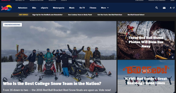
You might know that this is Red Bull’s home page, if you are familiar with their logo (top left). A new visitor, however, would be confused. Now, Red Bull can get away with this, because they have a large following, a niche customer, and chances are no one will come to the site without being a Red Bull lover.
You, on the other hand cannot unless you are a million-dollar company with a large and loyal following that comes to your site for fun and entertainment.
The Headline is About You and Not the customer
The visitor is on your site because s/he wants or needs something. If your headline talks about you instead of solving a problem for your customer, what’s the point? Just telling a visitor what you do is not good enough. What can you do for him/her?
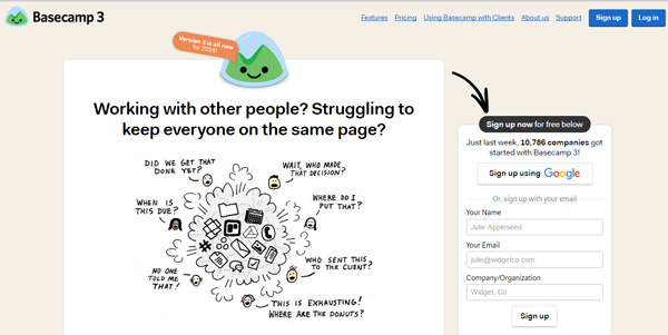
Basecamp is a project management tool, and it is obvious from the headline (and from the very effective image) exactly the problem they can solve for a project manager.
Main Image is MIA
People want to see something visual when they land on a homepage. Your image should convey what you do for your customers and text should complement that. Here is an example from Headbands of Hope, an e-retailer that makes a great profit and also has a cause.

The visuals here tell the whole story, along with some important text about what the company does for children with cancer. There are so many great tools now for getting great visuals, you can easily compensate for any lack of skills you have.
Not Giving the Visitor Clear Direction
Again, people come to a site with a single goal – to find what they are looking for. If they are not given clear directions about where to go to find that, they will become frustrated/confused and just leave. Alaska Sleep Clinic has the right idea. Take a look.
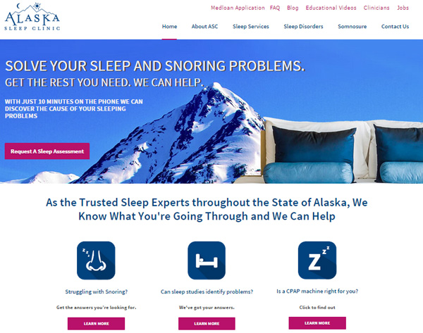
First, the headline addresses the problem of the customer. But look at the 3 options given – the visitor can clearly find his/her problem area and learn more. No confusion here. It’s all about the customer not the company.
Too Much Clutter
Video and/or Background Music
Video may have a place on websites, but not on the home page. Visitors want to come and find what they want. If you want to give a tour, put a link for the tour. If you want to have a “how-to” video about the use of your product, put a link to that. And background music can be really irritating. Just don’t do it.
Way too Much Text (and in small print) on Your Home Page
The home page is not the place to tell visitors all about yourself, how long you have been in business and how you started, or all of the details of the products or services you offer. That stuff is for other pages.
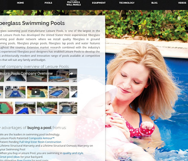
A great image, absolutely ruined by all of this tiny print, and its white on a black background. Who will go through the eye strain to read this? No one – they’ll just find another pool company, and Leisure Pools will have lost a potential customer.
Contrast the above with this:
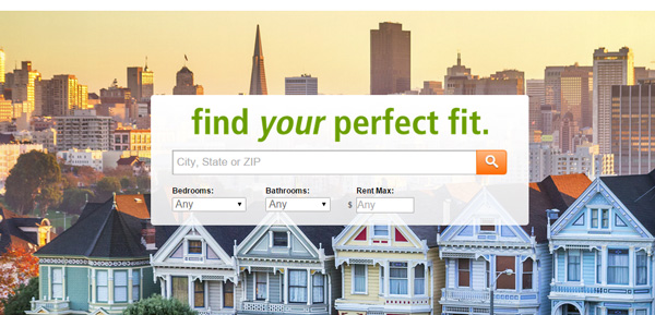
Simple – no text with irrelevant detail – just the search feature with basic information the customer supplies.
Remember the following “rules” as you design:
1. Focus on your customers’ needs and wants, not your need to tell them about you.
2. Have clear headlines that speak to problems you can solve
3. Lose the clutter and irrelevant text.
4. Use a great visual that relates to your product or service
Author:
“Ben Brychta is an MBA student from San Jose, California. He is big movie classics fan and loves to share his opinion on different thing happening in the spheres of the film industry, economics and design. You can contact him through his Twitter or LinkedIn“


