Leaflets remain one of the most popular design responsibilities for a graphic designer even with the advent of websites across the internet. Letting local people know about an upcoming event is a crucial way to create word of mouth and a leaflet is an excellent way to achieve this goal.
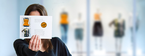
Make A Leaflet Design Stand Out From The Crowd
The main trick with leaflets is to think about the design before going ahead with it. Think about the role it will play. People see a leaflet pinned to a bulletin board or they are handed a leaflet by someone who is giving one to all the passersby who will accept a copy. The design has to be created in a such as a way to stand out and make them stop and pay attention to the words that are on the page rather than discard it quickly.
Offset Printing
Offset printing can be used to print a leaflet on both sides of the paper. Often people turn over a leaflet to check if they are missing anything on the other side, so it is certainly worth designing for a double sided leaflet rather than wasting the attention of the people seeing the leaflet.
A leaflet that later doubles as a poster that is stuck to a wall or pinned to a noticeboard can be printed out one side at a time, so don’t worry about not being able to show both sides if the leaflet is re-purposed later.
And also one of the most important part is to find a reliable printing company.Nowadays there are many high-quality print e-commerces, such as Onlineprinters, that offer affordable prices, customer service, and proven track records of success.
Careful Use of Color
The colors used in the design of any leaflet need to be eye-catching and also conform to the printing abilities (two-color printing, full-color etc.). They should draw the eye to the most important area on the leaflet, where the most crucial information will be relayed in words and images.
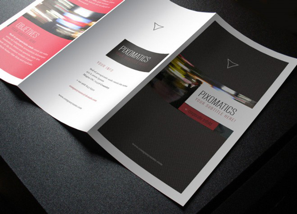
Contrasting colors can be used to provide shading and make certain lettering stick out when first looking at the page. This is very important because lose the attention of the person with the leaflet and you’ve lost it forever.
Don’t Forget The Theme
Whether the leaflet is intended to promote an event, announce a new venue or to promote a new product, the design should reflect the type of business and customers that business owners wish to attract. It is no good using an older, staid look to the typeface and color scheme if the clientele is actually teenagers and younger people in their early 20s. This will miss the mark completely even if the leaflet is being given to the correct target audience by the people handing the leaflet out.
Get The Size Correct
Leaflets are not all one size, although it is fair to say that using A4 pager size dimensions is probably the best way to go. There are other sizes like US Legal, A5, CC, DL and A6 which are also possibilities too.
It also depends whether the leaflet may be performing double duty later as a poster to pin to a noticeboard with lettering enlarged, by way of a large paper size, to be readable for people walking past.
Vector graphics
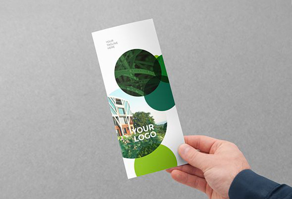
Be sure to design using vector graphics for any images and text used in the leaflet. This will help to ensure they can all scale up to different paper sizes without losing any image quality in the process.
A higher DPI and a large canvas are also useful for designers to allow for the leaflet design to be re-purposed for larger paper or poster sizes instead of only designed as an A4 leaflet with a restrictive design that prevents it being used for anything else because it has been designed too small.
Excellent Promotional Opportunities
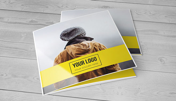
Leaflets are an excellent way to promote a business through eye-catching design and effective copy-writing with the promotional wording. They are most useful for businesses that wish to gain a larger market share or a create a greater awareness of their events, products or brand in the local area.


