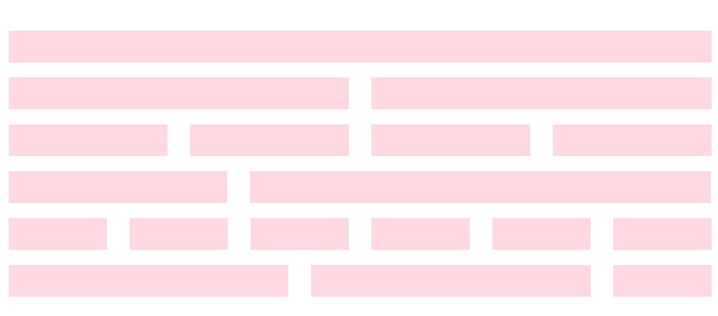
Stretch is a super simple responsive CSS grid system. For now, it is a 12 column grid that can have any gutter size you want. Columns can be pushed and pulled to make manoeuvring content really easy and breakpoints can be customised. The naming of classes is readable and easy to understand.Columns can be specified differently for three devices sizes.
Stretch can be implemented in two ways:


