Businesses face tremendous competition online. This is why the quality of their website assumes tremendous importance. A website that delivers a fantastic UX helps businesses convert visitors into customers.
Gone are the days when just about any website was enough to boost sales; that’s not happening anymore because cut-throat competition has compelled businesses to re-invent their websites for the better. This allows them to stay ahead of the competition by being more visible, accessible and conversion friendly.
This is the reason why a website mustn’t make errors. You might not know it, but there might be a few mistakes on your website that are the reason behind your business’s decreasing sales figures.
Check your website and see if you are not committing those common mistakes:
Slow Load Speed
 Your website might look good, courtesy the great content and visuals you are using and might also be easy to navigate. So, why is it attracting limited traffic? Why does it have a high bounce rate?
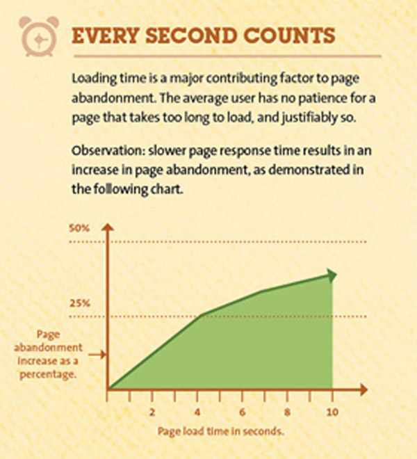
The answers to these questions might lie in the slow loading speed of your site on desktops and mobile screen of your target audience. This is as effective a traffic repellant as any.
A report says that 40 % of visitors abandon a website that takes more than 3 seconds to load. The report further states that a delay of 1 sec increases the abandonment rate by 25 %. Imagine the lost business opportunity!
So, figure out a way to cut down the loading time and keep it well below the ideal 3 seconds mark and see the difference.
Missing Responsive Design
Most of the businesses err by not thinking mobile. Maybe, you too are committing the same mistake by not having a responsive web design for your website.
The explosive, smartphone growth is a boon to the mobile e-commerce market. US mobile payments will reach $90 billion by 2017. Imagine the cumulative figure across the globe, and now see what your business is losing in terms of mobile-commerce, simply because it does not have a mobile –friendly website.
So, focus on a responsive web design for your site to make sure it offers the same user experience across diverse mobile devices.
No Lead Magnet
 Many websites fail because they do not offer a freebie or Lead Magnet. It can be a freely downloadable e- book or a report of good value to user.
In return, users will happily share their contact information; this can be used to reach out to them and explain and convince them about your product/service. This sets in motion the process of converting leads into customers.
So instead of asking your visitors to fill up a contact form, embed a Lead Magnet on your home page to drive more traffic.
Lack of Customer Orientation
If your sales copy talks about your company, products, services, your history, career, etc. rather than answering the super important question – What in it for the customers?, your web presence will fall down, flat-face.
So, get smart and talk about your potential customers’ needs and show them how you can help overcome their problems with your solutions. Connect with them.
Tell them about the benefits of your product or service and how it is a much better bet than the options provided by your competitors; if your customers begin to believe (rightly so) that you care about their needs and requirements, they will be convinced to take the next step in the sales funnel.
Stop being “self-centered” and become customer-centric!
Weak Call to Action (CTA)
Powerful CTAs raise conversion rates; unfortunately many websites have either weak or no CTAs at all. If you have committed the same mistake, you will not get the conversions you’re looking for.
CTA is not rocket science. All you have to do is focus on customer engagement. You can ask them to watch videos, download an eBook, register for a freebie, take a great offer, subscribe to a newsletter, or do whatever that keeps visitors engaged on your website for sufficient time.
Get your CTA buttons in the right place- top right corner of the website is ideal. What’s more, make sure the CTA stands out prominently from the surrounding design elements and the page layout.
No Videos
 According to Guardian, online video is the future of content marketing. Many websites lack the video support needed to convince and convert. If your website has no video clip then you better get one. According to Forrester Research one minute of video is worth 1.8 million words.
Compare that figure to the ‘thousand words that a static picture or image says’. The difference is huge. This gives you an indication of the awesome deliverables of using videos on your site.
Your online video adds personality to your brand and helps your business connect strongly with customers. According to one report, video is 53 times more likely to appear on the first page of a search engine. So get smart and add good videos to get more visibility for your site.
Too Many Distracting Ads
No doubt, online ads generate revenues but overdoing them on your website can distract attention of visitors. Further, you know how bothersome pop-ups are and that most of the computers have software programmed to block pop-up advertising.
If the revenue generated from them is not as worthwhile as the revenue generated from your product or services page, you better scale back on advertising to make your web page, advertisement clutter-free.
Content-Clutter
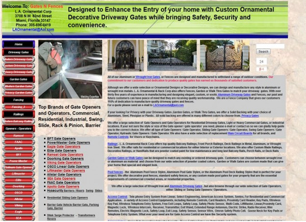
Get the right content for your website. It should neither be too much, nor too less, but good enough to convince and convert. Add relevant visuals, like videos, realistic pictures and graphs; all nicely spaced on a cleanly designed web page.
Keep your best content (text, images, video, etc.) above the fold to impress visitors to spend more time on your website.
Whether it is your all-important home page or product or services pages, make sure you provide smooth navigation and a good user experience to encourage meaningful conversions.
Conclusion
Overcoming these common website mistakes is not like climbing Mt.Everest. All you need is an expert’s help to rectify them and drive loads of useful traffic to your website for more profitability.


