
Creativity and business skills go hand in hand with these 5 great examples of engaging and exciting e-commerce sites. We have hand picked these 5 e-commerce sites because each of them presents their products or services in an imaginative and interesting way. Though each site does this differently, all 5 sites display the similar traits of being informative, eye catching, and user friendly. The more interesting that e-commerce is made, the more likely it is that visitors to an e-commerce site will turn into paying customers. Once you have read this article you will wonder why you ever thought that e-commerce had to be boring!
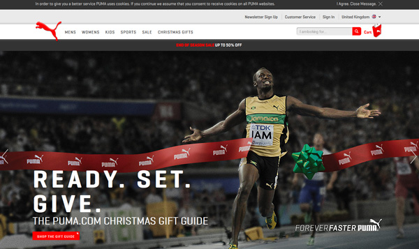
UK Puma
Superb photography really makes the Puma website a joy to navigate! It is also designed to be very intuitive in its layout, so it is easy to find the products you like. Information is presented very clearly on this website and is boosted with bold images that feature everything from close ups of running tracks to pictures of famous sports stars crossing the finishing line. Another great thing about this site is the way that it makes it very easy for you to see what the products will look like when you wear them. The layout is very clear, and doesn’t seem cluttered at all and yet manages to pack in a whole lot of information. All in all, if bold visuals, the Puma website is for you!
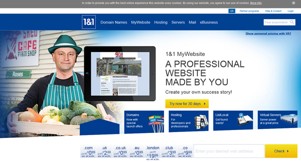
1and1
A cool blue theme and a wealth of clearly carefully researched information gives this website an instant air of reliability. This site is for a company creating website creation and design solutions, so it is not surprising that it is user friendly and easy to navigate, and boasts a sleek and contemporary aesthetic. One of the best features of this e-commerce site is the landing page, which enables users to scroll through different product options without physically leaving the landing page itself. Getting users to engage with an e-commerce site in this way is a great way of keeping them interested. Everyone likes to do a little exploring, it feeds the imagination and gives users a sense of purpose.
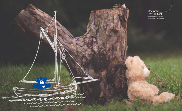
Build a Bear
This e-commerce site has a very welcoming feel. The Build A Bear company has been designed specifically for children, and enables them to make their own teddy bears to their own design. There are many physical Build A Bear stores dotted throughout the UK. This e-commerce site is the perfect example of a website that manages to recreate the aesthetic of a physical shop whilst adding something new. Evoking a traditional workshop, the bright and cheerful colours and high tech design of this site give a modern twist to the classic, comforting feel of the company.
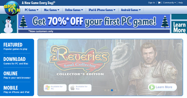
Big Fish Games
The e-commerce site for a games company was always going to be fun! This site is, like the others, very well presented and instantly easy on the eye. Tantalising the visitor with snippets of information it invites them to click through, engage with the site, and find out more. And, of course there are a few free taster games that users can try. This is a great way to whet visitors’ appetites to make a purchase, as well as ensuring that there are a few fun challenges to keep them interested as they browse around the site.
Woot
This site is a great example of the so called ‘gamification’ of e-commerce, but in a different way to Big Fish Games, discussed above. Gamification is basically the process whereby e-commerce sites turn shopping into a game, with challenges and rewards, to keep it interesting and hopefully to boost the number of purchases too. Woot.com offers users a daily deal which they can take advantage of if they are quick enough. There are only a limited number of products available for each day’s deal, so this e-commerce site really rewards some gentle competition, and encourages its visitors to stay engaged with the site every day to be in with a chance of winning out on that day’s deal.


