Why would anyone want a contact form? You can publish your email address on your contact page just as easily, one may think. The answer is that having a form available is a tried and true way of attaining organized information.
There are many reasons that favor creating a form. First, a contact form looks much more professional. Secondly, if end up changing the email address, some users will continue to use the old address. If you are using a contact form however, you can redirect your form submissions quietly behind the scenes. Thirdly, if a visitor of your website wishes to email you, it’s much easier for her to email you through the contact form. Otherwise she’ll have to log in to her email account. This requires more work and also takes her away from your site. Additionally, you can set your form to have CAPTCHA to protect you from spam. Forms are useful for both the person trying to relay their message as well as the contact.
Forms have other applications as well. They are used for account registrations, profile creation, conducting surveys, setting up stores, quizzes, job applications, or any number of purposes. JotForm gives you the freedom to customize your forms however you like.
Just like you need to keep other aspects of your website professional, you also need to use high quality, professional forms. JotForm is highly recommended for all of your form needs. It is an easy form building tool. Even if you have no coding or programming experience, you can create beautiful and professional forms within minutes.
Let me show you how it works.
First I went to the form builder and set up the basic layout of the form with the Form Builder. This is and has always been JotForm’s core product. Here you add the fields to the form, such as a text field for Name, and a Text Area Field for bio. That’s just for starters- there are many more options including sliders, file uploads, and payment widgets to collect money. There are hundreds of options for every need.
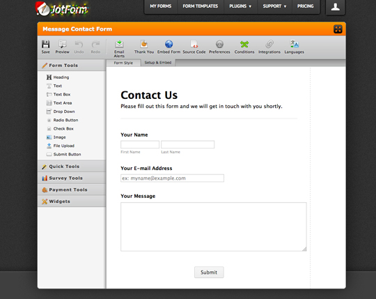
And then comes time to make it look good. Mid October JotForm released a web renowned tool, the Form Designer. It’s a point and click CSS builder. And if you don’t know what a CSS builder is, the good news is, you don’t need to! Although you are able to add custom CSS, you do not need to. By clicking on elements of the form you can quickly add color and style to your form. Seasoned designers will come to appreciate it for the time it saves them, and regular users will value that they can get great looking forms without having to be a computer programmer.
As the image below shows, it has a simple interface.
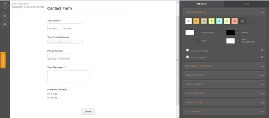
Let’s say I want to change the background of the image.
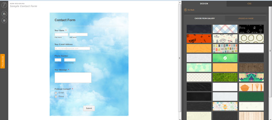
I clicked on the “Background Image” option from the right and chose an image from their library. (Or I could have also uploaded my own.) Once selected, the image was applied to the form.
The screenshot below shows the result.
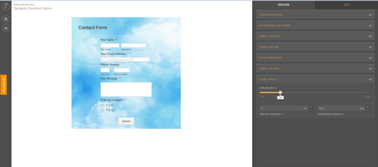
I can also control the size of my form and its various elements. I clicked on the “Line Layout” option and was presented with three options: line spacing, vertical padding and horizontal padding.
I can play around with these options to adjust the sizing and spacing of my contact form.
See below for the final result.
The highlight of the form designer is the CSS Helper, which is a point and click tool that makes adjusting CSS easy. Clicking the element creates the CSS selector, and the property fields are readily available. All the user needs to do is enter a valid property value.
The screenshot below illustrates this point.
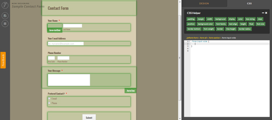
One final important feature which needs to be mentioned is the CSS editor. If you know how to write CSS code and want to design the form for yourself, you can use this option.
On December 15, 2014 JotForm launched a new service known as the Theme Store. Although JotForm’s crowning achievement is the Form Designer, which I have described above, they also noticed an unfulfilled area: people who want forms but don’t want to make them. JotForm understood many users want to choose a theme rather than create one from scratch. Thus, the Theme Store was born. JotForm is now not only a place to build and design forms from scratch, but is also a place to use those that already exist.
The Theme Store has lots of form designs that are accessible and available for immediate use. They include forms in numerous color schemes, fonts, and backgrounds. JotForm users will have access to the newest and best forms around. Users can also contribute their best theme designs to it, to sell to other users. The Theme Store will be constantly updated with additional designs every day.
The website is worth checking out. Go and take a look and let me know what you think about it in the comments below.


