The apex of this industry lies at the heart of constant churning out of ideas. As this year draws to a close most designers are looking diagonally across the search results and wondering just where to place which brand of design. There definitely are some worthwhile choices to consider in the nominations, honorable mentions and award winning categories for websites. But we are talking design types that will stand the test of time over the new ushering of technology. Never mind just responsive and customized CMS, we mean concepts that might as well set the tone for a company’s digital presence.
Typography
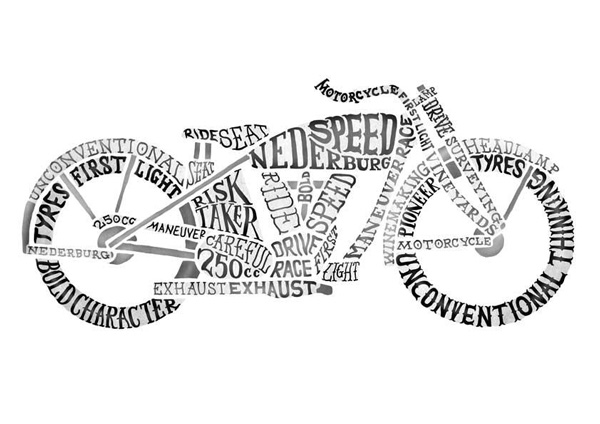 This is a no brainer. There are too many examples of design junkies throwing and showing bits of their craft on their websites. You know which style dominates proceedings? That’s right; the non-typical typograph. And it is simply logical if you consider it hindsight, because it is the one quickest method in which your creative skills can be amply shown to the world. The one above is an example from “Am I collective” typograph which works in an almost graffiti fashion to show case both objects and text. It is a filler example of sorts but the field of play is wide open in this. You can create endlessly and have some amazing results.
Flat Design
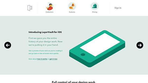 LayerVault is well known in design parlance to be one of the authorities in flat design implementation. You can even say that they have coined the modern expression within it after the boom of Windows 8 and iOS7. So why does Flat work? Well we like to associate it to an Indie look which people admire about Apple yes even though the setting of Flat belongs to Windows, its modern expression is taken up by iOS. Why does it work well? Because in conversion formats like PSD to HTML or WordPress, you have less work on the design end from detailing portion and you can have a very user friendly UI built in any case. A win win.
Video Driven
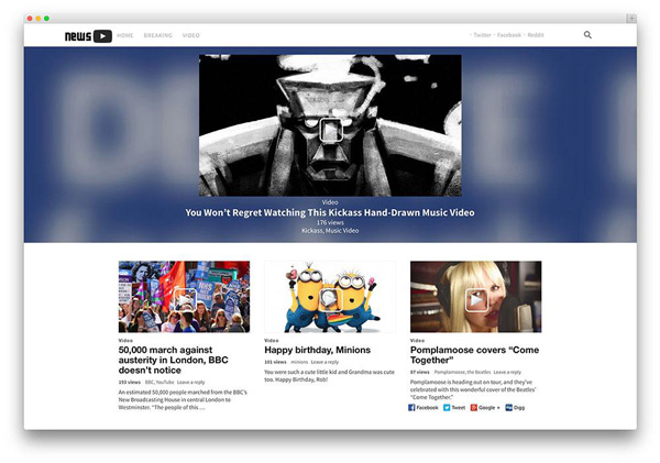
These main headers work as great introductory content to your site. So instead of worrying about multiple header panels and sliders, you have an entire video that showcases the purpose of your website. And in cases of animation centered sites, it makes perfect sense to adopt this strategy because you don’t want to design on top of their art which just again mixes the two. All in all, the video serves the visual aspect perfectly, just takes some toll on your browser cache though, but that’s easily handled.
Minimalism
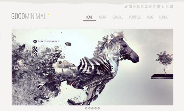 Minimalism is probably the most dominant trend amongst website designs today and with good measure as many sites are adopting the UI principle of user friendliness and cognitive ease of translation. You do not have to get lost in those terms though. It’s an easy principle. Now consider the WordPress theme above, it is easy to understand, your options are visible and the design style is quite alluring to say the least. Result: more frequent visitors as they are able to understand a simpler site quicker as compared to a complicated one.
User ease, cognitive translation are all concepts that relate to how easily you can sell your site to a new visitor. But from a design perspective, it is all about making the user feel welcome into using your website and just simplifying the entire process for them. As a practice, this theme is good to follow but again there are certain types of site this is good for and certain types where this does not work.
Before we close..
Themes and standards are present and they are all important industry tools but as designers it is equally important to be able to innovate and experiment within these designs because the website market does well based on its subject matter and niche. Whatever design style you adopt, has to translate the purpose of your website. This can even mean making use of a fusion between two or more styles but at the end of the day you want to make the commercial side of your site work. This is the core reason why this industry is evolving so quickly and you yet read a new list from me on these designs very soon.

