Newsletters are a great tool for promotion. They are most exhaustively used by affiliate marketers and email marketing companies. Normally, email newsletter are sent to subscribers of a particular website so they receive product/service updates.
The prevalent misconception is newsletters are all about catchy content and not about design. In actuality, email newsletters attract prospective customers by their design. In this article, we’ll discuss the importance of newsletter template design in email marketing.
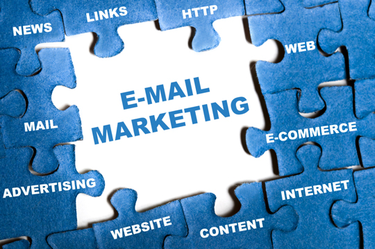
How to Design Templates for Email Newsletters
Whether you opt for DIY or hire a professional designer, it’s a must for you to know how an email newsletter template is designed. Keep the width of your newsletter between 550-600px and see to it that the pivotal information are within the top 300-500px of height.
Why this is important?
Having a fixed width doesn’t let the horizontal scrollbar to appear. Users don’t like horizontal scrollbar because they have to drag the scrollbar to right to see the full content. Also, the optimized preview pane for content is within 300-500px.
Photoshop document setup
Setting up a Photoshop document is fairly easy. You just have to open Photoshop and then create a new document. The height and width of the document should be set at 1000px and 800px respectively. Color should be RGB and resolution should be 72 dots per inch. The background color should be white.
– Creating the header
Write a crispy caption. If you want to add an image, select it and then drag it over into the template. You can use your favorite fonts.
– Adding the content
Since the content is to be added in the body, a rectangle of 600px width should be created underneath the header and stretched it to the bottom. The content should be put inside the rectangle. After opening the email, users will view the content.
– Social icons
To add social icons, a rectangle of 250px should be created and texts should be added that instruct the subscribers to follow the brand on social media.
Responsive Layout
If you have a web designer working on your email newsletter template, check if he’s using responsive layout. If you are designing the template yourself, use a third party platform that will enable your content to automatically adjust itself so readers could view the full content irrespective of the resolution of their devices.
The benefit of using third party tools is that they dynamically check the resolution of reader’s devices and format the content accordingly, so it fits the respective resolution. Users don’t have to increase or decrease the resolution. They could view a perfectly formatted page.
Such third party platforms have scores of other benefits like they let users create custom URLs and integrate video and multimedia. They also come with custom API so technical glitches could be kept at bay.
Landing Page Design
Design of the landing page plays a crucial role in converting leads. Email marketing campaign activities therefore, won’t pay off if the design of the landing page isn’t attractive. To make the landing page enticing, you need to use colors that are contrasting. For example, if the page has grey or bluish background, the form submission button could be dark red, so it creates a perfect contrast to the background and captures the attention of users.
Similar tips are prioritizing formatting and avoiding extravagance so the page doesn’t look messed up. Formatting is essential for neat and engaging landing page. For proper formatting, you need to clearly lay out the submission form, headlines and most importantly, the offer. An ideal template should have a clearly visible headline, a submission form underneath the headline, sub-header and a space on left or right side of the call-out box for short descriptive type content.
As for visual clutters, not only that they account for poor user-engagement, they can also make the website slow to load. Load time is a very important factor because even one second delay in the loading time of a page could cause 16% decrease in consumer satisfaction. While designing the landing page, one thing should be kept in mind; there should be similarities between the newsletter format and the landing page design format. The similarity will account for consistency.
Future of Email Marketing Campaign
Email marketing campaigns have lost their importance. That’s because users have become somewhat weary seeing promotional mails in their inbox. They often send those emails straightway to the spam folder.
But despite a slump in popularity, email marketing is still a viable way for users to receive information about a product’s launch details or description. Thus, email marketing needs to upgrade itself. It should be changed to something attractive and appealing from something routine and monotonous. That will be possible only if a campaign uses email templates with gripping design and winsome landing pages.


