If you are in the habit of taking your graphic design profession as casually as gulping down pizza, time for a wakeup call. Today, graphic designers are a dime a dozen. How do you compete among thousands of graphic designers globally, yet set yourself apart, and increase the chances of being found by your clients? The answer lies in these eight killer tips that will push you through the crowd and get noticed.
While we have chalked them down for logo designers, this is true for other designers as well.
Know Your Target Audience
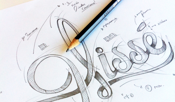
Research, research, research. The stress is never enough on the fact that every design project needs research. Once you are satisfied with your research, you need to make sure that you discuss the details of the industry, company and target audience with your customer. You cannot expect your logo design to stand out unless you design it with all these factors in mind.

Stress upon the client to tell you about his business as well as the type of people he caters to so you have a better idea of what needs to be included in the logo.
This Red Bull logo is one of the perfect examples you’ll find of designs which have been created with the industry and target audience in mind. The symbol shows two red bulls charging and heading towards against each other against a gold disk backdrop. This image symbolizes strength, speed and vitality, all of which are what the energy drink has to offer.
Never Underestimate Color
Ask any expert graphic designer and he will tell you that color is by far one of the most crucial components of a stunning logo. However, you must also check if the logo can keep its essence even after it has been stripped of colors as this will help you when printing in monochromatic media.

Choose three to four basic colors according to the products and services the company sells. But make sure that the shades you select look good together and don’t clash.
The EBay logo went through a transformation and the powerful results are obvious in the brand graphic you see here. Though the idea is the same, the colors are ever so lighter in shades and go perfectly together. The colors symbolize the large EBay community and their connectivity so they catch the viewer’s attention immediately.
Pay Attention to Typography
Apart from color, typography is also a vital component of your logo design. Many new designers undermine the quality of typography especially when they are using it with an image and forget that the final logo will contain the symbol as well as the name of the company.
So it is imperative that you pay attention to the strengths and weaknesses of Sans Serif, Serif, Helvetica and all the other fonts which are used by top brands.
The Coca-Cola logo is one of the most famous and highly recognizable logos. Ever wondered why? It’s simple – though the logo doesn’t use any image, the typography used is one which is catchy. There is just something in the design which makes you want to reach out and grab that can of coke.
Understand Graphics Requirements

As a graphic designer, you must be aware of and understand the type of graphics required perfectly. Though the two most common ones for logos are the vectors and raster images, experienced designer know that nothing beats vectors.
You need to use vectors in your logo because they are easy to manipulate and their flexibility make them the best choice for your brand’s image. Raster images should be avoided because you will need to use them as they are, which won’t make you stand out.
The WhatsApp logo uses the vector image of a telephone and its combination with the dialogue bubble make the company’s product obvious but highly influential.
Follow the K.I.S.S Rule
The first thing you learn when you enter the world of logo design is to keep things as simple as possible. Unfortunately, some designers don’t follow the K.I.S.S rule and end up creating something garish. So stay away from the temptation to add a lot of detail into a logo and focus on simplicity or include a hidden message, but make sure that it doesn’t make the design look confusing.
For example, what’s the first thing you notice about this Amazon logo? Probably the name and the smile, right? But do you also see that the arrow goes from “A” to “Z”? This denotes all that is available on the website and also implies that the company takes care of each of your needs. Simple yet neat, isn’t it?
Make it Timeless
Your client is spending big bucks so you can create an influential and powerful design for him. This is why, no matter which company you are designing for, you need to ensure that logo lasts for a long time.
Think about the present as well as the future of the company and the products which they plan to create because this will help you in creating a timeless logo.
When looking at the MasterCard logos, you’ll notice that not much has changed since 1979.
Take Inspiration
No matter how many years of experience you have, you can always get inspired by the art and design of others like yourself. Getting inspired is about exploring other people’s working, picking out the trends, techniques and methods used and making it your own by bringing in a piece of your own personality.
The best way to take inspiration is to look at the works and portfolio of different designers and study them in depth.
This Chanel logo was designed by Coco Channel herself and though there are many stories about how it was inspired, one which stands out is that she was inspired by the interlocking Cs, which she saw at Château Crémat. It’s said that Chanel looked up at the arch of the Chateau one night and was immediately inspired.
Believe in Your Design
Finally, once you have done everything to create a professional, influential and effective logo, you must ensure that you are satisfied with the final result. Because your client will need surety, you must know that your design is perfect so you can convince them of its ability as well.
So there you go, these were the 9 killer tips which are used by all experts who inspire other designers in the industry. Make sure you implement them in your new project and reap the benefits once your logo hits the market with a bang.


