
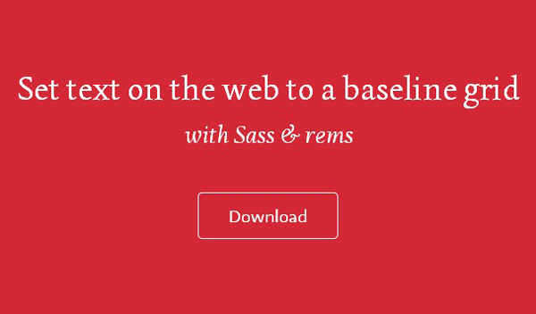
Set text on the web to a baseline grid with Sass & rems. Sassline can be used for blogs, prototyping, and other web projects. It has recommended base typography styling and mixins to work proportionally from the baseline grid. Select a modular-scale for each breakpoint and work responsively type-first.
The idea is to have easy to use and maintain SCSS files utilising the power of Sass to make the complex calculations to set type on a baseline grid on the web, with a production ready CSS output. Using rems for the font-sizing and the spacing measurements gives a simple way to use the proportions of the baseline grid throughout the design. Sass mixins do all the heavy lifting so your job is easy.


")


")
