A few years ago, people faced a lot of hardships when browsing the web via a smartphone. The most obvious was the screen size. Web developers and designers had to create websites that would work well on smaller screens. The constraints of a small screen have actually helped a website to be more flexible and responsive. Now, smartphone technologies have advanced to a point where it is influencing the traditional web designing concept.
Mobile users expect a fast and immersive experience. In order to create a mobile interface that can actually engage the user, pages have to be broken up into different parts depending on the browser and the screen size. Information of the smartphone is usually stored in small cards and this design concept has received positive feedback from numerous users. Presently, it more dominant in web architecture.
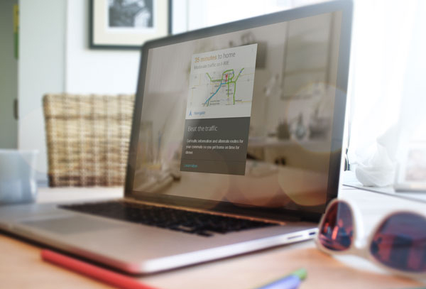
The attention of web-design is now on “cards”, a way to display the information in smaller chunks. Cards as a medium to disseminate information has been around for a long time. In the 9th century, Imperial China used them for games. Trade cards were prevalent in London during the 17th century which helped people find businesses. For many years, the mainstream are accustomed with business cards, greeting cards or birthday cards. These cards have been a great way to communicate quick information.
The same concept is kept in mind when formulating a website in the pattern of cards. In addition to using it as an information medium, there are infinite ways to manipulate “cards”. Just like a real card you can fold, expand, turn, stack, group, sort and spread digital cards. You can take advantage of all these options when designing a website. On cards, you can embed photos, multi-media content, music and videos. Make it interactive the way you want to.
Cards are perfect for all devices
It is becoming more prevalent that mobile devices will be the heart and soul for future businesses, no matter what their mode of operation. On mobile devices, cards are stacked vertically, streaming the activities on the phone. However, because of their presence and increased dominance for users to access the internet via mobile devices, website owners cannot completely forget about the other devices. A user may still view a website from a tablet, desktop or laptop.
For each of their landscape styles, cards can be arranged in various ways to create a customized, interactive canvas.
Card as a design pattern
Cards are available in different kinds of shapes and sizes. Usually, they include the information such as title, picture, user name and several icons. Sometimes there can be brief amount of texts, say for example a product description. If you observe them closely, cards are just like condensed webpages.
Websites adopting card design pattern
Twitter Cards
In the month of May, Twitter launched Cards for its web and mobile clients. These cards can be attached with the Tweets for an enriched experience. You can incorporate images, product details, video, media or audio in these cards.
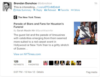
Cards drive engagement from your Tweets
The below Card types that can be attached to Tweets, each of which has a beautiful consumption experience built for Twitter’s web and mobile clients:
Summary Card: Default Card, including a title, description, thumbnail, and Twitter account attribution.
Summary Card with Large Image: Similar to a Summary Card, but with a prominently featured image and additional details and attribution.
Photo Card: A Card with a photo only.
Gallery Card: A Card highlighting a collection of four photos.
App Card: A Card to detail a mobile app with direct download.
Player Card: A Card to provide video/audio/media.
Product Card: A Card optimized for product details.
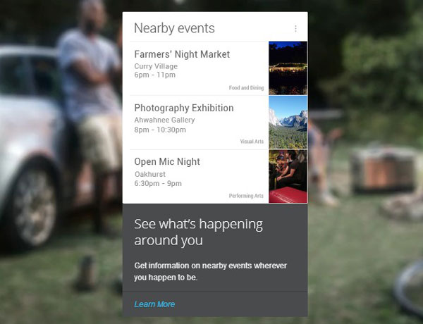
Google now
Google Now pushing personalized information to mobile devices, through cards.
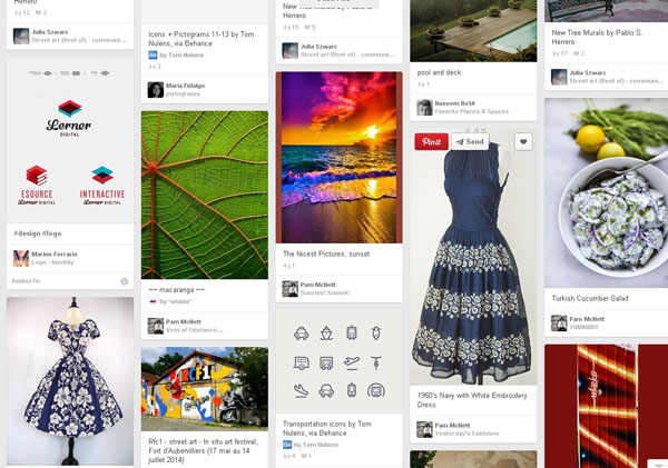
Pinterest has been largely influential in this card-based layout design sector. Countless websites have followed their footsteps to recreate an easily digestible layout.
There are several other websites that pick up cards to communicate their stories.
Cards do not have to remain in portrait mode always; it can be laid like landscape.
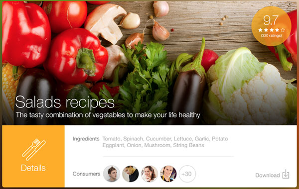
Cards are wonderful when you have to condense the key information and the pictures in a highly browsable format.
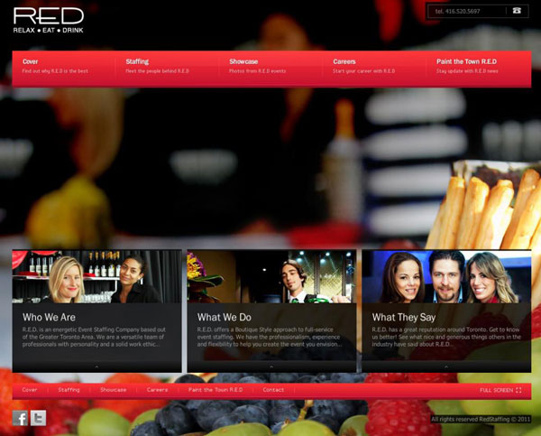
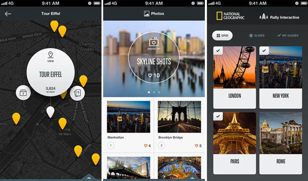
Cards are the best choice for guidebooks and apps.
It is evident that the card design will be the next big thing in web design and creativity. Content consumption on Facebook, Pinterest, Instagram and other social media will be built using card design metaphor. Cards are interactive models that are spreading on the internet pretty fast. These cards will help marketers tell their stories in new and exciting ways.


